
Product Designer · Product Owner · UX UI DEsigner
Kristen Becker
DIGITAL DESIGN, WITH A GLOBAL POINT OF VIEW.
Product. Experience. Identity.
A multidisciplinary approach to design, blending UX strategy, interface design, visual systems, and creative direction to turn complex ideas into compelling digital experiences.
MY RECENT PROJECTS
GET IN TOUCH →
CLIENT
Wish2Wear
ROLE
CPO · Head of Product Design
DURATION
Ongoing
DELIVERABLES
iOS App · Website · Admin Panel · Product Leadership
01 — OVERVIEW
[Project tagline — one sentence that captures what this project was about]
[Write a 2–3 sentence summary of the project here. What was the product, who was it for, and what was your role? This is the first thing a reader sees — make it clear and compelling.]
02 — THE PROBLEM
What needed to change — and why
[Describe the core problem or challenge this project was solving. What was broken, missing, or underserved? Why did it matter to the business and to users? Be specific — vague problems produce vague solutions.]
PROBLEM STATEMENT
"[Write your refined problem statement here. e.g. 'How might we help first-time users understand the value of the product within 60 seconds, before they decide to leave?']"
03 — GOALS & SUCCESS METRICS
01
[Primary goal — e.g. Reduce checkout drop-off by improving the payment flow]
02
[Secondary goal — e.g. Establish a consistent visual language across all platforms]
03
[Research goal — e.g. Understand why users abandon the onboarding sequence]
04
[Business goal — e.g. Increase trial-to-paid conversion within 30 days]
PRODUCT PILLARS
As an ex-manager dev at Riot, my client Sinan (Sean) taught me a lot about gamification, and general game design. One of the things he taught me was something known as design pillars. In game design, you choose a number, usually 4 to 6, main points or pillars every aspect of your game would revolve around. It could be a combat style, a story focus point, or anything else of relevance. This ensures that all departments and teams across a game development company strives to adhere to teh same feel or function. He then worked with me to recreate this, but in product design instead. Here are the product pillars we landed on
Weekly Momentum
Every week feels winnable and moves forward — always progressing.
One-Tap Execution
Do the work where you planned it, with a single simple action.
Realistic Planning
Plans should match actual capacity — not aspirational fantasy.
Adaptive Pacing
The system adapts to your rhythm without bossing you. A coach, not a sergeant.
Smooth Capture
Convert messy inputs and ideas into plan-ready items fast and frictionlessly.
Simple Insight
Feel progress without being overwhelmed by dashboards. Deep dives are optional.
04 — RESEARCH
Before redesigning Chronio, I wanted to understand the problem beyond the existing product. I produced a series of research reports covering the time-tracking market, competitors, user behaviour, motivations, adoption patterns, and underserved user groups, then synthesised those findings into personas and product opportunities. The research ultimately helped define Chronio as a personal productivity tool rather than a B2B time-tracking system.
USER INTERVIEWS
[How many participants? What were you trying to learn? What were the key themes that emerged?]
COMPETITIVE ANALYSIS
[Which competitors did you analyse? What patterns did you find across the landscape? What gaps did you identify?]
USABILITY TESTING
[What did you test, on what fidelity? What tasks did users complete? What failed?]
SURVEY / ANALYTICS
[What quantitative data did you gather? What did the numbers tell you that interviews couldn't?]
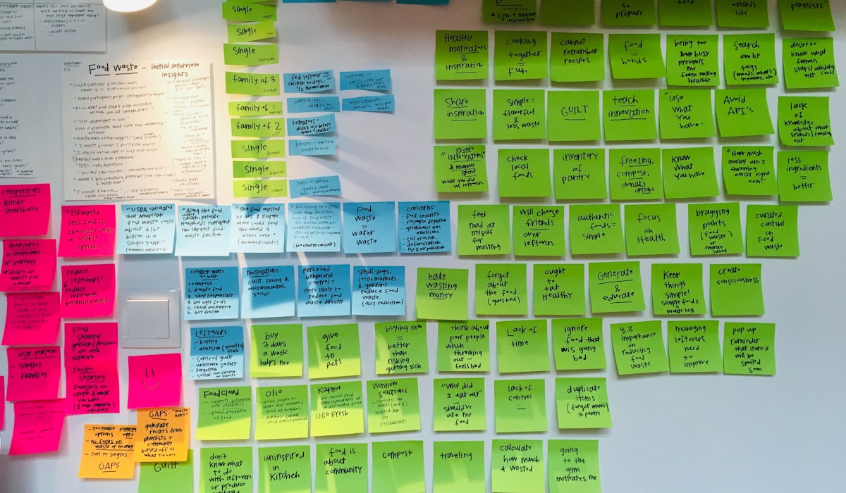
Key insights
1
[Key insight 01 — e.g. Users didn't understand the pricing model until the fourth screen — by then, 60% had already left]
2
[Key insight 02 — e.g. The primary CTA was competing visually with three secondary actions on the same level]
3
[Key insight 03 — e.g. Users trusted the product more when they saw social proof before being asked to sign up]
RESEARCH AT A GLANCE
[#]
[Metric — e.g. Users interviewed]
[e.g. Qualitative]
[#]
[Metric — e.g. Users interviewed]
[e.g. Qualitative]
[#]
[Metric — e.g. Users interviewed]
[e.g. Qualitative]
[#]
[Metric — e.g. Users interviewed]
[e.g. Qualitative]
05 — USER PERSONAS
PERSONA 01
[Persona Name — e.g. Sarah, 28]
[Job / archetype — e.g. First-time app user, non-technical]
CORE NEED
[Core need — e.g. Wants to complete the task quickly without reading instructions]
FRUSTRATION
[Core frustration — e.g. Confused by jargon and too many options at once]
PERSONA 02
[Persona Name — e.g. Marcus, 35]
[Job / archetype — e.g. Power user, returns weekly]
CORE NEED
[Core need — e.g. Wants shortcuts and customisation for efficiency]
FRUSTRATION
[Core frustration — e.g. Forced through onboarding he doesn't need every session]
[Add as many personas as are relevant — typically 2–4. Each should be grounded in your research, not invented. Include a photo if you have one.]
06 — DESIGN PROCESS
How I moved from problem to solution
01
Discover
[What did you do in the discovery phase? e.g. Stakeholder workshops, existing-product audit, user interviews, analytics review. What were you trying to understand?]
02
Define
[How did you synthesise your research? e.g. Affinity mapping, journey mapping, problem statement refinement, Jobs-to-be-Done framework. What was the "how might we" framing?]
03
Ideate
[How did you explore solutions? e.g. Sketching, design studio workshops, feature prioritisation, Crazy 8s. How many directions did you explore before narrowing down?]
04
Prototype
[What fidelity did you prototype at, and why? e.g. Lo-fi paper sketches → mid-fi Figma flows → hi-fi interactive prototype. What were you trying to validate at each stage?]
05
Test
[How did you test your designs? e.g. Moderated usability testing with 6 participants, unmoderated Maze tests, A/B testing in production. What changed after testing?]
06
Deliver
[How did you hand off to engineering? e.g. Annotated Figma specs, component library, design tokens, developer Q&A sessions, QA reviews during build.]
07 — WIREFRAMES & IA
[Describe your information architecture and early wireframe decisions. What were the main user flows? How did the IA evolve from your first sketches to the final structure? What were you trying to validate at the wireframe stage?]
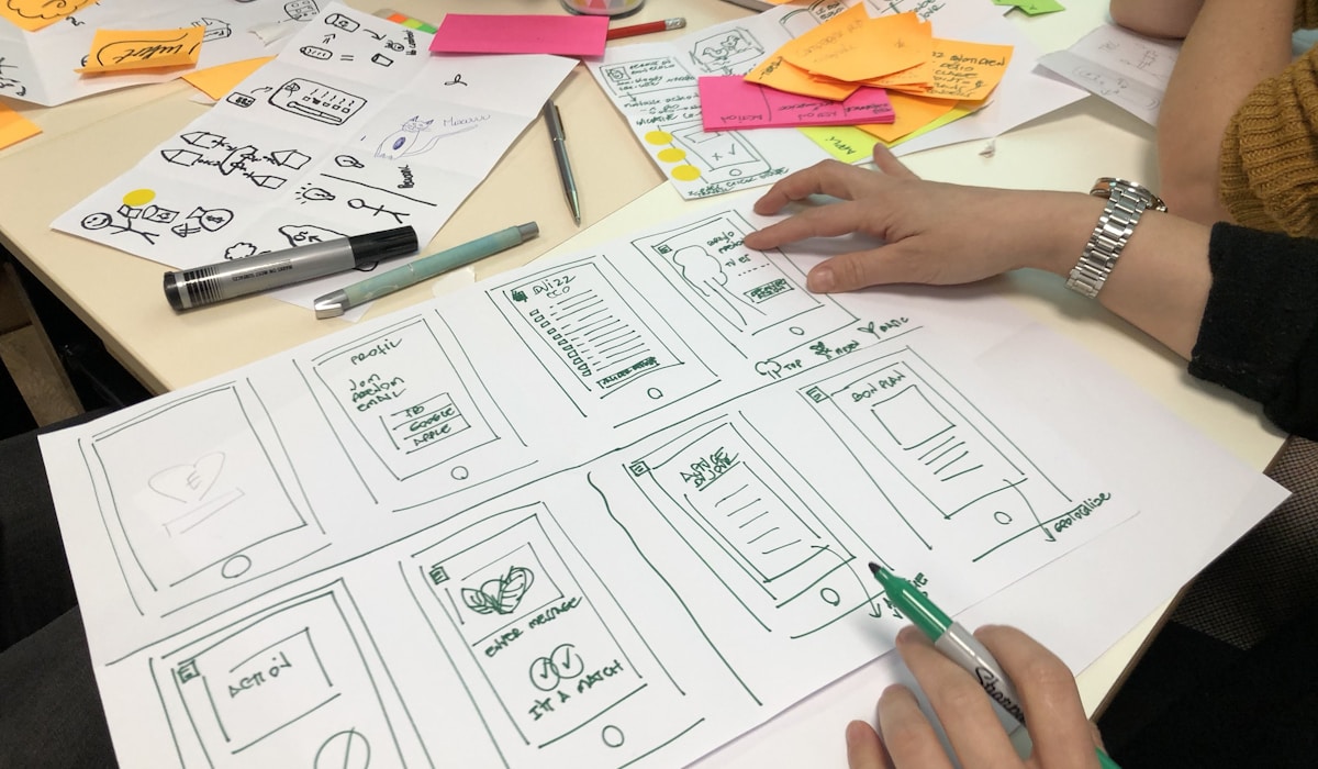
[Caption — e.g. Lo-fi wireframes, Round 1]
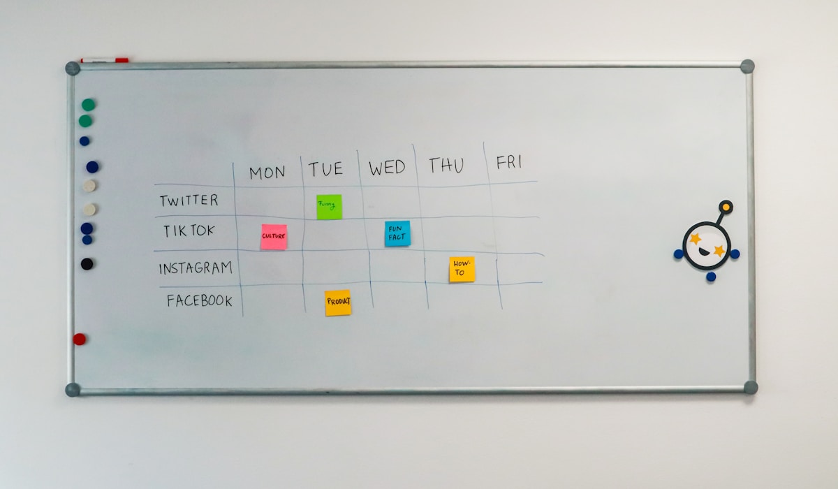
[Caption — e.g. User flow mapping, Week 2]
[Add more wireframe or IA images here. You can embed Figma frames using an embed link, or export and upload screenshots.]
08 — KEY DESIGN DECISIONS
[This is one of the most valuable sections of a case study. Explain the specific decisions you made and — more importantly — why. Recruiters and clients want to understand your thinking, not just see the output.]
[Design Decision 01 — e.g. Why we chose a bottom navigation over a hamburger menu]
[Explain the reasoning. What were the alternatives you considered? What evidence or principle guided the decision? What was the tradeoff you accepted?]
[Insert image, screen recording, or before/after comparison here]
[Design Decision 02 — e.g. Why we introduced a progress indicator at step 2, not step 1]
[Explain the reasoning. What were the alternatives you considered? What evidence or principle guided the decision? What was the tradeoff you accepted?]
[Insert image, screen recording, or before/after comparison here]
[Design Decision 03 — e.g. Why we used inline validation instead of an error summary]
[Explain the reasoning. What were the alternatives you considered? What evidence or principle guided the decision? What was the tradeoff you accepted?]
[Insert image, screen recording, or before/after comparison here]
09 — FINAL DESIGNS
[Walk through the final design screens here. Don't just show screenshots — narrate each one. What does the user see? What can they do? What makes this screen successful?]
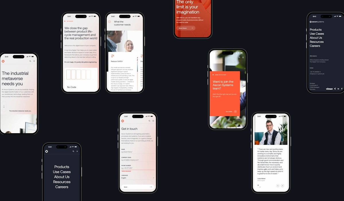
[Caption — e.g. Final onboarding flow, V3 · Figma / [Tool]]
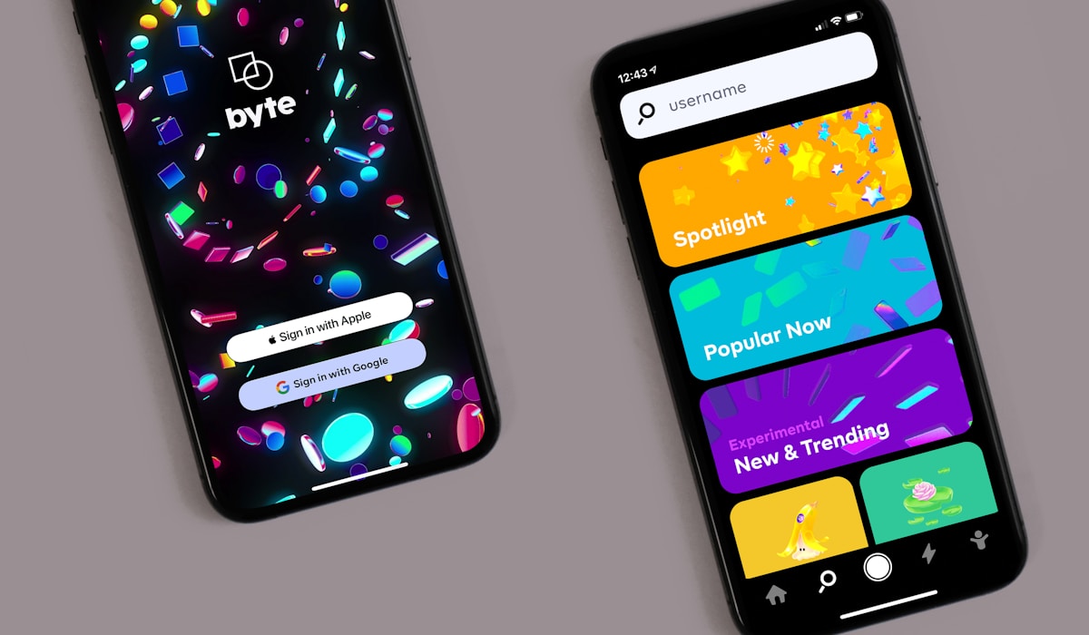
[Screen caption 1]
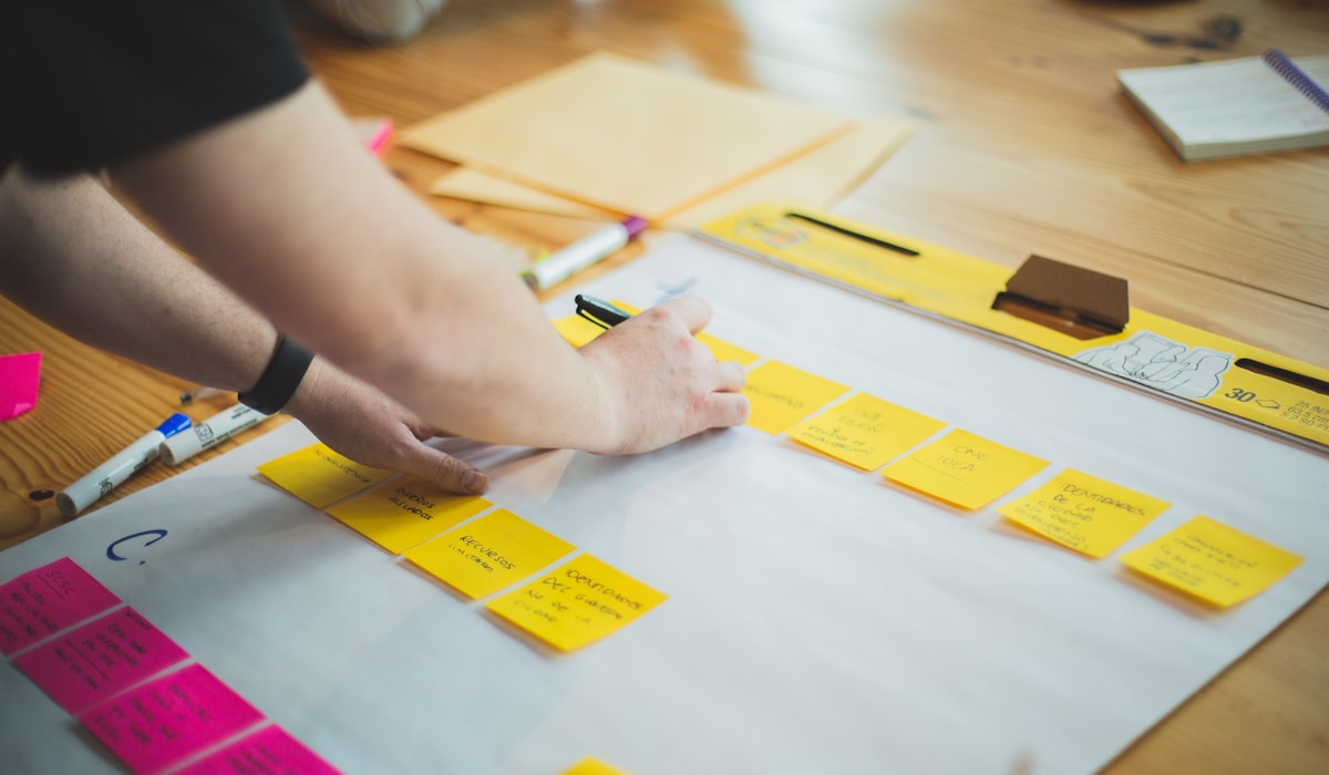
[Screen caption 2]
[Screen caption 3]
[Continue adding screens — annotate any that need explanation. If you have a prototype, embed it with a Figma prototype link below.]
INTERACTIVE PROTOTYPE
[Embed your Figma prototype here using an iframe, or add a button that links out to the prototype]
10 — OUTCOMES & IMPACT
What changed after we shipped
[Add context here — when was it shipped? What was the rollout? How did you measure success?]
[Metric — e.g. +34%]
[What it measures — e.g. Checkout conversion rate]
[Metric — e.g. −28%]
[What it measures — e.g. Time to complete onboarding]
[Metric — e.g. 4.8★]
[What it measures — e.g. App Store rating at launch]
[Metric — e.g. 0 →]
[What it measures — e.g. Critical accessibility issues post-audit]
"[Add a client or stakeholder quote about the outcome here — a direct quote is far more persuasive than a metric alone.]"
— [Name, Role, Company]
11 — LEARNINGS & RETROSPECTIVE
[The retrospective section separates strong case studies from average ones. Be honest — what went wrong, what surprised you, what would you fight harder for next time?]
1
[What would you do differently? e.g. We started designing before the research was complete — future projects need a clear research gate before Figma opens.]
2
[What surprised you? e.g. Users were far more tolerant of loading states when given a content preview — we underestimated the value of skeleton screens.]
3
[What would you push harder on? e.g. I would have pushed for a second round of usability testing before the final handoff — we caught issues in QA that testing would have surfaced earlier.]
12 — NEXT STEPS
[What comes after V1? What did you descope that you'd want to revisit? This shows strategic thinking — that you understand a product is never finished, only evolving.]
01
[Next step 01 — e.g. A/B test the new onboarding flow against the control to validate the retention improvement]
02
[Next step 02 — e.g. Design the notifications system, which was descoped from V1]
03
[Next step 03 — e.g. Run a full accessibility audit on the design system components]
NEXT PROJECT →
Tregadevs ED
WORK TOGETHER
Liked what you saw?
Open to collaborations, offers, and contracts.
GET IN TOUCH
Kristen Becker
© 2026 Kristen Becker. All rights reserved.
Product Designer · Product Owner · UX UI DEsigner
Kristen Becker
DIGITAL DESIGN, WITH A GLOBAL POINT OF VIEW.
Product. Experience. Identity.
A multidisciplinary approach to design, blending UX strategy, interface design, visual systems, and creative direction to turn complex ideas into compelling digital experiences.
MY RECENT PROJECTS
GET IN TOUCH →
CLIENT
Wish2Wear
ROLE
CPO · Head of Product Design
DURATION
Ongoing
DELIVERABLES
iOS App · Website · Admin Panel · Product Leadership
01 — OVERVIEW
[Project tagline — one sentence that captures what this project was about]
[Write a 2–3 sentence summary of the project here. What was the product, who was it for, and what was your role? This is the first thing a reader sees — make it clear and compelling.]
02 — THE PROBLEM
What needed to change — and why
[Describe the core problem or challenge this project was solving. What was broken, missing, or underserved? Why did it matter to the business and to users? Be specific — vague problems produce vague solutions.]
PROBLEM STATEMENT
"[Write your refined problem statement here. e.g. 'How might we help first-time users understand the value of the product within 60 seconds, before they decide to leave?']"
03 — GOALS & SUCCESS METRICS
01
[Primary goal — e.g. Reduce checkout drop-off by improving the payment flow]
02
[Secondary goal — e.g. Establish a consistent visual language across all platforms]
03
[Research goal — e.g. Understand why users abandon the onboarding sequence]
04
[Business goal — e.g. Increase trial-to-paid conversion within 30 days]
PRODUCT PILLARS
As an ex-manager dev at Riot, my client Sinan (Sean) taught me a lot about gamification, and general game design. One of the things he taught me was something known as design pillars. In game design, you choose a number, usually 4 to 6, main points or pillars every aspect of your game would revolve around. It could be a combat style, a story focus point, or anything else of relevance. This ensures that all departments and teams across a game development company strives to adhere to teh same feel or function. He then worked with me to recreate this, but in product design instead. Here are the product pillars we landed on
Weekly Momentum
Every week feels winnable and moves forward — always progressing.
One-Tap Execution
Do the work where you planned it, with a single simple action.
Realistic Planning
Plans should match actual capacity — not aspirational fantasy.
Adaptive Pacing
The system adapts to your rhythm without bossing you. A coach, not a sergeant.
Smooth Capture
Convert messy inputs and ideas into plan-ready items fast and frictionlessly.
Simple Insight
Feel progress without being overwhelmed by dashboards. Deep dives are optional.
04 — RESEARCH
Before redesigning Chronio, I wanted to understand the problem beyond the existing product. I produced a series of research reports covering the time-tracking market, competitors, user behaviour, motivations, adoption patterns, and underserved user groups, then synthesised those findings into personas and product opportunities. The research ultimately helped define Chronio as a personal productivity tool rather than a B2B time-tracking system.
USER INTERVIEWS
[How many participants? What were you trying to learn? What were the key themes that emerged?]
COMPETITIVE ANALYSIS
[Which competitors did you analyse? What patterns did you find across the landscape? What gaps did you identify?]
USABILITY TESTING
[What did you test, on what fidelity? What tasks did users complete? What failed?]
SURVEY / ANALYTICS
[What quantitative data did you gather? What did the numbers tell you that interviews couldn't?]
Key insights
1
[Key insight 01 — e.g. Users didn't understand the pricing model until the fourth screen — by then, 60% had already left]
2
[Key insight 02 — e.g. The primary CTA was competing visually with three secondary actions on the same level]
3
[Key insight 03 — e.g. Users trusted the product more when they saw social proof before being asked to sign up]
RESEARCH AT A GLANCE
[#]
[Metric — e.g. Users interviewed]
[e.g. Qualitative]
[#]
[Metric — e.g. Users interviewed]
[e.g. Qualitative]
[#]
[Metric — e.g. Users interviewed]
[e.g. Qualitative]
[#]
[Metric — e.g. Users interviewed]
[e.g. Qualitative]
05 — USER PERSONAS
PERSONA 01
[Persona Name — e.g. Sarah, 28]
[Job / archetype — e.g. First-time app user, non-technical]
CORE NEED
[Core need — e.g. Wants to complete the task quickly without reading instructions]
FRUSTRATION
[Core frustration — e.g. Confused by jargon and too many options at once]
PERSONA 02
[Persona Name — e.g. Marcus, 35]
[Job / archetype — e.g. Power user, returns weekly]
CORE NEED
[Core need — e.g. Wants shortcuts and customisation for efficiency]
FRUSTRATION
[Core frustration — e.g. Forced through onboarding he doesn't need every session]
[Add as many personas as are relevant — typically 2–4. Each should be grounded in your research, not invented. Include a photo if you have one.]
06 — DESIGN PROCESS
How I moved from problem to solution
01
Discover
[What did you do in the discovery phase? e.g. Stakeholder workshops, existing-product audit, user interviews, analytics review. What were you trying to understand?]
02
Define
[How did you synthesise your research? e.g. Affinity mapping, journey mapping, problem statement refinement, Jobs-to-be-Done framework. What was the "how might we" framing?]
03
Ideate
[How did you explore solutions? e.g. Sketching, design studio workshops, feature prioritisation, Crazy 8s. How many directions did you explore before narrowing down?]
04
Prototype
[What fidelity did you prototype at, and why? e.g. Lo-fi paper sketches → mid-fi Figma flows → hi-fi interactive prototype. What were you trying to validate at each stage?]
05
Test
[How did you test your designs? e.g. Moderated usability testing with 6 participants, unmoderated Maze tests, A/B testing in production. What changed after testing?]
06
Deliver
[How did you hand off to engineering? e.g. Annotated Figma specs, component library, design tokens, developer Q&A sessions, QA reviews during build.]
07 — WIREFRAMES & IA
[Describe your information architecture and early wireframe decisions. What were the main user flows? How did the IA evolve from your first sketches to the final structure? What were you trying to validate at the wireframe stage?]
[Caption — e.g. Lo-fi wireframes, Round 1]
[Caption — e.g. User flow mapping, Week 2]
[Add more wireframe or IA images here. You can embed Figma frames using an embed link, or export and upload screenshots.]
08 — KEY DESIGN DECISIONS
[This is one of the most valuable sections of a case study. Explain the specific decisions you made and — more importantly — why. Recruiters and clients want to understand your thinking, not just see the output.]
[Design Decision 01 — e.g. Why we chose a bottom navigation over a hamburger menu]
[Explain the reasoning. What were the alternatives you considered? What evidence or principle guided the decision? What was the tradeoff you accepted?]
[Insert image, screen recording, or before/after comparison here]
[Design Decision 02 — e.g. Why we introduced a progress indicator at step 2, not step 1]
[Explain the reasoning. What were the alternatives you considered? What evidence or principle guided the decision? What was the tradeoff you accepted?]
[Insert image, screen recording, or before/after comparison here]
[Design Decision 03 — e.g. Why we used inline validation instead of an error summary]
[Explain the reasoning. What were the alternatives you considered? What evidence or principle guided the decision? What was the tradeoff you accepted?]
[Insert image, screen recording, or before/after comparison here]
09 — FINAL DESIGNS
[Walk through the final design screens here. Don't just show screenshots — narrate each one. What does the user see? What can they do? What makes this screen successful?]
[Caption — e.g. Final onboarding flow, V3 · Figma / [Tool]]
[Screen caption 1]
[Screen caption 2]
[Screen caption 3]
[Continue adding screens — annotate any that need explanation. If you have a prototype, embed it with a Figma prototype link below.]
INTERACTIVE PROTOTYPE
[Embed your Figma prototype here using an iframe, or add a button that links out to the prototype]
10 — OUTCOMES & IMPACT
What changed after we shipped
[Add context here — when was it shipped? What was the rollout? How did you measure success?]
[Metric — e.g. +34%]
[What it measures — e.g. Checkout conversion rate]
[Metric — e.g. −28%]
[What it measures — e.g. Time to complete onboarding]
[Metric — e.g. 4.8★]
[What it measures — e.g. App Store rating at launch]
[Metric — e.g. 0 →]
[What it measures — e.g. Critical accessibility issues post-audit]
"[Add a client or stakeholder quote about the outcome here — a direct quote is far more persuasive than a metric alone.]"
— [Name, Role, Company]
11 — LEARNINGS & RETROSPECTIVE
[The retrospective section separates strong case studies from average ones. Be honest — what went wrong, what surprised you, what would you fight harder for next time?]
1
[What would you do differently? e.g. We started designing before the research was complete — future projects need a clear research gate before Figma opens.]
2
[What surprised you? e.g. Users were far more tolerant of loading states when given a content preview — we underestimated the value of skeleton screens.]
3
[What would you push harder on? e.g. I would have pushed for a second round of usability testing before the final handoff — we caught issues in QA that testing would have surfaced earlier.]
12 — NEXT STEPS
[What comes after V1? What did you descope that you'd want to revisit? This shows strategic thinking — that you understand a product is never finished, only evolving.]
01
[Next step 01 — e.g. A/B test the new onboarding flow against the control to validate the retention improvement]
02
[Next step 02 — e.g. Design the notifications system, which was descoped from V1]
03
[Next step 03 — e.g. Run a full accessibility audit on the design system components]
NEXT PROJECT →
Tregadevs ED
WORK TOGETHER
Liked what you saw?
Open to collaborations, offers, and contracts.
GET IN TOUCH
Kristen Becker
© 2026 Kristen Becker. All rights reserved.
Product Designer · Product Owner · UX UI DEsigner
Kristen Becker
DIGITAL DESIGN, WITH A GLOBAL POINT OF VIEW.
Product. Experience. Identity.
A multidisciplinary approach to design, blending UX strategy, interface design, visual systems, and creative direction to turn complex ideas into compelling digital experiences.
MY RECENT PROJECTS
GET IN TOUCH →
CLIENT
Wish2Wear
ROLE
CPO · Head of Product Design
DURATION
Ongoing
DELIVERABLES
iOS App · Website · Admin Panel · Product Leadership
01 — OVERVIEW
[Project tagline — one sentence that captures what this project was about]
[Write a 2–3 sentence summary of the project here. What was the product, who was it for, and what was your role? This is the first thing a reader sees — make it clear and compelling.]
02 — THE PROBLEM
What needed to change — and why
[Describe the core problem or challenge this project was solving. What was broken, missing, or underserved? Why did it matter to the business and to users? Be specific — vague problems produce vague solutions.]
PROBLEM STATEMENT
"[Write your refined problem statement here. e.g. 'How might we help first-time users understand the value of the product within 60 seconds, before they decide to leave?']"
03 — GOALS & SUCCESS METRICS
01
[Primary goal — e.g. Reduce checkout drop-off by improving the payment flow]
02
[Secondary goal — e.g. Establish a consistent visual language across all platforms]
03
[Research goal — e.g. Understand why users abandon the onboarding sequence]
04
[Business goal — e.g. Increase trial-to-paid conversion within 30 days]
PRODUCT PILLARS
As an ex-manager dev at Riot, my client Sinan (Sean) taught me a lot about gamification, and general game design. One of the things he taught me was something known as design pillars. In game design, you choose a number, usually 4 to 6, main points or pillars every aspect of your game would revolve around. It could be a combat style, a story focus point, or anything else of relevance. This ensures that all departments and teams across a game development company strives to adhere to teh same feel or function. He then worked with me to recreate this, but in product design instead. Here are the product pillars we landed on
Weekly Momentum
Every week feels winnable and moves forward — always progressing.
One-Tap Execution
Do the work where you planned it, with a single simple action.
Realistic Planning
Plans should match actual capacity — not aspirational fantasy.
Adaptive Pacing
The system adapts to your rhythm without bossing you. A coach, not a sergeant.
Smooth Capture
Convert messy inputs and ideas into plan-ready items fast and frictionlessly.
Simple Insight
Feel progress without being overwhelmed by dashboards. Deep dives are optional.
04 — RESEARCH
Before redesigning Chronio, I wanted to understand the problem beyond the existing product. I produced a series of research reports covering the time-tracking market, competitors, user behaviour, motivations, adoption patterns, and underserved user groups, then synthesised those findings into personas and product opportunities. The research ultimately helped define Chronio as a personal productivity tool rather than a B2B time-tracking system.
USER INTERVIEWS
[How many participants? What were you trying to learn? What were the key themes that emerged?]
COMPETITIVE ANALYSIS
[Which competitors did you analyse? What patterns did you find across the landscape? What gaps did you identify?]
USABILITY TESTING
[What did you test, on what fidelity? What tasks did users complete? What failed?]
SURVEY / ANALYTICS
[What quantitative data did you gather? What did the numbers tell you that interviews couldn't?]
Key insights
1
[Key insight 01 — e.g. Users didn't understand the pricing model until the fourth screen — by then, 60% had already left]
2
[Key insight 02 — e.g. The primary CTA was competing visually with three secondary actions on the same level]
3
[Key insight 03 — e.g. Users trusted the product more when they saw social proof before being asked to sign up]
RESEARCH AT A GLANCE
[#]
[Metric — e.g. Users interviewed]
[e.g. Qualitative]
[#]
[Metric — e.g. Users interviewed]
[e.g. Qualitative]
[#]
[Metric — e.g. Users interviewed]
[e.g. Qualitative]
[#]
[Metric — e.g. Users interviewed]
[e.g. Qualitative]
05 — USER PERSONAS
PERSONA 01
[Persona Name — e.g. Sarah, 28]
[Job / archetype — e.g. First-time app user, non-technical]
CORE NEED
[Core need — e.g. Wants to complete the task quickly without reading instructions]
FRUSTRATION
[Core frustration — e.g. Confused by jargon and too many options at once]
PERSONA 02
[Persona Name — e.g. Marcus, 35]
[Job / archetype — e.g. Power user, returns weekly]
CORE NEED
[Core need — e.g. Wants shortcuts and customisation for efficiency]
FRUSTRATION
[Core frustration — e.g. Forced through onboarding he doesn't need every session]
[Add as many personas as are relevant — typically 2–4. Each should be grounded in your research, not invented. Include a photo if you have one.]
06 — DESIGN PROCESS
How I moved from problem to solution
01
Discover
[What did you do in the discovery phase? e.g. Stakeholder workshops, existing-product audit, user interviews, analytics review. What were you trying to understand?]
02
Define
[How did you synthesise your research? e.g. Affinity mapping, journey mapping, problem statement refinement, Jobs-to-be-Done framework. What was the "how might we" framing?]
03
Ideate
[How did you explore solutions? e.g. Sketching, design studio workshops, feature prioritisation, Crazy 8s. How many directions did you explore before narrowing down?]
04
Prototype
[What fidelity did you prototype at, and why? e.g. Lo-fi paper sketches → mid-fi Figma flows → hi-fi interactive prototype. What were you trying to validate at each stage?]
05
Test
[How did you test your designs? e.g. Moderated usability testing with 6 participants, unmoderated Maze tests, A/B testing in production. What changed after testing?]
06
Deliver
[How did you hand off to engineering? e.g. Annotated Figma specs, component library, design tokens, developer Q&A sessions, QA reviews during build.]
07 — WIREFRAMES & IA
[Describe your information architecture and early wireframe decisions. What were the main user flows? How did the IA evolve from your first sketches to the final structure? What were you trying to validate at the wireframe stage?]
[Caption — e.g. Lo-fi wireframes, Round 1]
[Caption — e.g. User flow mapping, Week 2]
[Add more wireframe or IA images here. You can embed Figma frames using an embed link, or export and upload screenshots.]
08 — KEY DESIGN DECISIONS
[This is one of the most valuable sections of a case study. Explain the specific decisions you made and — more importantly — why. Recruiters and clients want to understand your thinking, not just see the output.]
[Design Decision 01 — e.g. Why we chose a bottom navigation over a hamburger menu]
[Explain the reasoning. What were the alternatives you considered? What evidence or principle guided the decision? What was the tradeoff you accepted?]
[Insert image, screen recording, or before/after comparison here]
[Design Decision 02 — e.g. Why we introduced a progress indicator at step 2, not step 1]
[Explain the reasoning. What were the alternatives you considered? What evidence or principle guided the decision? What was the tradeoff you accepted?]
[Insert image, screen recording, or before/after comparison here]
[Design Decision 03 — e.g. Why we used inline validation instead of an error summary]
[Explain the reasoning. What were the alternatives you considered? What evidence or principle guided the decision? What was the tradeoff you accepted?]
[Insert image, screen recording, or before/after comparison here]
09 — FINAL DESIGNS
[Walk through the final design screens here. Don't just show screenshots — narrate each one. What does the user see? What can they do? What makes this screen successful?]
[Caption — e.g. Final onboarding flow, V3 · Figma / [Tool]]
[Screen caption 1]
[Screen caption 2]
[Screen caption 3]
[Continue adding screens — annotate any that need explanation. If you have a prototype, embed it with a Figma prototype link below.]
INTERACTIVE PROTOTYPE
[Embed your Figma prototype here using an iframe, or add a button that links out to the prototype]
10 — OUTCOMES & IMPACT
What changed after we shipped
[Add context here — when was it shipped? What was the rollout? How did you measure success?]
[Metric — e.g. +34%]
[What it measures — e.g. Checkout conversion rate]
[Metric — e.g. −28%]
[What it measures — e.g. Time to complete onboarding]
[Metric — e.g. 4.8★]
[What it measures — e.g. App Store rating at launch]
[Metric — e.g. 0 →]
[What it measures — e.g. Critical accessibility issues post-audit]
"[Add a client or stakeholder quote about the outcome here — a direct quote is far more persuasive than a metric alone.]"
— [Name, Role, Company]
11 — LEARNINGS & RETROSPECTIVE
[The retrospective section separates strong case studies from average ones. Be honest — what went wrong, what surprised you, what would you fight harder for next time?]
1
[What would you do differently? e.g. We started designing before the research was complete — future projects need a clear research gate before Figma opens.]
2
[What surprised you? e.g. Users were far more tolerant of loading states when given a content preview — we underestimated the value of skeleton screens.]
3
[What would you push harder on? e.g. I would have pushed for a second round of usability testing before the final handoff — we caught issues in QA that testing would have surfaced earlier.]
12 — NEXT STEPS
[What comes after V1? What did you descope that you'd want to revisit? This shows strategic thinking — that you understand a product is never finished, only evolving.]
01
[Next step 01 — e.g. A/B test the new onboarding flow against the control to validate the retention improvement]
02
[Next step 02 — e.g. Design the notifications system, which was descoped from V1]
03
[Next step 03 — e.g. Run a full accessibility audit on the design system components]
NEXT PROJECT →
Tregadevs ED
WORK TOGETHER
Liked what you saw?
Open to collaborations, offers, and contracts.
GET IN TOUCH
Kristen Becker
© 2026 Kristen Becker. All rights reserved.