KRISTEN BECKER
Projects
Contact
Chronio
CLIENT
Sean C.
ROLE
Sole Product and UX Designer
DURATION
6 Months
DELIVERABLES
Complete UX Rework, Brand reword, and UI guidance
01 — OVERVIEW
A smarter time-tracking platform designed to turn everyday habits into actionable productivity insights.
Chronio is a productivity and time-management platform that helps users understand where their time goes, build better habits, and stay on track. I worked across the product experience and branding, designing features including productivity scoring, action plans, AI-powered planning and coaching, and an adaptive timer.
02 — DESIGN PROCESS
How I moved from problem to solution
01
Research
I began by understanding the people Chronio could serve, their behaviours, motivations, frustrations and relationship with productivity. This research became the foundation for the personas and every decision that followed.
02
Personas
I translated the research into three priority personas, each representing a distinct relationship with time, productivity and tracking. Rather than designing for a generic “productivity user,” these personas gave the project specific needs, behaviours and frustrations to design around.
03
User Journeys
With the personas established, I mapped how they currently experience productivity in the real world, before Chronio even enters the picture. I explored everyday routines and competitor experiences, documenting actions, emotions and pain points to uncover opportunities for a new product.
04
Feature map
I translated those pain points into opportunities and potential features, then organised them into functional categories and MVP levels. This created a clear product structure and helped simplify Chronio's mental model before moving into the interface.
05
Wireframing
I brought the feature map into the product, translating the new structure into low-fidelity wireframes across Chronio's core experiences. The focus was on hierarchy, navigation, interaction logic and reducing unnecessary complexity before introducing visual design.
06
Brand Design
Once the underlying experience was established, I developed Chronio's visual identity and design language. The goal was to move the product away from its original spreadsheet-like appearance and create something more approachable, modern and aligned with the new user-focused direction.
07
User Testing
With the redesigned experience and visual direction in place, I put Chronio in front of users to see whether the decisions made throughout the process actually worked. Testing helped identify remaining points of confusion, validate the new experience and refine the product before moving forward.
08
Final Touches
The final stage was about refining the experience based on everything uncovered throughout the process. I addressed remaining usability issues, polished interactions and visual details, and made the final adjustments needed to bring the product together as a cohesive experience.
Research gave us the evidence. Personas gave us the users. Emotional journeys gave us the problems. Feature mapping gave us the product direction. Wireframes gave it structure. Brand gave it personality. Testing showed us what still needed to change. Final touches brought it all together.
03 — THE PROBLEM
What needed to change — and why
Chronio started as a personal tool built by an experienced developer to help him understand and manage his time. Because he had designed and built the system himself, its logic came naturally to him. But when he showed it to other people, the response was consistent: they simply couldn’t figure out how to use it.
The problem wasn’t that Chronio lacked functionality, it was that the product was built around the creator’s mental model rather than the user’s. Its spreadsheet-like interface made an already complex system feel even harder to approach.
I was brought in to bridge that gap: simplify the experience, make the product feel intuitive to people who didn’t build it, make it look better, and identify opportunities to make Chronio more useful as a product.
PROBLEM STATEMENT
How might we transform a technically powerful tool built around an engineer’s mental model into a simple, intuitive productivity experience that anyone can understand and use?
04 — Goals & Product Pillars
Everything Chronio is structured around
01
Make Chronio intuitive
Redesign the experience so users can understand what to do without needing an explanation from the creator. Replace the engineer-first mental model with a user-first one.
02
Move away from the “Excel spreadsheet” feel
Create a modern, approachable interface that feels like a productivity product rather than a data-management tool.
03
Simplify time tracking
Make starting, stopping and categorising time effortless. Reduce the amount of thinking required to use the core functionality.
04
Make data meaningful
Turn raw time-tracking data into insights users can actually understand and act on. Make productivity patterns and trends easier to interpret.
05
Identify opportunities beyond the original feature set
Look at what users actually need from a time-management platform and introduce features that add meaningful value, rather than simply adding functionality for the sake of it.
PRODUCT PILLARS
As an ex-manager dev at Riot, my client Sinan (Sean) taught me a lot about gamification, and general game design. One of the things he taught me was something known as design pillars. In game design, you choose a number, usually 4 to 6, main points or pillars every aspect of your game would revolve around. It could be a combat style, a story focus point, or anything else of relevance. This ensures that all departments and teams across a game development company strives to adhere to the same feel or function. He then worked with me to recreate this, but in product design instead. Here are the product pillars we landed on
Weekly Momentum
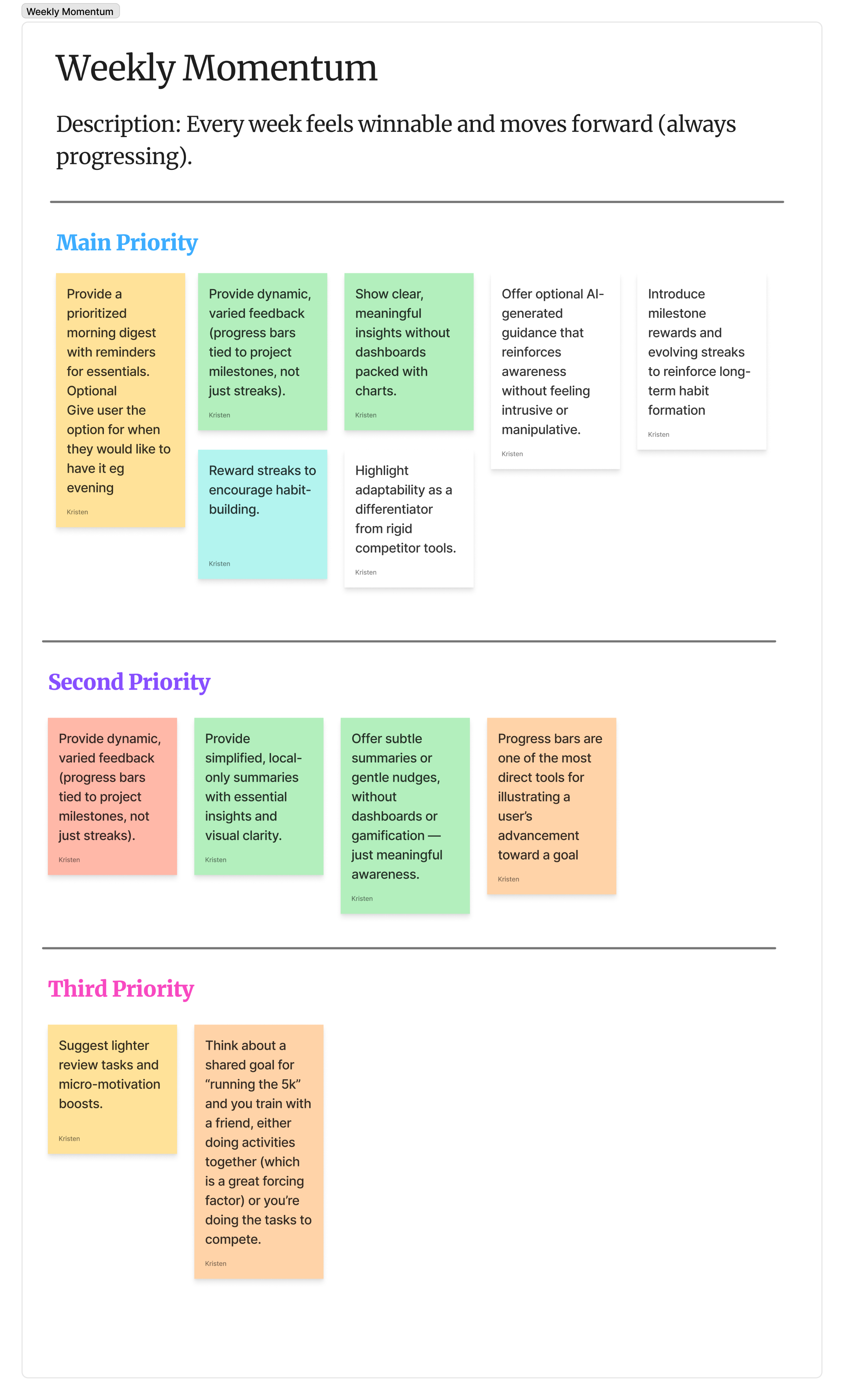
Every week feels winnable and moves forward, always progressing.
One-Tap Execution
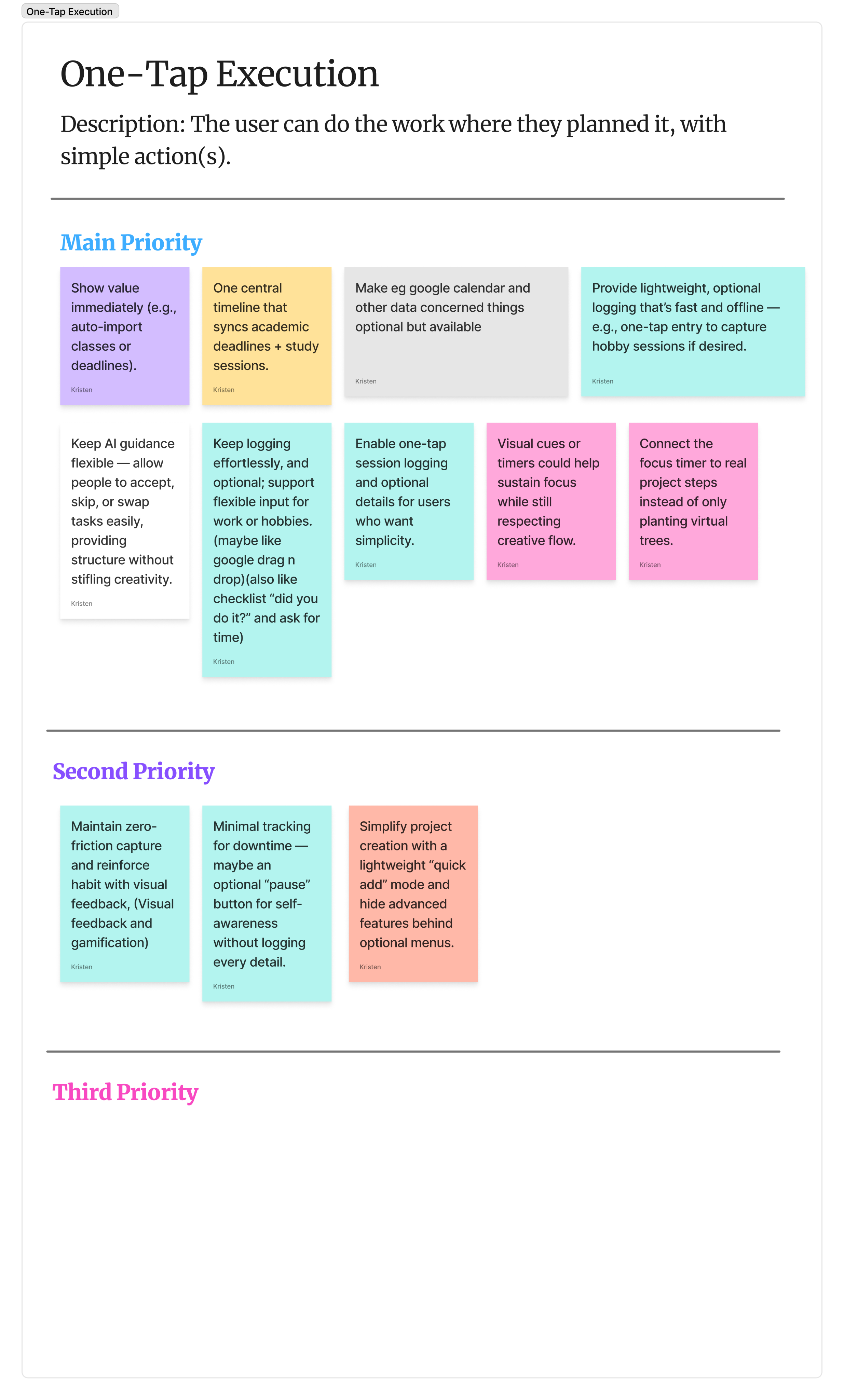
Do the work where you planned it, with a single simple action.
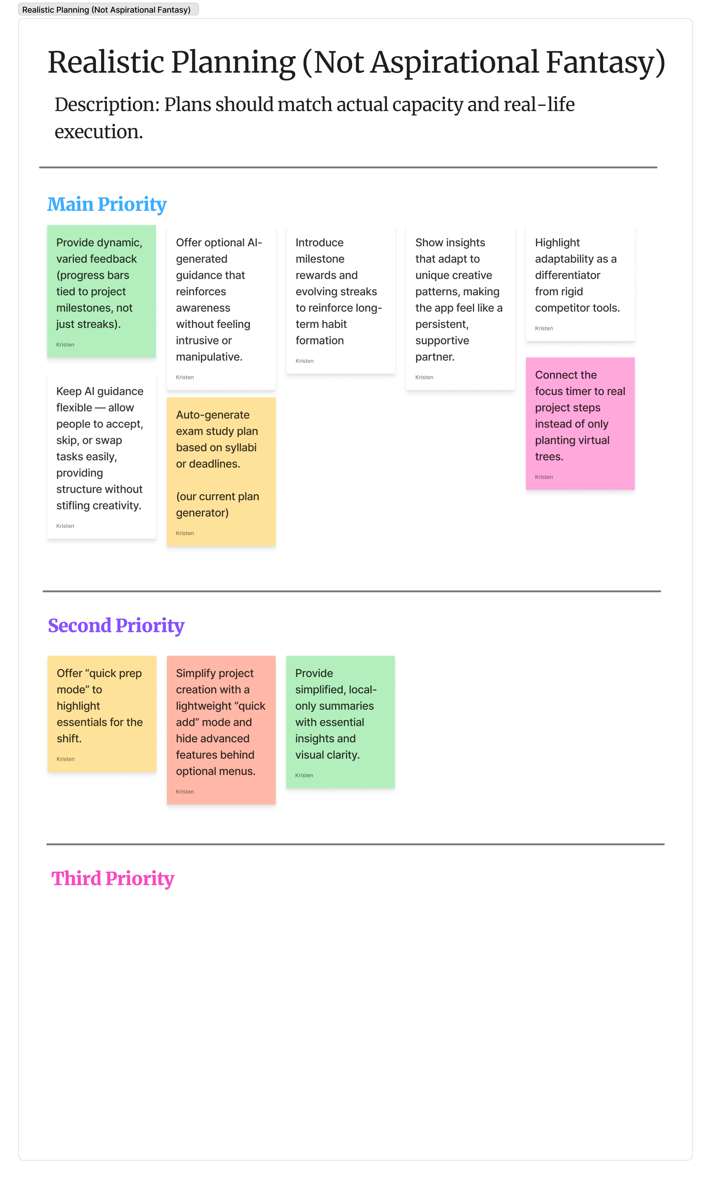
Realistic Planning
Plans should match actual capacity — not aspirational fantasy.
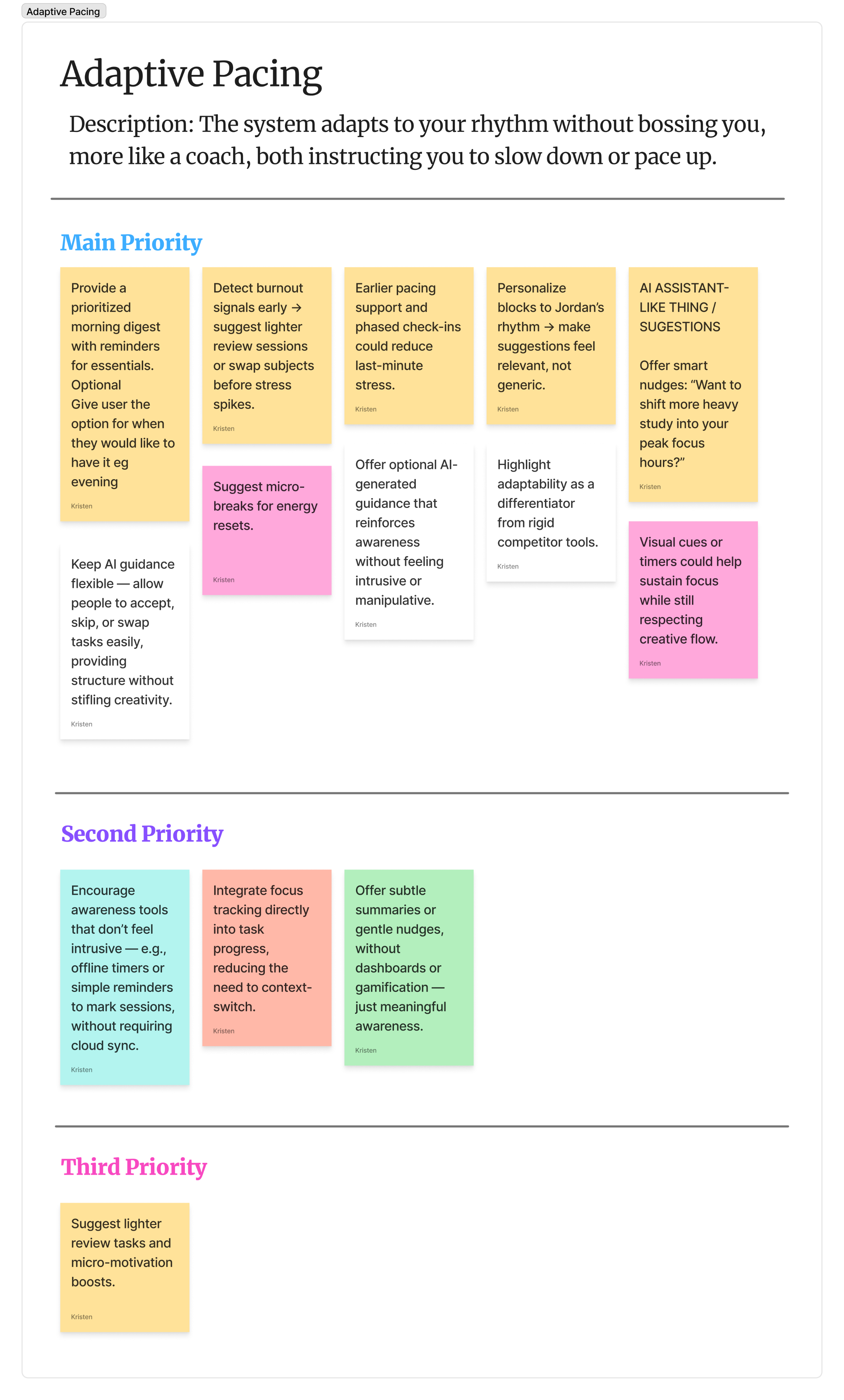
Adaptive Pacing
The system adapts to your rhythm without bossing you. A coach, not a sergeant.
Smooth Capture
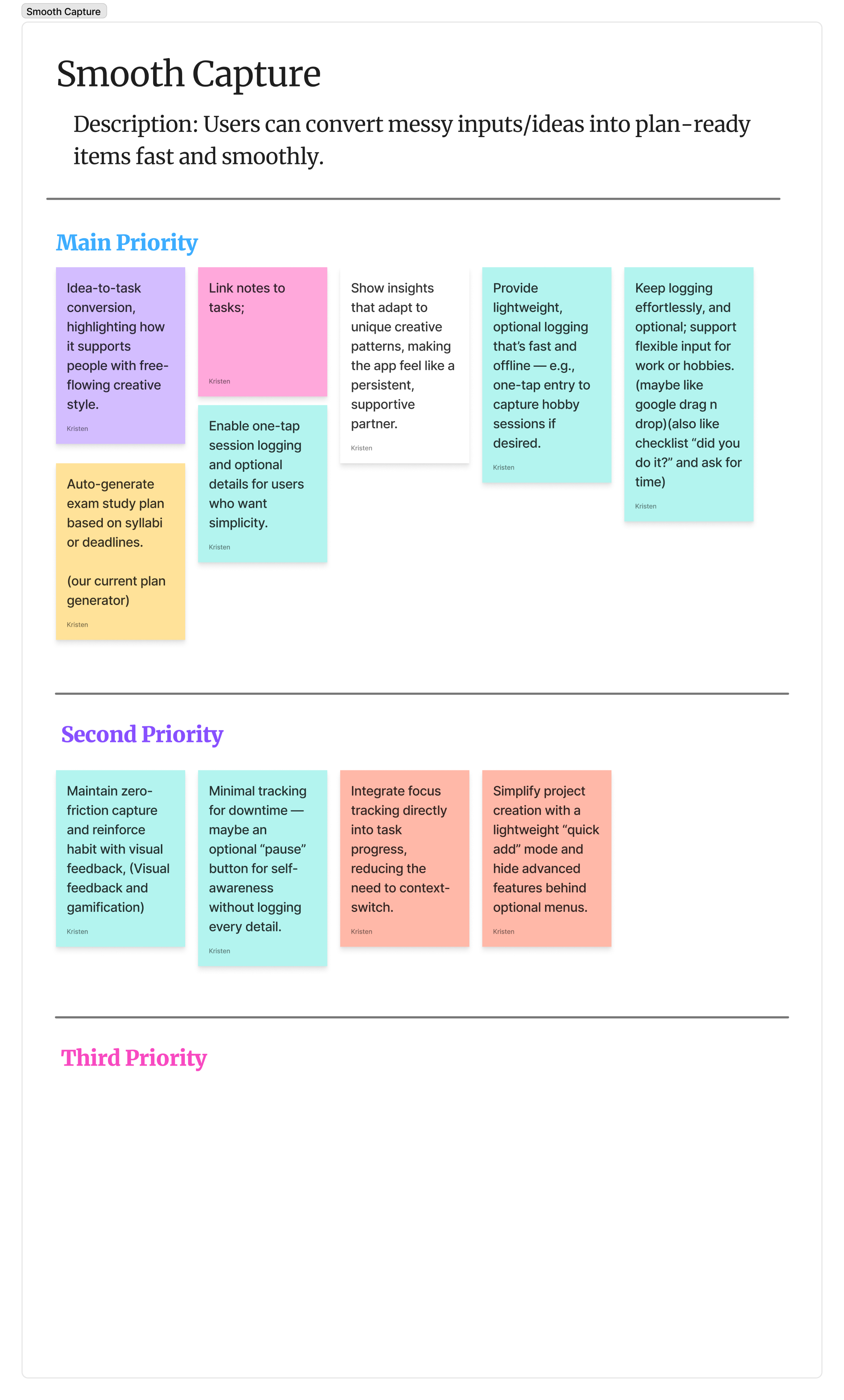
Convert messy inputs and ideas into plan-ready items fast and frictionlessly.
05 — RESEARCH
Research at a glance
Before redesigning Chronio, I wanted to understand the problem beyond the existing product. I produced a series of research reports covering the time-tracking market, competitors, user behaviour, motivations, adoption patterns, and underserved user groups, then synthesised those findings into personas and product opportunities. The research ultimately helped define Chronio as a personal productivity tool rather than a B2B time-tracking system.
What I researched
Market & trends
I looked at how time-tracking and productivity tools are evolving, including AI-powered automation, deeper analytics, integrations, mobile-first experiences and the growing focus on wellbeing.
Competitors
I analysed products including Clockify, Toggl, RescueTime, Harvest and Habitica, looking beyond their feature sets at what users praised, what frustrated them, and where existing products were falling short.
User behaviour
& psychology
A key finding was that complexity itself can become a productivity problem. Users often abandon tools because of cognitive overload, excessive setup and maintenance, while visible progress, meaningful feedback and personalisation can encourage continued use.
User archetypes
I explored different reasons people track their time and identified underserved groups including casual trackers, hobbyists, privacy-conscious users and neurodivergent users. Their needs varied significantly — from ultra-low-friction tracking to visual structure, flexible planning and meaningful personal milestones.
What it revealed
One of the most important findings was that the market was already well-served by tools built around professional time tracking, billing and reporting — but there was an opportunity in personal time awareness and productivity. The research showed that personal users are motivated less by accountability and billing, and more by self-awareness, efficiency, goals and habit formation.
It also highlighted a clear tension in the market: simple tools often lacked meaningful insight, while powerful tools could become overwhelming. This created an opportunity for Chronio to sit somewhere in between — giving users useful depth without making them learn a complicated system.
The research also pointed toward opportunities in AI-assisted planning, personalised recommendations, visual progress, adaptive experiences and actionable analytics — areas that could help Chronio move beyond simply recording time and instead help users understand and improve how they spend it.
RESEARCH AT A GLANCE
71
Pages of research reports and findings
52
Authentic sources used and cited
18
Pre-defined research questions answered
5
user archytypes
5
Competetors analyzed
5
Market trends evaluated
5+
Core opportunities identified
3
user archytypes
Key insights
1
Time tracking was already a crowded market
The market was heavily focused on freelancers, businesses and professional teams, particularly around billing, reporting, payroll, project management and accountability. This suggested that simply building another conventional time-tracking tool would be difficult to differentiate.
2
There was an opportunity in personal time awareness
The research pointed toward a different opportunity: individual users who want to understand and improve how they spend their time, rather than companies wanting to monitor employees or manage billable hours. This ultimately influenced the decision to position Chronio around personal productivity rather than B2B time tracking.
3
More functionality doesn't necessarily mean a better product
A recurring issue across the market was the tension between simple tools that provide little insight and powerful tools that become overwhelming. Complexity, excessive setup and constant manual maintenance can become reasons for users to abandon productivity tools.
This directly reinforced the need to make Chronio powerful without making users understand the system behind it.
4
Users don't just want to record time; they want to understand it
Raw time logs have limited value on their own. The research identified a stronger opportunity around turning tracked time into meaningful insights, such as productivity patterns, focus periods, wasted time and areas for improvement.
5
Different users have fundamentally different relationships with time
The research identified five distinct archetypes, including freelancers, corporate knowledge workers, students, neurodivergent users, and privacy-focused/casual trackers. Their motivations and definitions of success were significantly different.
This helped establish that Chronio couldn't rely on a single assumption about what "productivity" means.
6
Low friction was critical
For users who track time casually or inconsistently, tracking needs to feel quick, lightweight and optional. If tracking itself becomes another task to manage, users are likely to disengage.
7
Motivation matters because tracking requires commitment
Unlike many productivity tools, time tracking asks users to continually record their behaviour. The research identified visual feedback, progress, rewards and gamification as potential ways to make that commitment feel worthwhile rather than burdensome.
8
I could make time tracking proactive
AI and automation emerged as a major market direction, with opportunities around automatic logging, predicting task durations, identifying inefficiencies and generating personalised recommendations.
9
The future opportunity was adaptive productivity
The research identified a broader movement toward personalisation, wellness, adaptive scheduling, deeper analytics and AI-assisted productivity.
That became an important foundation for features such as AI planning, adaptive experiences, productivity scoring and actionable recommendations rather than treating Chronio as a simple stopwatch.
The big Takeaway
The research showed that Chronio didn't need to compete by tracking more. It needed to make time tracking more meaningful , transforming complex data into simple, personalised guidance that helps individuals understand their time and actually do something with it.
06 — USER PERSONAS
Grounding the product in real human need
PERSONA 01
Jordan Reyes, 21
The committed Student and academic
"I need to feel in control of my time, not just count hours."
Goals
Meet academic deadlines without last-minute cramming
Identify peak focus windows
Balance coursework, part-time work, clubs
Frustrations
Procrastination trap, starts too late
Consistently underestimates task time
Tools feel rigid, novelty wears off fast
Behavior Pattern
Semi-structured. Builds plans then abandons them when life intervenes. Reactive.
Design Insight
Chronio can learn his rhythms and surface insights like "You're most focused 9–11am." Adaptive planning + gamified loops = habit formation.
PERSONA 02
Riley Morgan, 32
The Time-Blind Creative
"If the app feels like a chore, I'll stop. Simple as that."
Goals
Externalize time to stop losing hours
Brain-dump ideas without friction
Build routines that don't stifle creativity
Frustrations
Hard to initiate tasks without external triggers
Overly rigid tools feel suffocating
Under-stimulating trackers leads to abandonment
Behavior Pattern
Chaotic without support. Lives in bursts of energy. Thrives with cues and gamified feedback.
Design Insight
Animated timers, one-tap brain-dumps, and flexible AI blocks. Time externalization reduces anxiety, which is the core value for Riley.
PERSONA 03
Jennifer Anderson, 38
The Privacy-First Minimalist
"Tracking should feel light and private, not like being watched."
Goals
Awareness of time without intrusive monitoring
Track hobbies with minimal effort
Full data control, ideally local-only
Frustrations
Distrusts apps that store data externally
Feature bloat overwhelms her quickly
Resents manipulative gamification loops
Behavior Pattern
Informal, light-touch. Only tracks when it feels useful. Avoids constant-input demands.
Design Insight
Chronio must lead with privacy assurance. Optional offline mode + lightweight AI summaries without dashboards = her ideal tool.
The 3 core personas identified in the research phase
06 — Emotionl USER JOURNEYS
Understanding how situations break down in real life
Rather than starting with Chronio's existing features and asking how we could improve them, I deliberately approached the product as if Chronio didn't exist yet. The goal was to understand what was actually happening in people's lives , how they currently plan, work, procrastinate, track time, switch between tools, lose momentum and reflect on their productivity, and design from those experiences outward. Each emotional journey was built from the same research that informed the personas, mapping actions, emotions, pain points and moments of friction to uncover opportunities for new features and experiences. This allowed us to design a new productivity platform around real user needs, rather than simply redesigning the platform that already existed. This was then followed by a user journey with a competitor app, and then a user journey with our current platform. This creates a total of 9 user journeys, 3 per persona, from multiple perspectives, giving us a lot of insight on how to design our improved app.
Persona 1 - Jordan Reyes
User journey A
Managing a Study + Workday
Everyday life
Goals
Successfully get through a packed study + workday while staying organized and avoiding late-night stress.
01
MORNING PREP
Jordan wakes up, rushes through getting ready, checks calendar.
"I hope I didn't forget anything."
EMOTION
Medium stress, mild fatigue
Provide a prioritized morning digest with reminders for essentials.
02
CLASSES / LABS
Attends back-to-back classes, takes notes, and multitasks with tutoring messages.
"Too much info at once…"
EMOTION
High stress, high mental overload
Link notes to tasks; suggest micro-breaks for energy resets.
03
TUTORING SHIFT
Shifts into tutoring role, has limited time to get ready.
"Wish I had more prep time."
EMOTION
Medium confidence, medium stress
Offer "quick prep mode" to highlight essentials for the shift.
04
EVENING STUDY
Opens laptop, reviews tasks, procrastinates, then crams for deadlines.
"I can't focus anymore."
EMOTION
Low motivation, high frustration
Suggest lighter review tasks and micro-motivation boosts.
05
WIND DOWN
Scrolls on phone in bed, journaling occasionally, stress lingers.
"I didn't finish enough."
EMOTION
Medium stress, high fatigue
Provide an evening reflection ritual and auto-carryover for tasks.
Key Opportunities
Smarter, energy-aware scheduling.Morning prep digest + evening closure ritual.
Motivation boosts that break procrastination.
Tools to reduce context-switching fatigue.
User journey B
Competitor Apps During Exam Season
Competitor app
Goals
Stay consistent and organized during a 2-week exam period using fragmented tools.
01
CREATES EXAM PLAN IN NOTION
Jordan sets up a Notion table with subjects, topics, deadlines, and estimated hours.
"This setup is taking forever…"
EMOTION
High effort, low motivation
Auto-generate exam study plan based on syllabi or deadlines.
02
LOGS SESSIONS WITH POMODORO
Uses a Pomodoro timer app to structure study sessions (25–50 min blocks).
"I can focus for now, but this timer feels robotic."
EMOTION
Medium discipline, rising fatigue
Adaptive session timing (adjusted by focus level + energy).
03
CROSS-CHECKS IN GOOGLE CALENDAR
Switches to Calendar to confirm assignment due dates and exam times.
"Wait, did I double-book myself?"
EMOTION
Medium stress, high cognitive load from app-switching
One central timeline that syncs academic deadlines + study sessions.
04
ADJUSTS AFTER BURNOUT
After several days, Jordan burns out and skips Pomodoro sessions. Reworks Notion plan reactively.
"I'm behind again. Why do I even bother planning?"
EMOTION
High stress, low confidence
Detect burnout signals early - suggest lighter review sessions or swap subjects before stress spikes.
Key Opportunities
Centralized Exam Mode: A dedicated mode that combines plan, schedule, and execution.
Proactive Adjustments: AI that detects fatigue and shifts schedules dynamically.Progress Insights: Track productivity patterns to show "big picture" progress, not just isolated sessions.Ease of Setup: Auto-generate study plans to remove friction at the start.
User journey G
Planning & Tracking Sessions
Our Application
Goals
Adopt the app as the central place for managing study sessions and improving consistency over time.
01
OPENS APP (ONBOARDING)
Jordan signs up and sees a short guided flow introducing key features (study blocks, adaptive timer, insights).
"Okay, let's see if this is easier than my current setup."
EMOTION
Medium curiosity, slight hesitation
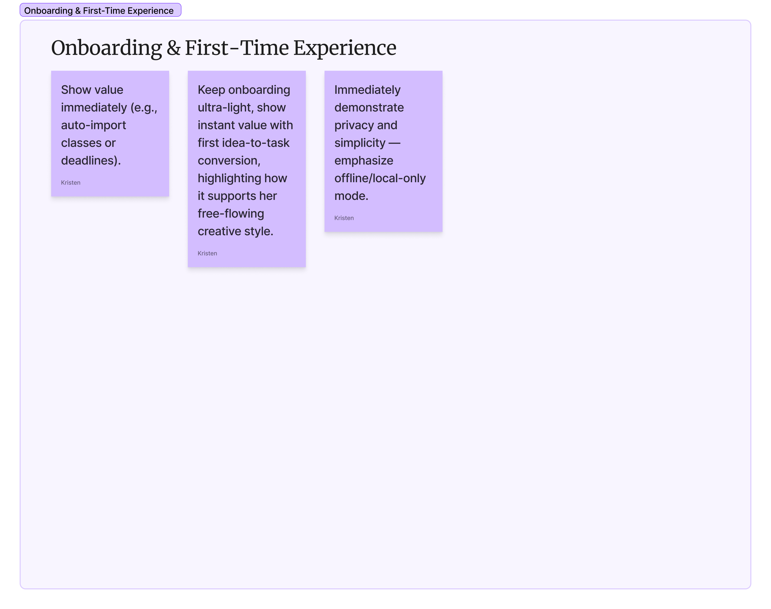
Show value immediately (e.g., auto-import classes or deadlines).
02
VIEWS SUGGESTED STUDY BLOCKS
The app suggests a plan based on classes, exams, and energy levels (morning vs. evening).
"This actually looks doable."
EMOTION
Motivation high, learning curve medium
Personalize blocks to Jordan's rhythm - make suggestions feel relevant, not generic.
03
STARTS ADAPTIVE TIMER
Jordan starts a focus session. Timer adapts based on focus level (shorter if distracted, longer if locked in).
"This feels less rigid than Pomodoro."
EMOTION
Focus medium-high, stress low
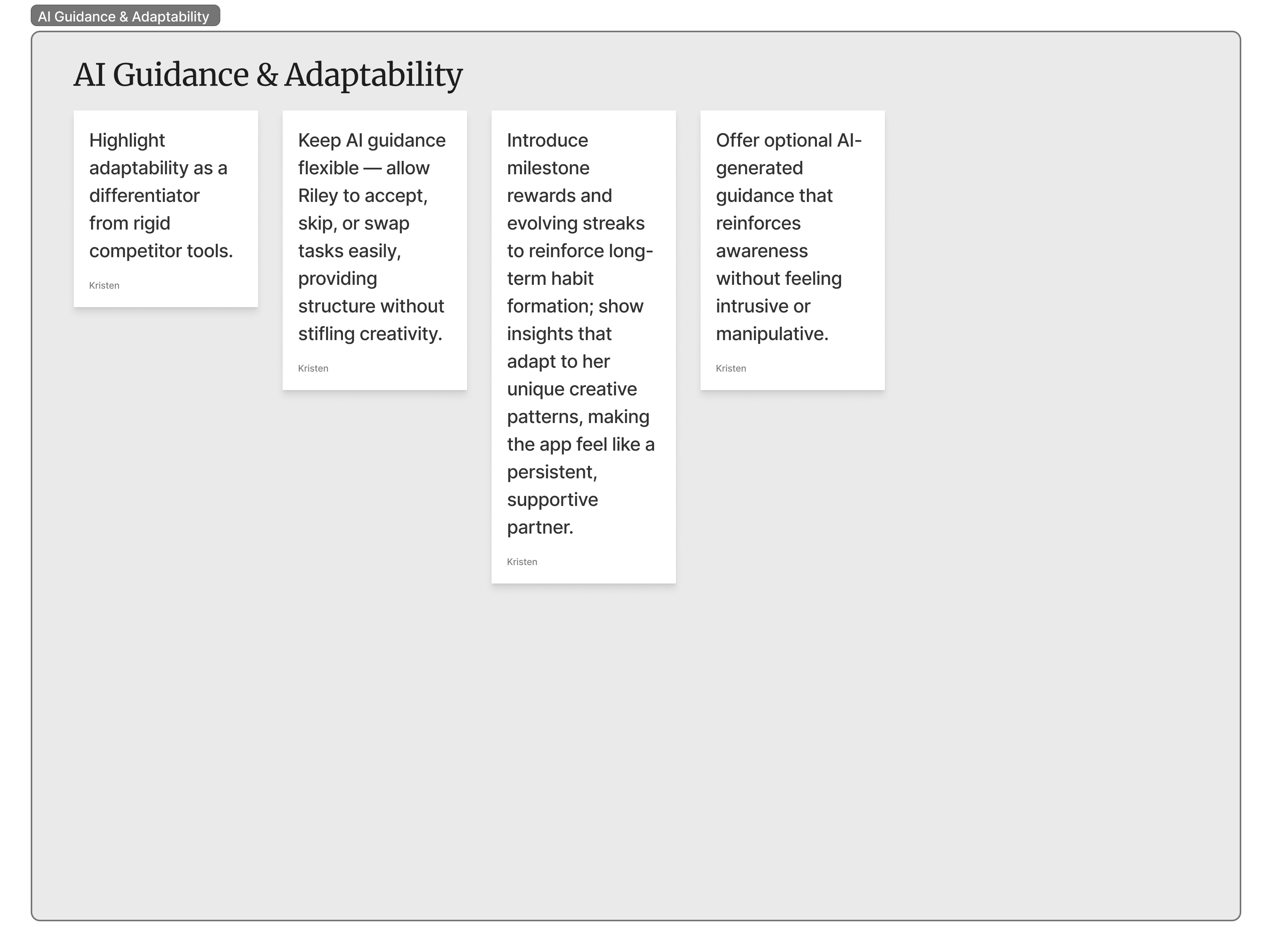
Highlight adaptability as a differentiator from rigid competitor tools.
04
LOGS FOCUS SESSION
At the end of the session, Jordan rates focus, notes distractions, and logs progress.
"I actually got more done than expected."
EMOTION
Satisfaction medium-high, consistency medium
Make logging quick (1-tap) + reward streaks to encourage habit-building.
05
REVIEWS ENERGY PEAK INSIGHTS
Jordan sees patterns, e.g. strongest focus between 10am–1pm, most distracted late at night.
"Wow, I didn't realize I'm so consistent in the mornings."
EMOTION
Curiosity high, motivation high
Offer smart nudges: "Want to shift more heavy study into your peak focus hours?"
Key Opportunities
Immediate Value: Quick setup + instant insights prove usefulness early.Adaptive Suggestions: Study blocks and timers that flex with Jordan's real behavior.
Habit Support: Gentle nudges, streaks, and small wins keep motivation alive over weeks.
Retention: Energy-peak insights make the app indispensable for long-term study planning.
Persona 2 - Riley Morgan
User journey A
Starting a Client Project
Everyday life
Goals
Begin a new freelance design project without structured tools, relying on environment, personal systems, and energy bursts to move work forward.
01
MORNING PREP
Riley wakes up, checks phone, makes coffee, scrolls social media, feels vague pressure from an upcoming client deadline.
"I should really start… but I'm not sure where."
EMOTION
Procrastination, guilt, lack of momentum
External cues or triggers could help Riley transition into work mode faster.
02
IDEA BRAIN-DUMP
Riley opens a notebook or uses the whiteboard wall to sketch rough ideas and jot tasks.
"At least I've got something down now."
EMOTION
Relief and clarity, but still scattered and unstructured
A lightweight, low-friction space to capture and organize ideas without feeling like "work."
03
CREATIVE BURST
Riley dives into design work, loses track of time, enters a hyper-focused state.
"I'm really in the zone now."
EMOTION
Excitement, flow, satisfaction - but fragile, can derail quickly
Visual cues or timers could help sustain focus while still respecting creative flow.
04
BREAKS (MIDDAY RESET)
Riley gets distracted, wanders off for a snack or scrolls social media, intending to take a short break.
"I'll just rest for a few minutes…"
EMOTION
Breaks stretch too long, leading to guilt
Gentle, flexible break reminders or engaging re-entry cues could reduce derailment.
05
DEADLINE CRUNCH
Hours before delivery, Riley works late into the night, fueled by stress and urgency.
"Why do I always leave it this late?"
EMOTION
Anxiety, determination, physical/mental fatigue
Earlier pacing support and phased check-ins could reduce last-minute stress.
Key Opportunities
Task Initiation Support: Nudges, micro-actions, or environmental cues to help Riley start faster.Idea Capture: Brain-dump tools that feel playful and forgiving.
Sustainable Focus: Visual cues and adaptive timers to extend bursts without killing flow.Break Management: Friendly prompts that keep breaks refreshing but not derailing.Deadline Support: Gentle pacing reminders to avoid crunch cycles.
User journey B
Using Forest + Trello for a Design Sprint
Competitor app
Goals
Complete a short client design sprint by pairing a focus app (Forest) with a task manager (Trello).
01
SETS FOREST TIMER
Riley opens Forest, sets a 45-minute focus session, and locks the phone.
"Okay, let's get this sprint started - no distractions."
EMOTION
Motivation medium-high at first, curiosity
Connect the focus timer to real project steps instead of only planting virtual trees.
02
STARTS TRELLO BOARD
Riley creates a Trello board with columns (To Do, Doing, Done) and adds client tasks.
"This should keep me organized."
EMOTION
Organized but slightly overwhelmed by setup time
Reduce friction by auto-generating boards/templates linked to sprint goals.
03
FOCUS UNTIL BOREDOM HITS
Riley starts working, but after two or three Forest sessions, motivation dips.
"Planting trees doesn't feel as exciting anymore."
EMOTION
Focus low-medium, boredom, reward fatigue
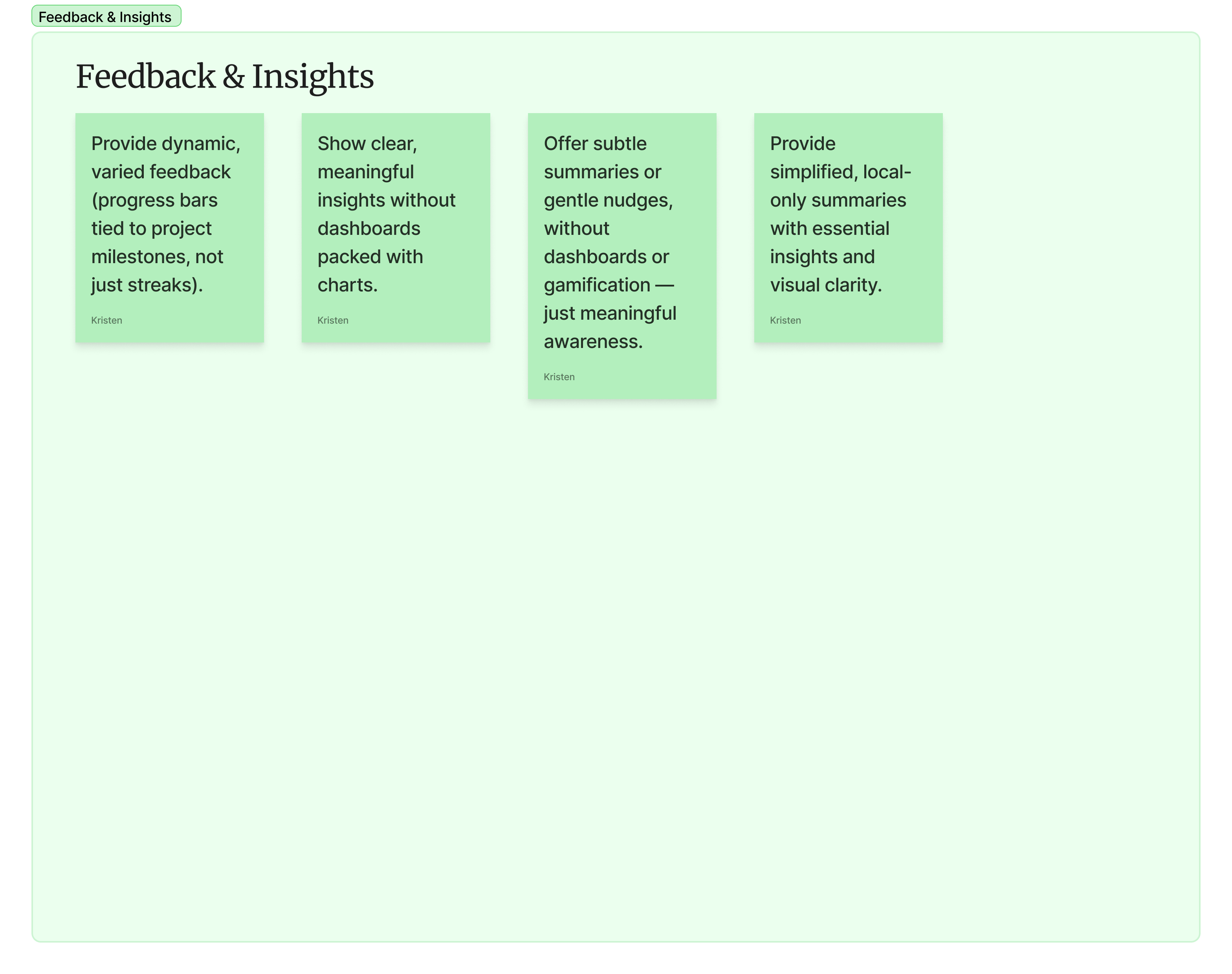
Provide dynamic, varied feedback (progress bars tied to project milestones, not just streaks).
04
JUMPS BETWEEN APPS
Riley flips between Forest and Trello, sometimes losing track of what was done in each.
"Wait, did I finish that or not?"
EMOTION
Frustration, scattered energy
Integrate focus tracking directly into task progress, reducing the need to context-switch.
05
FINISHES LATE NIGHT
Despite using both apps, Riley ends up working late to wrap the sprint.
"Why am I still behind even though I tracked my time?"
EMOTION
Anxiety, exhaustion, disillusionment with the tools
Smarter pacing and integrated milestone reminders could help Riley spread effort earlier.
Key Opportunities
Integration: Link focus sessions directly to Trello tasks or milestones.Reduced Friction: Templates and auto-setup for design sprints.Dynamic Rewards: Avoid reward fatigue by evolving visual cues tied to progress.Seamless Tracking: Eliminate app-hopping by merging focus + task management in one place.Better Pacing: Provide early nudges to avoid late-night crunches.
User journey G
Tracking Creative Bursts
Our Application
Goals
Adopt the app as a supportive system for capturing ideas, staying engaged in creative bursts, and sustaining motivation over the long term without stifling flow.
01
OPENS APP (ONBOARDING)
Riley downloads the app, signs up quickly, and tries the brain-dump + timer feature after a short tutorial.
"This feels simple, not like the heavy tools I've ditched before."
EMOTION
Curiosity medium-high, mild skepticism
Keep onboarding ultra-light, show instant value with first idea-to-task conversion, highlighting how it supports Riley's free-flowing creative style.
02
QUICK BRAIN-DUMP
Before starting a project, Riley jots down scattered ideas into the brain-dump space. The app auto-sorts them into categories (concepts, deadlines, inspirations).
"Nice, I don't have to organize everything right away."
EMOTION
Relief high, stress low
Maintain zero-friction capture and reinforce habit with visual feedback, making brain-dumps feel rewarding while respecting creative energy.
03
STARTS ADAPTIVE TIMER
Riley sets a visual, animated timer — progress ring, colors shifting as time passes. Timer adapts slightly to energy level (shorter if restless, longer if in flow).
"This feels more alive than a boring countdown clock."
EMOTION
Focus medium-high, engagement strong
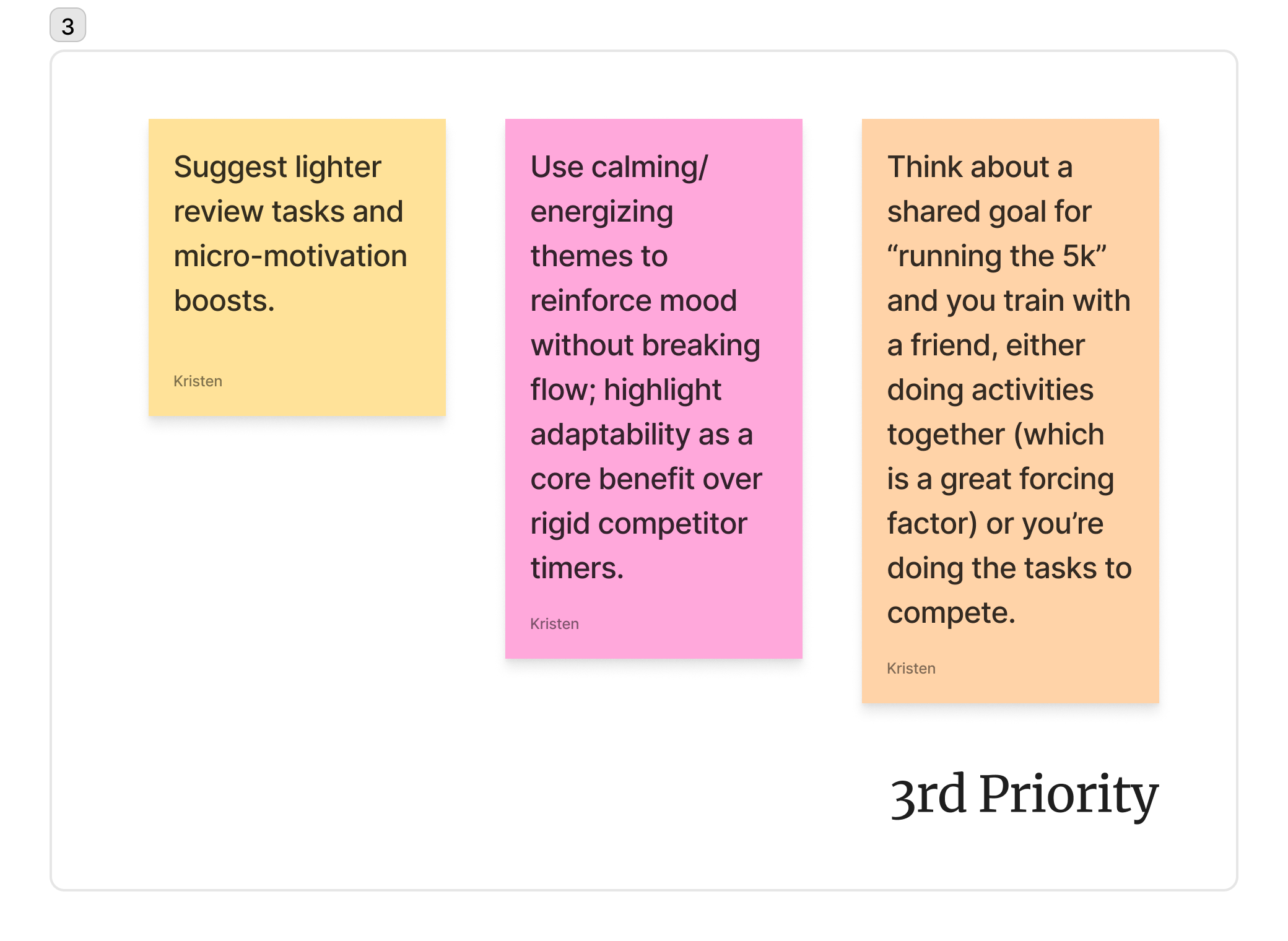
Use calming/energizing themes to reinforce mood without breaking flow; highlight adaptability as a core benefit over rigid competitor timers.
04
AI SUGGESTS MINI-TASKS
After logging a few sessions, the app begins suggesting mini-tasks ("Draft headline," "Sketch color palette," "Export mockup") based on patterns.
"Oh, that's actually a good small step to start with."
EMOTION
Motivation high, occasional resistance if suggestions feel too structured
Keep AI guidance flexible - allow Riley to accept, skip, or swap tasks easily, providing structure without stifling creativity.
05
REVIEWS ENERGY PEAK INSIGHTS
Riley checks progress dashboards, seeing streaks, session history, and creative "seasons." Notices improvement in consistency and flow over weeks.
"I actually stayed consistent this week — I like seeing that."
EMOTION
Pride medium-high, curiosity high, trust in the tool growing
Introduce milestone rewards and evolving streaks to reinforce long-term habit formation; show insights that adapt to unique creative patterns.
Key Opportunities
Zero-Friction Capture: Brain-dump must always feel fast and freeing.Playful Structure: Visual timers + adaptive mini-tasks guide without suffocating flow.Adaptive Gamification: Evolving streaks and rewards prevent fatigue.
Trust Building: Flexible suggestions increase adoption and long-term retention.Retention Hooks: Milestone celebrations and seasonal insights reinforce the app as a creative companion.
Persona 3 - Jennifer Anderson
User journey A
Balancing Translation Work with Pottery
Everyday life
Goals
Manage professional translation work while enjoying personal hobbies like pottery, gaining awareness of time use without relying on invasive tools.
01
CLIENT TRANSLATION BLOCK
Jennifer dedicates a block of focused time to translating client documents, usually at her home workspace. She keeps a rough mental note of start/end times.
"I need to finish this before my pottery session, but I also want to stay relaxed."
EMOTION
Focus medium-high, mild anxiety about deadlines
Encourage awareness tools that don't feel intrusive — e.g., offline timers or simple reminders to mark sessions, without requiring cloud sync.
02
BREAK (MIDDAY)
She takes a short break — coffee, reading, or a walk. Breaks are informal, not logged in any system.
"I just need a pause, no notifications, no pressure."
EMOTION
Relief high, calmness medium-high
Minimal tracking for downtime - maybe an optional "pause" button for self-awareness without logging every detail.
03
POTTERY HOBBY
Jennifer spends time in her pottery studio, shaping clay, experimenting, and enjoying the tactile process. She has no need to track this formally, but notes internally how long she spends.
"I want to relax and enjoy the process — I don't need to record every minute."
EMOTION
Engagement high, stress low
Provide lightweight, optional logging that's fast and offline e.g. one-tap entry to capture hobby sessions if desired.
04
EVENING REVIEW
She reflects mentally on the day - noting roughly how long she worked, when she was productive, and how much time went to hobbies.
"I feel like I balanced work and me-time reasonably today."
EMOTION
Satisfaction medium-high, curiosity low-medium
Offer subtle summaries or gentle nudges, without dashboards or gamification — just meaningful awareness.
05
LOGGING INSIGHTS
If she wants, Jennifer logs insights from the day in a notebook or lightweight app. She values brevity: one line or quick note.
"It took a few seconds to note this - simple and private."
EMOTION
Satisfaction medium → high, low friction
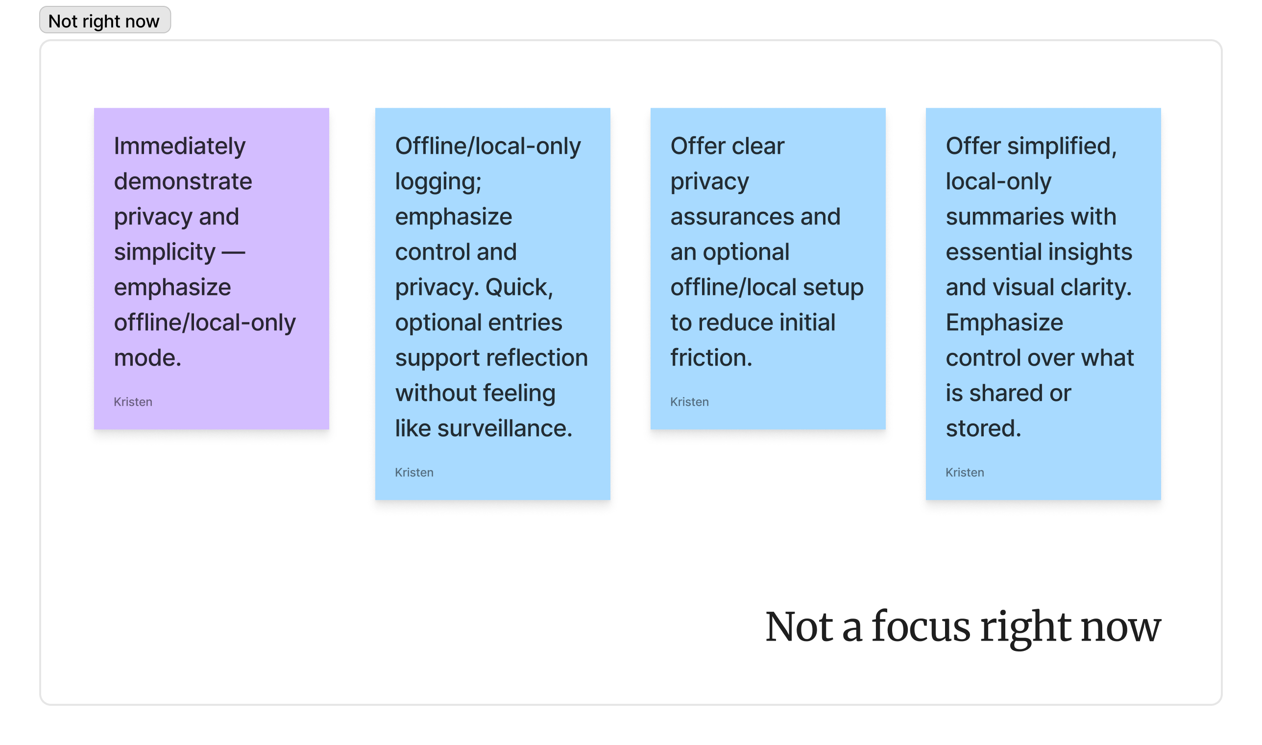
Offline/local-only logging; emphasize control and privacy. Quick, optional entries support reflection without feeling like surveillance.
Key Opportunities
Privacy-First Tracking: Avoid cloud storage or intrusive permissions.One-Tap Logs: Keep input minimal for non-work sessions.Meaningful Summaries: Provide actionable awareness without dashboards or gamification.Support Work-Life Balance: Make personal hobbies as trackable (if desired) as work blocks, without extra mental load.Autonomy: Give full control — pause, skip, or log whenever Jennifer chooses.
User journey B
Trying Toggl for Client Work
Competitor app
Goals
Experiment with a time-tracking app to gain insight into work habits while maintaining privacy and minimal friction.
01
SIGNS UP (ONBOARDING)
Jennifer downloads Toggl and creates an account. She is prompted to set up cloud sync and enable notifications.
"I'm not sure about giving my data to the cloud."
EMOTION
Medium concern, slight curiosity
Offer clear privacy assurances and optional offline/local setup to reduce initial friction.
02
SETS CLIENT PROJECT
She creates a project for a translation client and adds expected tasks. The interface is feature-rich but slightly overwhelming.
"There are too many buttons and options - I just want to track my time."
EMOTION
Frustration medium-high, slight hesitation
Simplify project creation with a lightweight "quick add" mode and hide advanced features behind optional menus.
03
STARTS TIMER
Jennifer begins her translation session and starts the timer. She receives occasional prompts from Toggl to log breaks or track idle time.
"I don't want reminders popping up - I just want to focus."
EMOTION
Annoyance medium-high, focus low-medium
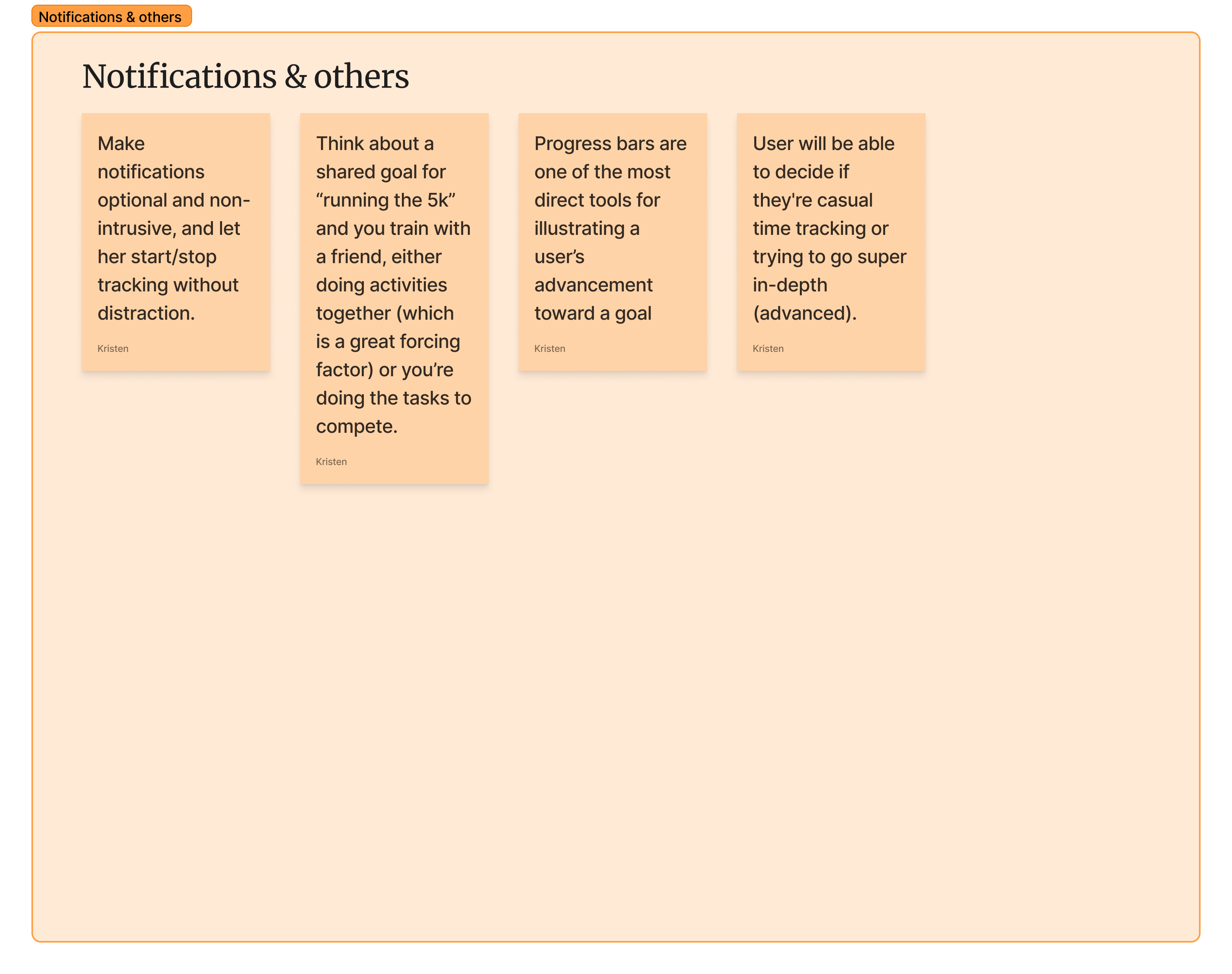
Make notifications optional and non-intrusive, and let her start/stop tracking without distraction.
04
STOPS TIMER
She finishes the client work and stops the timer. Toggl asks her to categorize the session, rate productivity, or tag activities.
"I just want to log the session - not fill out all these fields."
EMOTION
Frustration medium-high, satisfaction low
Enable one-tap session logging and optional details for users who want simplicity.
05
REVIEWS WEEKLY SUMMARY
At the end of the week, Jennifer looks at the dashboard to see total hours and activity breakdowns. The dashboard is dense, with lots of charts, and shows cloud-stored data.
"This is too much info, and I don't know if my data is secure."
EMOTION
Overwhelm medium-high, distrust medium-high
Offer simplified, local-only summaries with essential insights and visual clarity. Emphasize control over what is shared or stored.
Key Opportunities
Simpler Onboarding: Let users skip or opt out of cloud sync.Lightweight Project Setup: Quick-add mode avoids unnecessary complexity.Optional Prompts: Notifications or reminders should be fully customizable.One-Tap Logging: Reduce friction in daily use.Privacy Assurance: Provide transparency and control over data storage to build trust and encourage retention.
User journey G
Low-Friction Privacy-First Tracking
Our Application
Goals
Adopt a lightweight, privacy-first app to gain awareness of work and hobby time while maintaining full control over data.
01
OPENS APP (ONBOARDING)
Jennifer downloads the app and sees a short guided flow emphasizing offline-first design, local data storage, and one-tap logging.
"Finally, a tool that doesn't require cloud sync or bombard me with notifications."
EMOTION
Medium curiosity, slight hesitation
Immediately demonstrate privacy and simplicity - emphasize offline/local-only mode.
02
LOGS TIME (DAILY USE)
She quickly logs a client translation session or a pottery block using one-tap entry. The interface is minimal, uncluttered, and offline.
"This is easy - just what I needed."
EMOTION
Friction low, satisfaction medium-high
Keep logging effortless and optional; support flexible input for work or hobbies.
03
VIEWS SIMPLE SUMMARY
Jennifer checks a lightweight summary showing hours spent on translation, pottery, and breaks. The dashboard is clean, minimal, and offline.
"I can see where my time went without feeling overwhelmed."
EMOTION
Curiosity medium-high, stress low
Provide clear, meaningful insights without dashboards packed with charts.
04
OPTIONAL AI INSIGHT
The app suggests subtle improvements or patterns - e.g. "You spent 35% of tracked time on pottery this week" or "Consider a mid-morning break for better focus."
"Nice, these tips are simple and useful, not pushy."
EMOTION
Motivation medium-high, trust medium
Offer optional AI-generated guidance that reinforces awareness without feeling intrusive or manipulative.
05
PAUSES OR ENDS SESSION
Jennifer can pause tracking at any time or end a session without prompts. The app respects her choice and saves data locally.
"I'm in control - I can log when I want and pause anytime."
EMOTION
Confidence high, satisfaction high
Reinforce autonomy and control, making the app feel safe, trustworthy, and long-term sustainable.
Key Opportunities
Offline-First Mode: Build trust by avoiding cloud storage.Minimal UI: Keep the interface simple to reduce friction.Gentle Progress Notifications: Optional, subtle nudges for reflection.Flexible Logging: One-tap entries for work or hobby sessions.Flexible Logging: One-tap entries for work or hobby sessions.User Control & Autonomy: Full freedom to pause, skip, or end sessions encourages long-term retention.
08 — Feature Mapping
Deciding what to build and when
Once the emotional journeys had exposed the problems users were experiencing, I needed to turn those problems into a cohesive product system rather than a collection of disconnected feature ideas.
I started by taking each identified pain point and creating a potential solution or feature to address it. These solutions were then organised into functional categories such as Plans, Notifications, Tracking, Focus, Insights and AI. Once every problem had a corresponding solution and the feature set was structured, I introduced a priority system — separating features into first, second and third priorities, as well as ideas that weren't needed yet.
The next step was bringing in Chronio's six design pillars. Each feature was mapped against the pillar it supported, ranked by importance, and then refined to ensure the solution still aligned with the principles we had established earlier in the case study.
This gave us a structured system where each of the six pillars had its own set of features, and every feature had a clear priority. More importantly, we now understood not just what Chronio should contain, but why each feature existed, where it belonged, how it should contribute to the experience, and what mattered most.
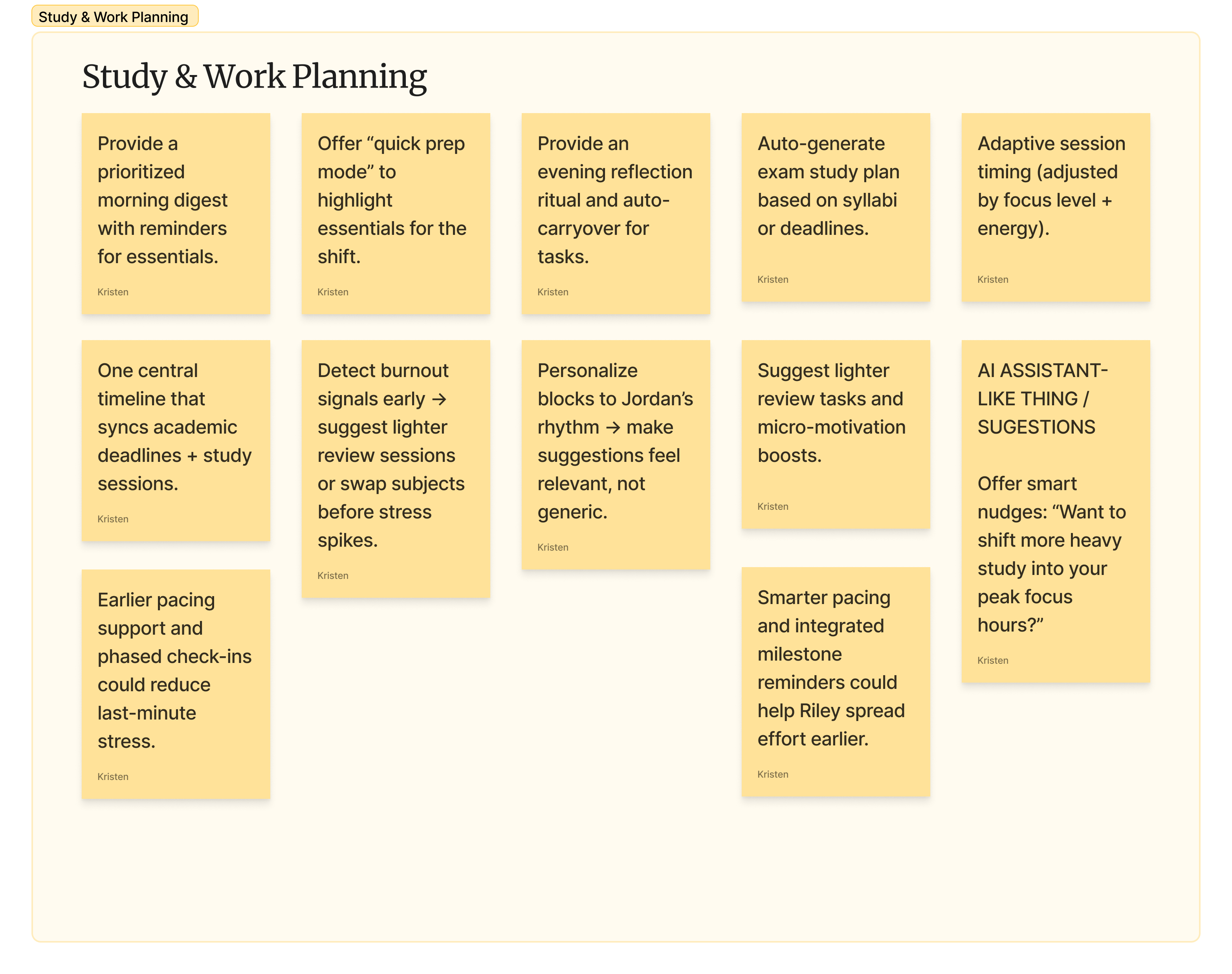
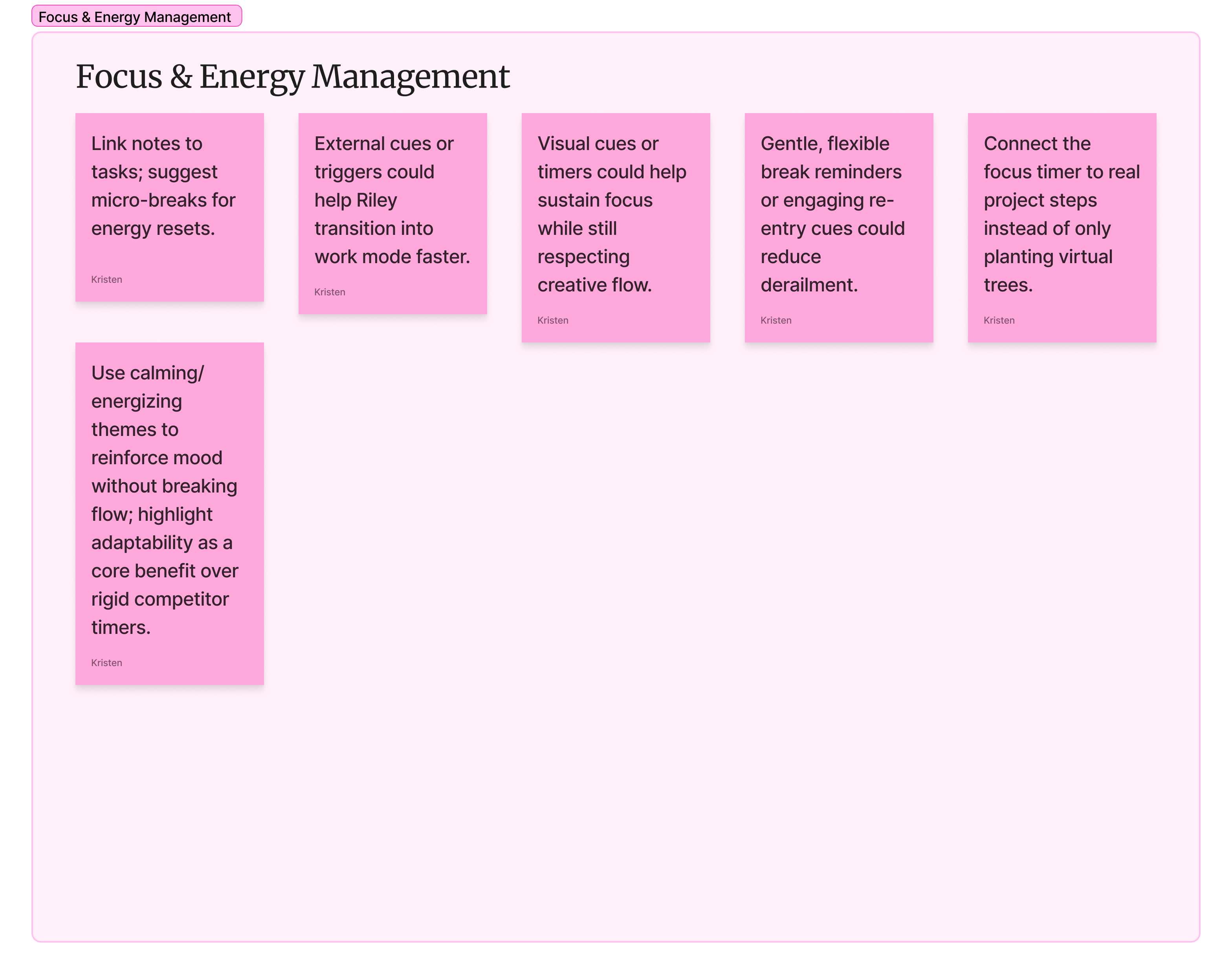
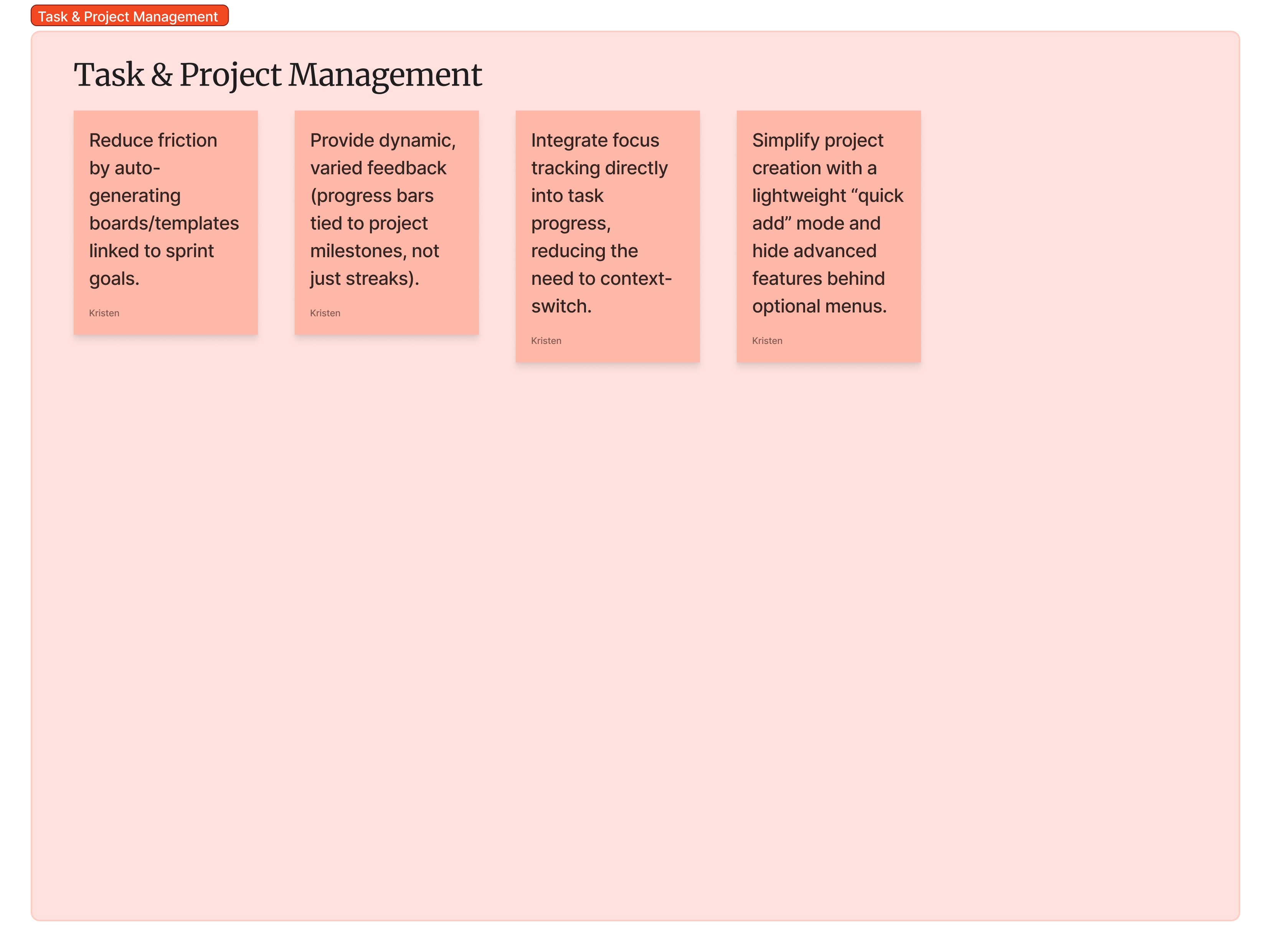
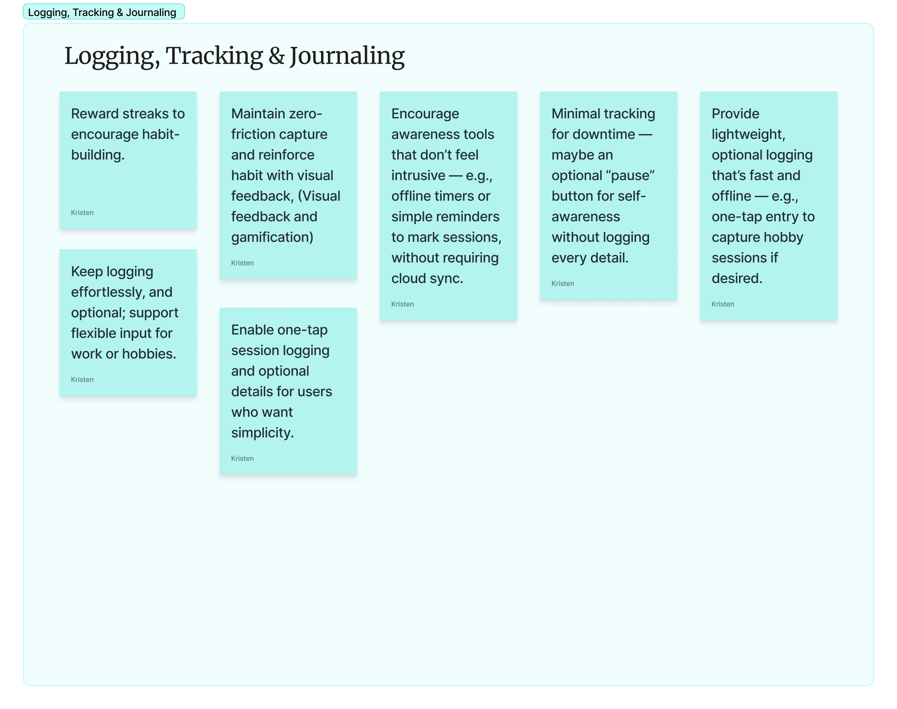
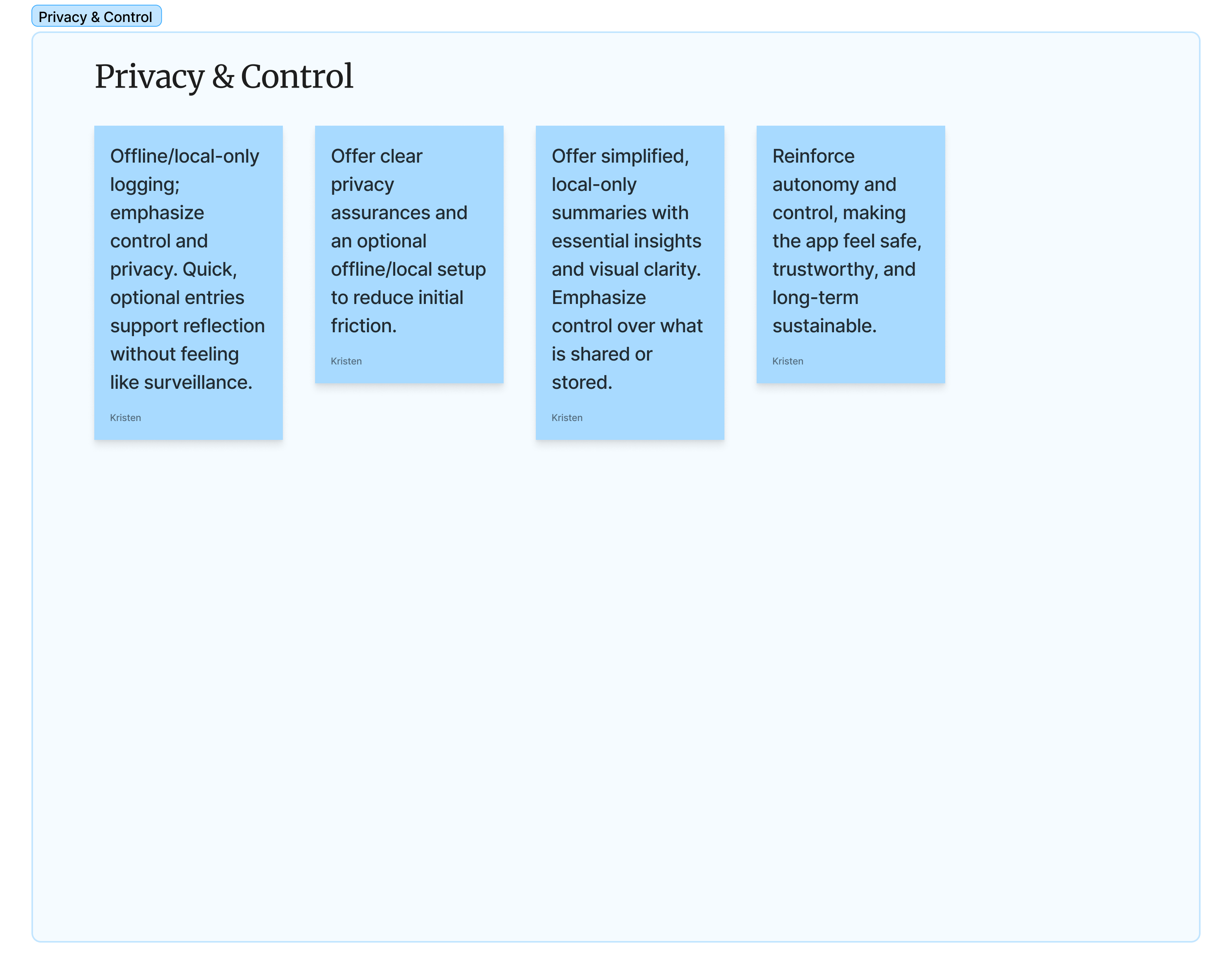
Feature categorization
Here each problem observed in the user journeys were listed, and they were categorized. This shows us the area that has the most opportunity, and shows any overlapping, duplicate, and relating problems that could be solved by 1 solution or feature.
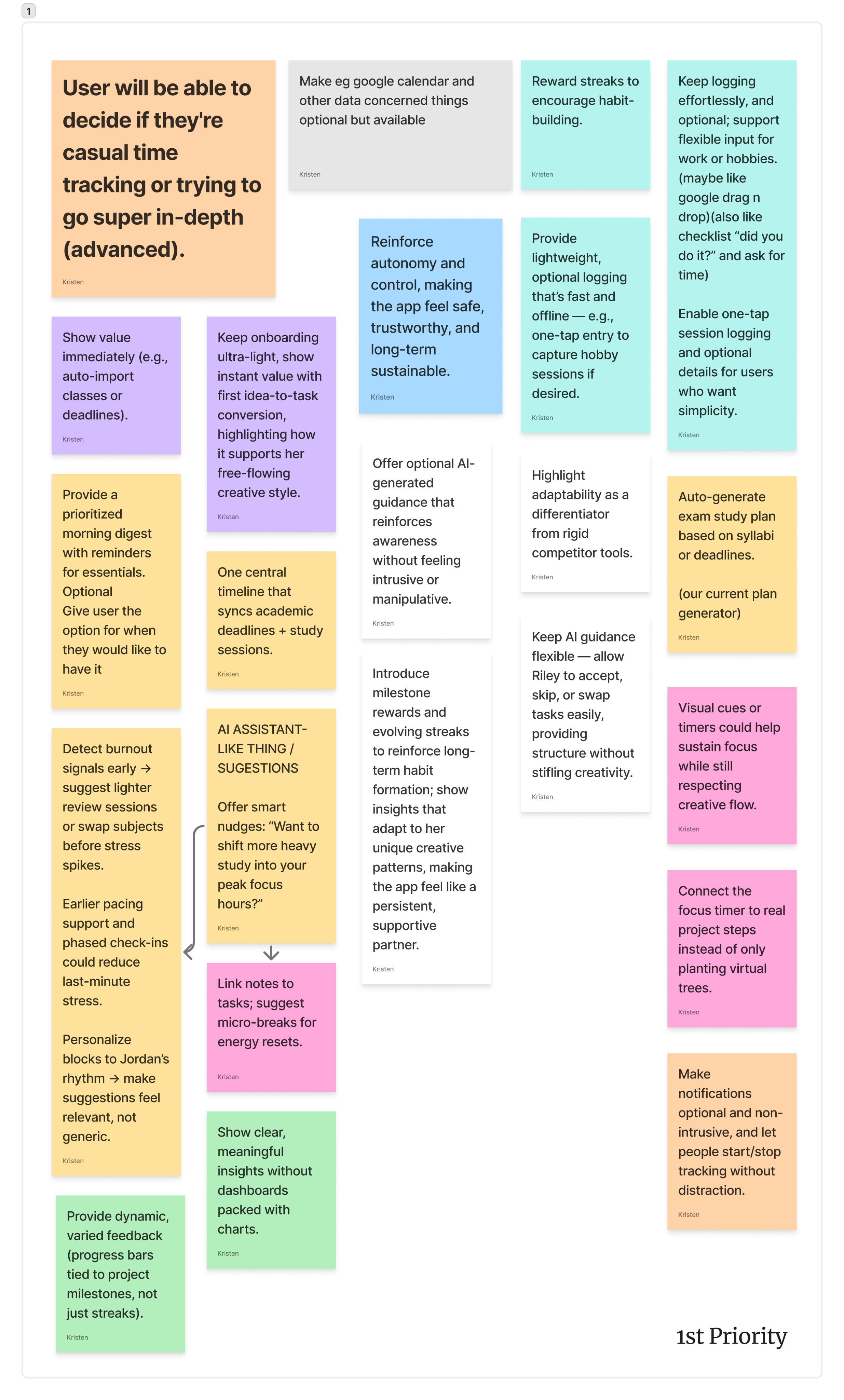
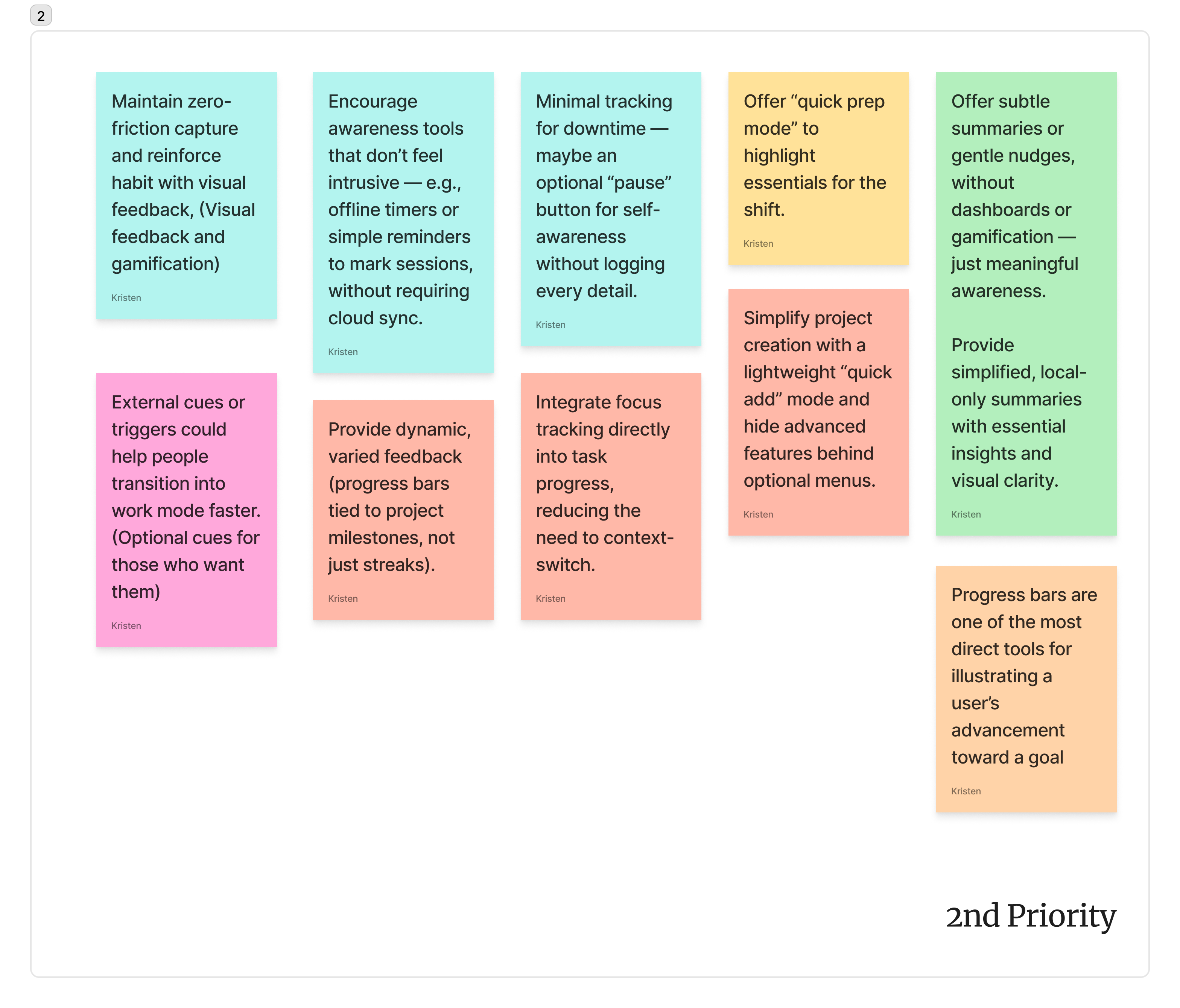
Feature prioritization
Here each feature is assigned a priority. The options are 1st (top priority), followed by 2nd, followed by 3rd, with an additional category called “no right now”. A lot went into deciding what goes where. Both Sinan and I played a role, we had dedicated meetings to discuss what goes where and why. Some factors include; what will be a good option for MVP 1, what will market the best, what the development timeline will be, what the technological requirements are, etc.
Bringing it back into pillars
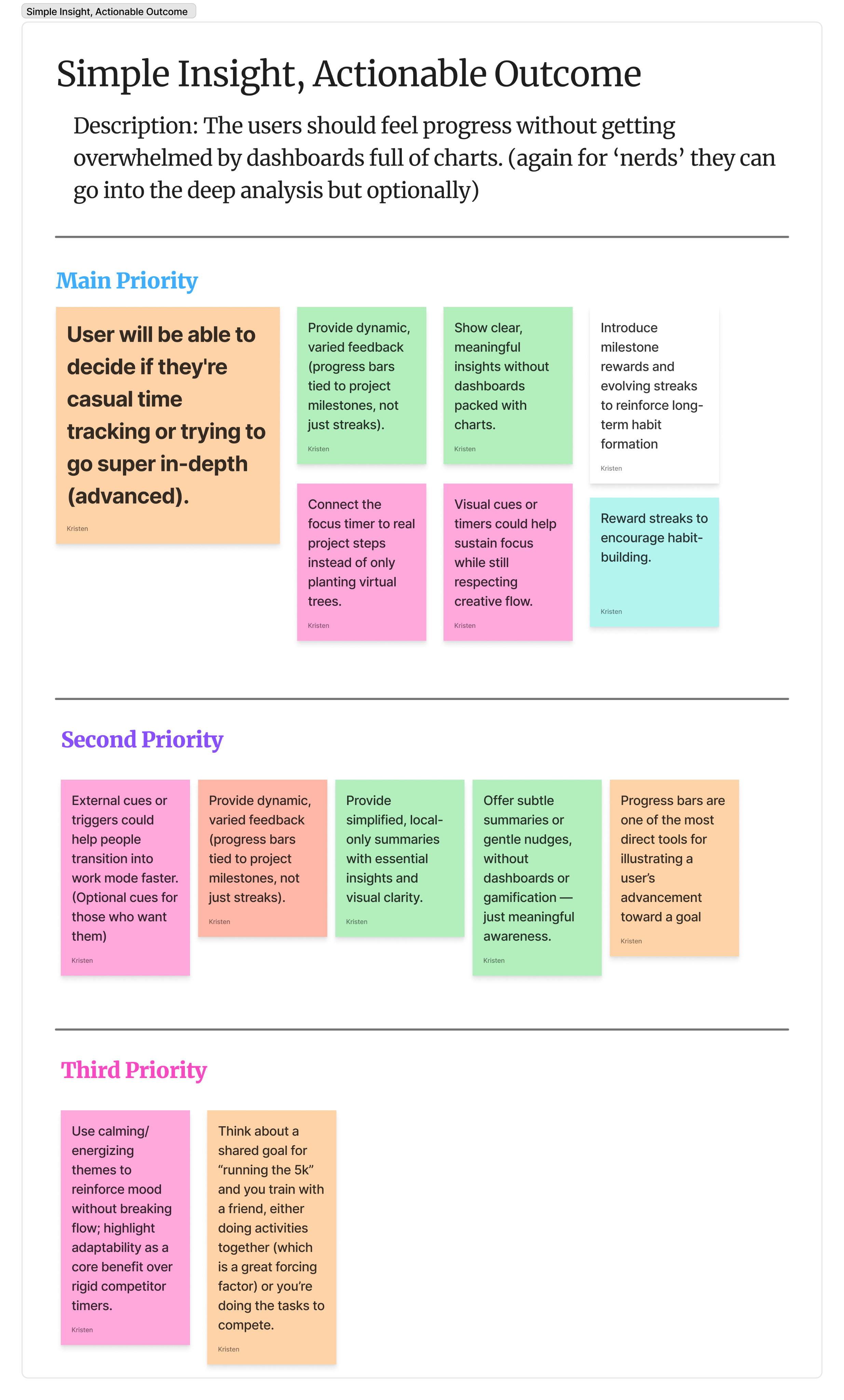
The final rounded out features/solutions brought back and unified within the pillars identified earlier in the case study, listed in order of priority.
09 — Wireframing
Taking what we learned, and making it function
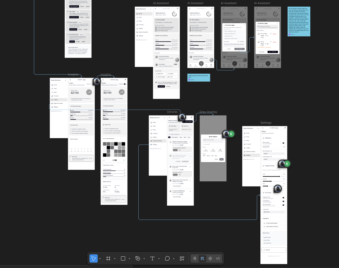
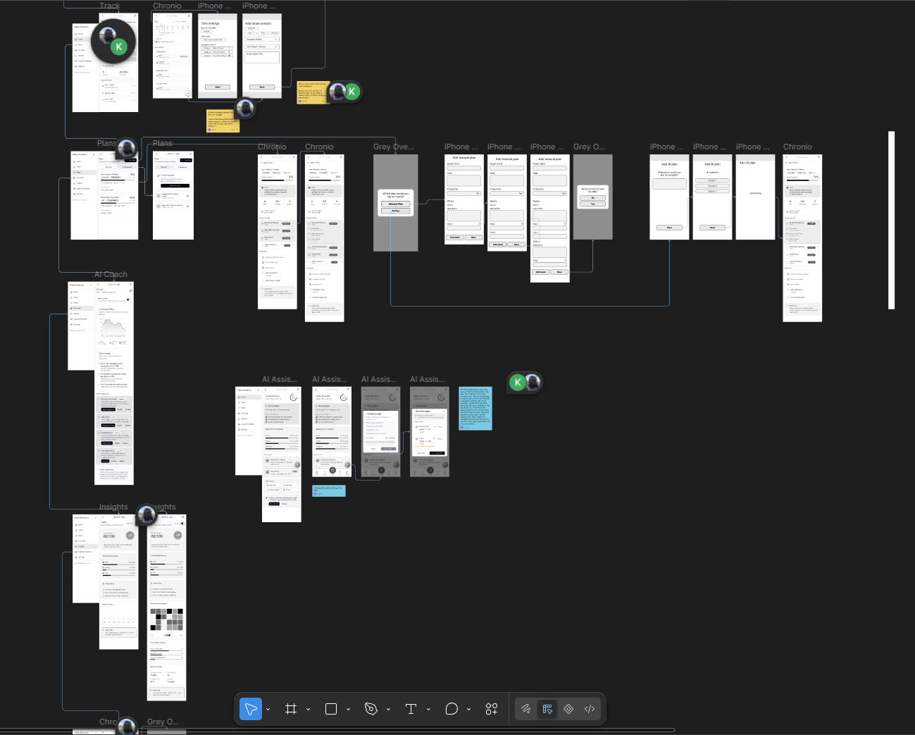
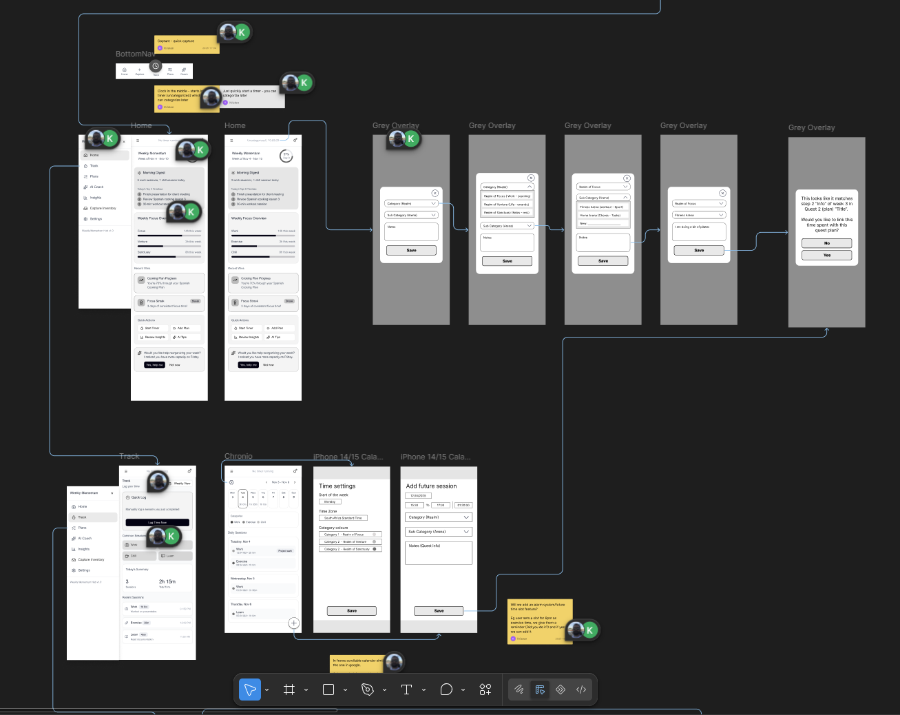
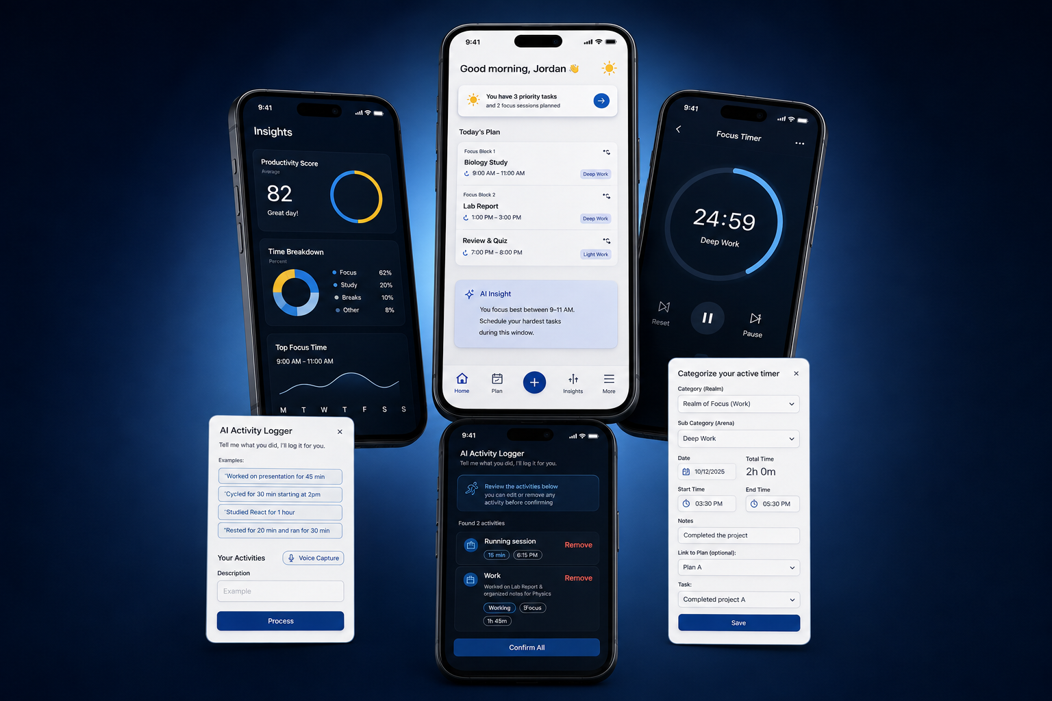
With the feature map establishing what belongs where, the next step was to work out how everything should actually function. This approach was discussed and agreed upon with Sinan from the outset: rather than me taking on the visual UI design, which he was comfortable handling himself, my role would focus on the UX foundation behind the product.
I translated the feature map into low-fidelity wireframes, sketching out how each feature would work step by step, how users would move through the experience, what information should take priority, and how the overall hierarchy and layouts should be structured. The goal was not to create finished screens, but to establish a clear, usable blueprint based on UX best practices. Sinan and I reviewed the frames frequently, and I made sure to add mapping lines and annotation notes.
This gave Sinan a structured foundation to work from when developing the final app and website layouts, while leaving the visual direction and UI execution in his hands. It was a collaborative division of responsibilities, agreed upon together rather than a separation of work imposed by either of us.
Screenshot samples
A sneak peak of the final designs
10 — Brand Structure
Giving Chronio a personality before giving it a UI
Once we understood what Chronio needed to do, the next question was what should it feel like?
The product sits in a crowded productivity market, but we didn't want it to look or sound like another productivity tool. A lot of the category is built around urgency - streaks, deadlines, optimisation, notifications and the constant feeling that there is more to do.
Chronio was intentionally different.
Its purpose was to help people understand and manage their time without adding more pressure to it. That meant the brand needed to feel calm, intelligent and structured, while still having enough personality to stand on its own.
So before settling on a logo, colour palette or typeface, we established the foundations of the brand.
The Brand in One Thought
Time becomes manageable when it becomes visible.
Clarity over pressure.
Direction over urgency.
Progress over perfection.
Exploring the identity
With the positioning established, I started exploring what "clarity in motion" could look like.
The goal wasn't to immediately find the logo. We explored different visual interpretations of time, movement, structure and the letter C, looking at how abstract the identity could become while remaining recognisable.
Early concepts explored different approaches to:
The Chronio C, Circular time references, Movement and progression, Flowing forms, Time markers, Abstract geometric structures, Negative space, Continuous forms.
Some concepts leaned heavily into the literal idea of time, while others explored a more abstract representation of movement. The more literal directions were understandable, but they also risked making Chronio feel like another scheduling or calendar product. The stronger directions were the ones where time was implied rather than illustrated. That led us toward the idea of a C in motion, a form that feels like it is moving forward while remaining simple enough to become a recognisable brand mark.
The logo Concepts

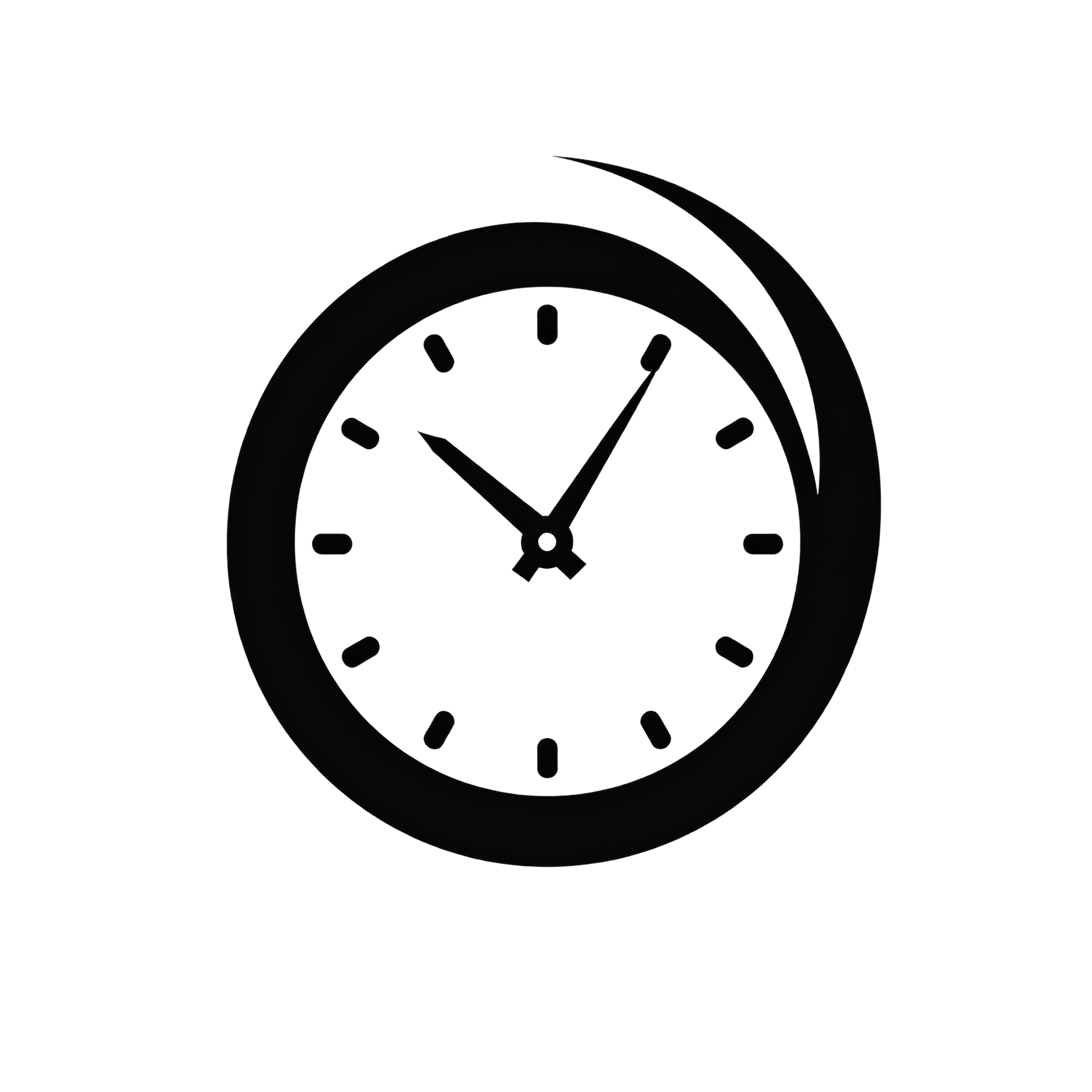
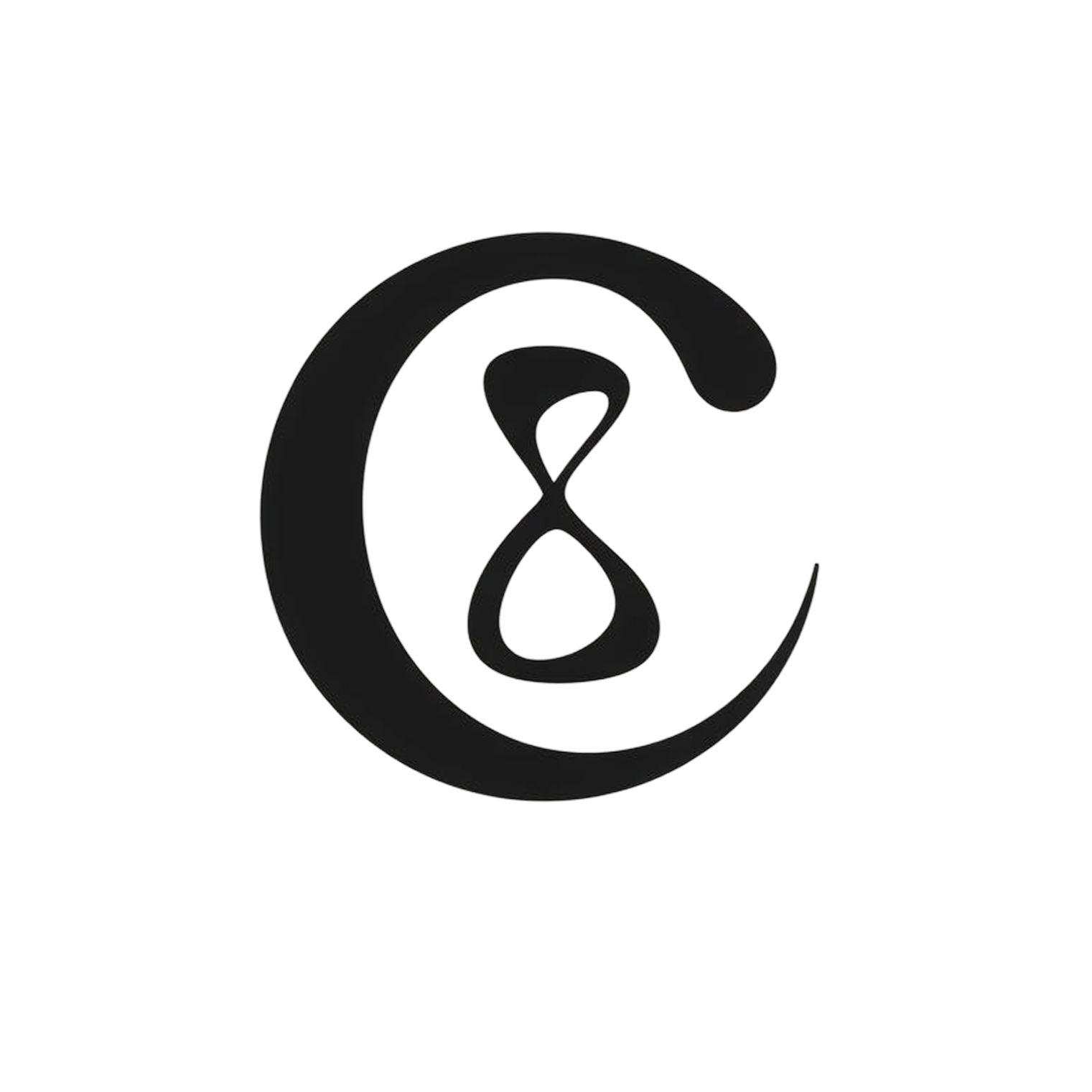

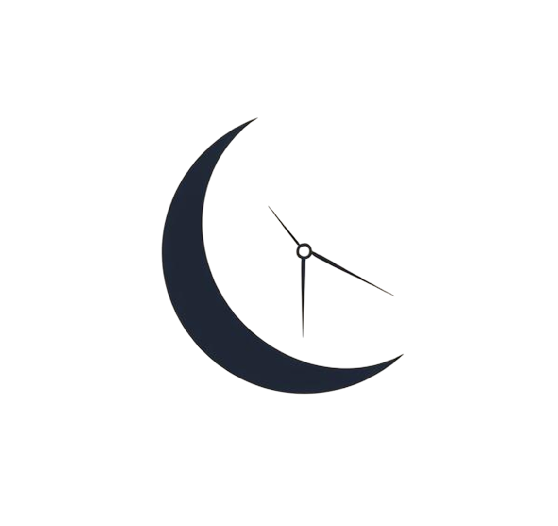
After creating the concepts it was presented to Sinan, who had the final vote and say over the chosen Logo variation. In the end he went with option 4, the duo-tone C with the hourglass inside. The idea is to have this represent teh C in the final Chronio logo
The finalized colour pallets
We agreed to explore a lot of pallets with different ideas behind them. Some mono-tone, some duo-tone, some multi-coloured. Each pallet was analyzed based on a specific aspect or set of rules. Each pallet was then incorporated into
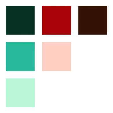
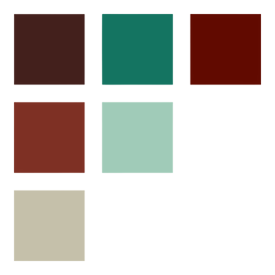
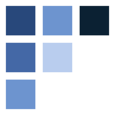
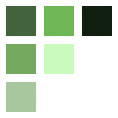
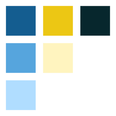
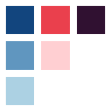
The final decision, much like the logo, rested with Sinan. After thoroughly exploring all options, conducting tests, and analyzing the rationale behind each, he chose option 5. The blue tones convey peace and calm, while the yellow signifies energy. Together, these colors create a platform that embodies the harmony of energy and tranquility. The varying shades stack seamlessly, and their positions on the color spectrum ensure they complement each other without causing color buffer issues. Ultimately, we adopted a clean design, white for light mode and dark grey for dark mode, with colors serving as accent elements.
Finding the voice
The visual identity wasn't the only thing we needed to define. We also had to establish how Chronio would communicate with its users. Because the product deals with productivity, there was a real risk of falling into the usual language of deadlines, optimisation and pressure. Instead, we wanted Chronio to feel more like a wise mentor, someone who provides direction without making the user feel like they're being told what to do.
That meant choosing language that guides rather than commands, encourages rather than pressures, and informs without overwhelming. Instead of telling someone "You're falling behind," Chronio might say "Here's what's next." Instead of "Complete your tasks," it could offer "A clear step forward." The difference is subtle, but important: the product should support the user's agency rather than make them feel judged by it.
This became especially important because the brand's philosophy and its language needed to reinforce one another. If Chronio was built around reducing productivity pressure, the words inside the product couldn't accidentally recreate that pressure.
Bringin it together
As the exploration progressed, the different parts of the identity began to converge around the same idea. The brand strategy established what Chronio stood for and where it should sit within the productivity space. The logo translated those ideas into a recognisable symbol, while the colour palette established the emotional tone of the product. Typography brought clarity and personality to the system, and the tone of voice ensured that Chronio could communicate with users in a way that felt supportive rather than demanding.
None of these decisions were intended to exist independently. They were different expressions of the same underlying philosophy: reduce noise, increase clarity, and help people make intentional decisions with their time.
This gave us a brand that could move naturally from strategy into the actual product experience. We weren't simply creating an identity that looked good alongside the app; we were creating a set of principles that could influence how the app itself behaved, communicated and guided its users.
Finishing up
The Final Brand Direction
By the end of the branding exploration, Chronio could be distilled into four words: calm, clear, intelligent and intentional.
The goal wasn't to make Chronio another tool that helps people squeeze more out of every minute. It was to create something that helps people understand their time well enough to decide what actually deserves it. That distinction became the foundation for the product moving forward.
With the brand established, we could move from defining what Chronio should feel like to working out how Chronio should actually work.
11 — User testing
Testing real users, getting real data
20 users tested an interactive MVP prototype across 11 feature scenarios. Demographic variety was intentional, different ages, employment types, and tech comfort levels. 40% already used similar apps, 60% did not. We narrowed the results down to was the feature found, was hesitation (abbreviated as hesit.) present in the use of the feature, and what the success rate of the feature is when it comes to use after it has been found.
Note: With 5 users, results serve as directional insights, not a statistical sample. The primary goal was to validate MVP1 flows and surface usability friction before design investment.
Please view this case study on a bigger screen to see the user testing breakdown
Bringin it together
Critical
Quick Start Timer redesign
Timer pop-up must appear on first tap, not require tapping again on the active timer. The top placement is not intuitive, needs clearer affordance or popup-on-start behavior.
high
Separate calendar view
Users consistently suggested the calendar should be accessible from the side menu and home screen as a dedicated entry point, not nested.
medium
Dark mode
Mentioned by multiple users unprompted. Dark mode is expected by this user base — not an optional enhancement.
High
Rename "Track" section
Users assumed "Track" only contained logs. The label needs to communicate the full scope of the section - time logs, sessions, and entries.
medium
Home page layout
Current home shows too many statistics. Users want quick-access buttons to every feature first, with stats displayed more subtly below, not competing for attention.
Backlog
Smartwatch companion app
Mentioned by 100% of test users. Starting, pausing, and completing sessions from the wrist is a highly desired extension of the core timer experience.
What was revealed
Everything we can take away from not only the initial the research, but also the user testing
85%
Feature success rate
82%
People don’t have a good time management structure according to research
AI features are the strongest differentiator
Usability testing confirmed it: AI Quick Input and AI Plan Creator were near-perfect in discoverability and task completion. These features — not the timer — are what users fall in love with first.
Privacy is a feature, not a footnote
Jennifer represents a growing segment that distrusts cloud-first tools. Offline-first isn't just ethical, it's a genuine competitive differentiator in this space.
The core loop must be a single surface
The highest-friction moment in every persona's journey is switching between planning, tracking, and reflection tools. Chronio's Plan - Focus - Reflect - Adjust loop is its biggest competitive moat.
Quick Start Timer needs a redesign before launch
The only critical failure in testing. The affordance is wrong , and users need immediate visual feedback after starting the timer. This is a must-fix before MVP1 ships.
Most Loved Feature
AI Quick Input — the AI agent that converts spoken or typed descriptions into structured time logs was universally praised. All 20 users confirmed they understood it immediately and saw its value. This is the feature to lead with.
12 — Outcome and Reflection
Signing off on Chronio
Chronio taught me that good product design isn't about making a product simpler by removing complexity — it's about absorbing that complexity so the user doesn't have to.
The biggest lesson was the importance of designing beyond the interface. The original product already had a strong technical foundation, but understanding why users were struggling required looking at their real-world behaviours, emotional journeys and expectations before deciding what the product should actually become. The research, personas, feature mapping and design pillars gave us a way to make those decisions intentionally rather than designing features in isolation.
The user testing phase gave us the final reality check. Some of the things that seemed intuitive during the design process still created confusion when real users interacted with them, particularly feature naming and terminology.
Sinan took the testing feedback and worked through the comments and suggestions one by one, implementing changes directly into Chronio. This included improvements such as dark mode, clearer feature naming and revised wording throughout the product.
The biggest evolution came from the AI voice-to-text experience. Users can describe what they did during their day naturally, and Chronio can interpret that input and automatically log the relevant information rather than requiring them to manually track everything. This became one of the most significant ways the product could deliver on its original promise of making time awareness easier rather than creating another task to manage.
Where Chronio is now
Chronio has since moved into Beta, with the product continuing to evolve from the foundation established throughout this process.
What started as a developer-built personal tool became a much broader product concept, one shaped around how people actually experience their time, rather than how a system needs to store it.
The biggest takeaway for me:
Don't design around what a product can do. Design around what people are actually trying to accomplish, then let the technology make that easier.
Review
★ ★ ★ ★ ★
I was delighted to work with Kristen. She is incredibly responsive, professional, and remained very open to feedback throughout the process. She produced high-quality outcomes that aligned perfectly with our project plan and timeline. Even when things got busy on my end, she remained proactive. I’d highly recommend her to anyone looking for a reliable and talented collaborator! Definitely I’ll work with her again.
~ Sinan (Sean) C.
An Upwork Project
NEXT PROJECT →
Tregadevs ED
WORK TOGETHER
Liked what you saw?
Open to collaborations, offers, and contracts.
Kristen Becker
© 2026 Kristen Becker. All rights reserved.
KRISTEN BECKER
Projects
Contact
Chronio
CLIENT
Sean C.
ROLE
Sole Product and UX Designer
DURATION
6 Months
DELIVERABLES
Complete UX Rework, Brand reword, and UI guidance
01 — OVERVIEW
A smarter time-tracking platform designed to turn everyday habits into actionable productivity insights.
Chronio is a productivity and time-management platform that helps users understand where their time goes, build better habits, and stay on track. I worked across the product experience and branding, designing features including productivity scoring, action plans, AI-powered planning and coaching, and an adaptive timer.
02 — DESIGN PROCESS
How I moved from problem to solution
01
Research
I began by understanding the people Chronio could serve, their behaviours, motivations, frustrations and relationship with productivity. This research became the foundation for the personas and every decision that followed.
02
Personas
I translated the research into three priority personas, each representing a distinct relationship with time, productivity and tracking. Rather than designing for a generic “productivity user,” these personas gave the project specific needs, behaviours and frustrations to design around.
03
User Journeys
With the personas established, I mapped how they currently experience productivity in the real world, before Chronio even enters the picture. I explored everyday routines and competitor experiences, documenting actions, emotions and pain points to uncover opportunities for a new product.
04
Feature map
I translated those pain points into opportunities and potential features, then organised them into functional categories and MVP levels. This created a clear product structure and helped simplify Chronio's mental model before moving into the interface.
05
Wireframing
I brought the feature map into the product, translating the new structure into low-fidelity wireframes across Chronio's core experiences. The focus was on hierarchy, navigation, interaction logic and reducing unnecessary complexity before introducing visual design.
06
Brand Design
Once the underlying experience was established, I developed Chronio's visual identity and design language. The goal was to move the product away from its original spreadsheet-like appearance and create something more approachable, modern and aligned with the new user-focused direction.
07
User Testing
With the redesigned experience and visual direction in place, I put Chronio in front of users to see whether the decisions made throughout the process actually worked. Testing helped identify remaining points of confusion, validate the new experience and refine the product before moving forward.
08
Final Touches
The final stage was about refining the experience based on everything uncovered throughout the process. I addressed remaining usability issues, polished interactions and visual details, and made the final adjustments needed to bring the product together as a cohesive experience.
Research gave us the evidence. Personas gave us the users. Emotional journeys gave us the problems. Feature mapping gave us the product direction. Wireframes gave it structure. Brand gave it personality. Testing showed us what still needed to change. Final touches brought it all together.
03 — THE PROBLEM
What needed to change — and why
Chronio started as a personal tool built by an experienced developer to help him understand and manage his time. Because he had designed and built the system himself, its logic came naturally to him. But when he showed it to other people, the response was consistent: they simply couldn’t figure out how to use it.
The problem wasn’t that Chronio lacked functionality, it was that the product was built around the creator’s mental model rather than the user’s. Its spreadsheet-like interface made an already complex system feel even harder to approach.
I was brought in to bridge that gap: simplify the experience, make the product feel intuitive to people who didn’t build it, make it look better, and identify opportunities to make Chronio more useful as a product.
PROBLEM STATEMENT
How might we transform a technically powerful tool built around an engineer’s mental model into a simple, intuitive productivity experience that anyone can understand and use?
04 — Goals & Product Pillars
Everything Chronio is structured around
01
Make Chronio intuitive
Redesign the experience so users can understand what to do without needing an explanation from the creator. Replace the engineer-first mental model with a user-first one.
02
Move away from the “Excel spreadsheet” feel
Create a modern, approachable interface that feels like a productivity product rather than a data-management tool.
03
Simplify time tracking
Make starting, stopping and categorising time effortless. Reduce the amount of thinking required to use the core functionality.
04
Make data meaningful
Turn raw time-tracking data into insights users can actually understand and act on. Make productivity patterns and trends easier to interpret.
05
Identify opportunities beyond the original feature set
Look at what users actually need from a time-management platform and introduce features that add meaningful value, rather than simply adding functionality for the sake of it.
PRODUCT PILLARS
As an ex-manager dev at Riot, my client Sinan (Sean) taught me a lot about gamification, and general game design. One of the things he taught me was something known as design pillars. In game design, you choose a number, usually 4 to 6, main points or pillars every aspect of your game would revolve around. It could be a combat style, a story focus point, or anything else of relevance. This ensures that all departments and teams across a game development company strives to adhere to the same feel or function. He then worked with me to recreate this, but in product design instead. Here are the product pillars we landed on
Weekly Momentum
Every week feels winnable and moves forward, always progressing.
One-Tap Execution
Do the work where you planned it, with a single simple action.
Realistic Planning
Plans should match actual capacity — not aspirational fantasy.
Adaptive Pacing
The system adapts to your rhythm without bossing you. A coach, not a sergeant.
Smooth Capture
Convert messy inputs and ideas into plan-ready items fast and frictionlessly.
05 — RESEARCH
Research at a glance
Before redesigning Chronio, I wanted to understand the problem beyond the existing product. I produced a series of research reports covering the time-tracking market, competitors, user behaviour, motivations, adoption patterns, and underserved user groups, then synthesised those findings into personas and product opportunities. The research ultimately helped define Chronio as a personal productivity tool rather than a B2B time-tracking system.
What I researched
Market & trends
I looked at how time-tracking and productivity tools are evolving, including AI-powered automation, deeper analytics, integrations, mobile-first experiences and the growing focus on wellbeing.
Competitors
I analysed products including Clockify, Toggl, RescueTime, Harvest and Habitica, looking beyond their feature sets at what users praised, what frustrated them, and where existing products were falling short.
User behaviour
& psychology
A key finding was that complexity itself can become a productivity problem. Users often abandon tools because of cognitive overload, excessive setup and maintenance, while visible progress, meaningful feedback and personalisation can encourage continued use.
User archetypes
I explored different reasons people track their time and identified underserved groups including casual trackers, hobbyists, privacy-conscious users and neurodivergent users. Their needs varied significantly — from ultra-low-friction tracking to visual structure, flexible planning and meaningful personal milestones.
What it revealed
One of the most important findings was that the market was already well-served by tools built around professional time tracking, billing and reporting — but there was an opportunity in personal time awareness and productivity. The research showed that personal users are motivated less by accountability and billing, and more by self-awareness, efficiency, goals and habit formation.
It also highlighted a clear tension in the market: simple tools often lacked meaningful insight, while powerful tools could become overwhelming. This created an opportunity for Chronio to sit somewhere in between — giving users useful depth without making them learn a complicated system.
The research also pointed toward opportunities in AI-assisted planning, personalised recommendations, visual progress, adaptive experiences and actionable analytics — areas that could help Chronio move beyond simply recording time and instead help users understand and improve how they spend it.
RESEARCH AT A GLANCE
71
Pages of research reports and findings
52
Authentic sources used and cited
18
Pre-defined research questions answered
5
user archytypes
5
Competetors analyzed
5
Market trends evaluated
5+
Core opportunities identified
3
user archytypes
Key insights
1
Time tracking was already a crowded market
The market was heavily focused on freelancers, businesses and professional teams, particularly around billing, reporting, payroll, project management and accountability. This suggested that simply building another conventional time-tracking tool would be difficult to differentiate.
2
There was an opportunity in personal time awareness
The research pointed toward a different opportunity: individual users who want to understand and improve how they spend their time, rather than companies wanting to monitor employees or manage billable hours. This ultimately influenced the decision to position Chronio around personal productivity rather than B2B time tracking.
3
More functionality doesn't necessarily mean a better product
A recurring issue across the market was the tension between simple tools that provide little insight and powerful tools that become overwhelming. Complexity, excessive setup and constant manual maintenance can become reasons for users to abandon productivity tools.
This directly reinforced the need to make Chronio powerful without making users understand the system behind it.
4
Users don't just want to record time; they want to understand it
Raw time logs have limited value on their own. The research identified a stronger opportunity around turning tracked time into meaningful insights, such as productivity patterns, focus periods, wasted time and areas for improvement.
5
Different users have fundamentally different relationships with time
The research identified five distinct archetypes, including freelancers, corporate knowledge workers, students, neurodivergent users, and privacy-focused/casual trackers. Their motivations and definitions of success were significantly different.
This helped establish that Chronio couldn't rely on a single assumption about what "productivity" means.
6
Low friction was critical
For users who track time casually or inconsistently, tracking needs to feel quick, lightweight and optional. If tracking itself becomes another task to manage, users are likely to disengage.
7
Motivation matters because tracking requires commitment
Unlike many productivity tools, time tracking asks users to continually record their behaviour. The research identified visual feedback, progress, rewards and gamification as potential ways to make that commitment feel worthwhile rather than burdensome.
8
I could make time tracking proactive
AI and automation emerged as a major market direction, with opportunities around automatic logging, predicting task durations, identifying inefficiencies and generating personalised recommendations.
9
The future opportunity was adaptive productivity
The research identified a broader movement toward personalisation, wellness, adaptive scheduling, deeper analytics and AI-assisted productivity.
That became an important foundation for features such as AI planning, adaptive experiences, productivity scoring and actionable recommendations rather than treating Chronio as a simple stopwatch.
The big Takeaway
The research showed that Chronio didn't need to compete by tracking more. It needed to make time tracking more meaningful , transforming complex data into simple, personalised guidance that helps individuals understand their time and actually do something with it.
06 — USER PERSONAS
Grounding the product in real human need
PERSONA 01
Jordan Reyes, 21
The committed Student and academic
"I need to feel in control of my time, not just count hours."
Goals
Meet academic deadlines without last-minute cramming
Identify peak focus windows
Balance coursework, part-time work, clubs
Frustrations
Procrastination trap, starts too late
Consistently underestimates task time
Tools feel rigid, novelty wears off fast
Behavior Pattern
Semi-structured. Builds plans then abandons them when life intervenes. Reactive.
Design Insight
Chronio can learn his rhythms and surface insights like "You're most focused 9–11am." Adaptive planning + gamified loops = habit formation.
PERSONA 02
Riley Morgan, 32
The Time-Blind Creative
"If the app feels like a chore, I'll stop. Simple as that."
Goals
Externalize time to stop losing hours
Brain-dump ideas without friction
Build routines that don't stifle creativity
Frustrations
Hard to initiate tasks without external triggers
Overly rigid tools feel suffocating
Under-stimulating trackers leads to abandonment
Behavior Pattern
Chaotic without support. Lives in bursts of energy. Thrives with cues and gamified feedback.
Design Insight
Animated timers, one-tap brain-dumps, and flexible AI blocks. Time externalization reduces anxiety, which is the core value for Riley.
PERSONA 03
Jennifer Anderson, 38
The Privacy-First Minimalist
"Tracking should feel light and private, not like being watched."
Goals
Awareness of time without intrusive monitoring
Track hobbies with minimal effort
Full data control, ideally local-only
Frustrations
Distrusts apps that store data externally
Feature bloat overwhelms her quickly
Resents manipulative gamification loops
Behavior Pattern
Informal, light-touch. Only tracks when it feels useful. Avoids constant-input demands.
Design Insight
Chronio must lead with privacy assurance. Optional offline mode + lightweight AI summaries without dashboards = her ideal tool.
The 3 core personas identified in the research phase
06 — Emotionl USER JOURNEYS
Understanding how situations break down in real life
Rather than starting with Chronio's existing features and asking how we could improve them, I deliberately approached the product as if Chronio didn't exist yet. The goal was to understand what was actually happening in people's lives , how they currently plan, work, procrastinate, track time, switch between tools, lose momentum and reflect on their productivity, and design from those experiences outward. Each emotional journey was built from the same research that informed the personas, mapping actions, emotions, pain points and moments of friction to uncover opportunities for new features and experiences. This allowed us to design a new productivity platform around real user needs, rather than simply redesigning the platform that already existed. This was then followed by a user journey with a competitor app, and then a user journey with our current platform. This creates a total of 9 user journeys, 3 per persona, from multiple perspectives, giving us a lot of insight on how to design our improved app.
Persona 1 - Jordan Reyes
User journey A
Managing a Study + Workday
Everyday life
Goals
Successfully get through a packed study + workday while staying organized and avoiding late-night stress.
01
MORNING PREP
Jordan wakes up, rushes through getting ready, checks calendar.
"I hope I didn't forget anything."
EMOTION
Medium stress, mild fatigue
Provide a prioritized morning digest with reminders for essentials.
02
CLASSES / LABS
Attends back-to-back classes, takes notes, and multitasks with tutoring messages.
"Too much info at once…"
EMOTION
High stress, high mental overload
Link notes to tasks; suggest micro-breaks for energy resets.
03
TUTORING SHIFT
Shifts into tutoring role, has limited time to get ready.
"Wish I had more prep time."
EMOTION
Medium confidence, medium stress
Offer "quick prep mode" to highlight essentials for the shift.
04
EVENING STUDY
Opens laptop, reviews tasks, procrastinates, then crams for deadlines.
"I can't focus anymore."
EMOTION
Low motivation, high frustration
Suggest lighter review tasks and micro-motivation boosts.
05
WIND DOWN
Scrolls on phone in bed, journaling occasionally, stress lingers.
"I didn't finish enough."
EMOTION
Medium stress, high fatigue
Provide an evening reflection ritual and auto-carryover for tasks.
Key Opportunities
Smarter, energy-aware scheduling.Morning prep digest + evening closure ritual.
Motivation boosts that break procrastination.
Tools to reduce context-switching fatigue.
User journey B
Competitor Apps During Exam Season
Competitor app
Goals
Stay consistent and organized during a 2-week exam period using fragmented tools.
01
CREATES EXAM PLAN IN NOTION
Jordan sets up a Notion table with subjects, topics, deadlines, and estimated hours.
"This setup is taking forever…"
EMOTION
High effort, low motivation
Auto-generate exam study plan based on syllabi or deadlines.
02
LOGS SESSIONS WITH POMODORO
Uses a Pomodoro timer app to structure study sessions (25–50 min blocks).
"I can focus for now, but this timer feels robotic."
EMOTION
Medium discipline, rising fatigue
Adaptive session timing (adjusted by focus level + energy).
03
CROSS-CHECKS IN GOOGLE CALENDAR
Switches to Calendar to confirm assignment due dates and exam times.
"Wait, did I double-book myself?"
EMOTION
Medium stress, high cognitive load from app-switching
One central timeline that syncs academic deadlines + study sessions.
04
ADJUSTS AFTER BURNOUT
After several days, Jordan burns out and skips Pomodoro sessions. Reworks Notion plan reactively.
"I'm behind again. Why do I even bother planning?"
EMOTION
High stress, low confidence
Detect burnout signals early - suggest lighter review sessions or swap subjects before stress spikes.
Key Opportunities
Centralized Exam Mode: A dedicated mode that combines plan, schedule, and execution.
Proactive Adjustments: AI that detects fatigue and shifts schedules dynamically.Progress Insights: Track productivity patterns to show "big picture" progress, not just isolated sessions.Ease of Setup: Auto-generate study plans to remove friction at the start.
User journey G
Planning & Tracking Sessions
Our Application
Goals
Adopt the app as the central place for managing study sessions and improving consistency over time.
01
OPENS APP (ONBOARDING)
Jordan signs up and sees a short guided flow introducing key features (study blocks, adaptive timer, insights).
"Okay, let's see if this is easier than my current setup."
EMOTION
Medium curiosity, slight hesitation
Show value immediately (e.g., auto-import classes or deadlines).
02
VIEWS SUGGESTED STUDY BLOCKS
The app suggests a plan based on classes, exams, and energy levels (morning vs. evening).
"This actually looks doable."
EMOTION
Motivation high, learning curve medium
Personalize blocks to Jordan's rhythm - make suggestions feel relevant, not generic.
03
STARTS ADAPTIVE TIMER
Jordan starts a focus session. Timer adapts based on focus level (shorter if distracted, longer if locked in).
"This feels less rigid than Pomodoro."
EMOTION
Focus medium-high, stress low
Highlight adaptability as a differentiator from rigid competitor tools.
04
LOGS FOCUS SESSION
At the end of the session, Jordan rates focus, notes distractions, and logs progress.
"I actually got more done than expected."
EMOTION
Satisfaction medium-high, consistency medium
Make logging quick (1-tap) + reward streaks to encourage habit-building.
05
REVIEWS ENERGY PEAK INSIGHTS
Jordan sees patterns, e.g. strongest focus between 10am–1pm, most distracted late at night.
"Wow, I didn't realize I'm so consistent in the mornings."
EMOTION
Curiosity high, motivation high
Offer smart nudges: "Want to shift more heavy study into your peak focus hours?"
Key Opportunities
Immediate Value: Quick setup + instant insights prove usefulness early.Adaptive Suggestions: Study blocks and timers that flex with Jordan's real behavior.
Habit Support: Gentle nudges, streaks, and small wins keep motivation alive over weeks.
Retention: Energy-peak insights make the app indispensable for long-term study planning.
Persona 2 - Riley Morgan
User journey A
Starting a Client Project
Everyday life
Goals
Begin a new freelance design project without structured tools, relying on environment, personal systems, and energy bursts to move work forward.
01
MORNING PREP
Riley wakes up, checks phone, makes coffee, scrolls social media, feels vague pressure from an upcoming client deadline.
"I should really start… but I'm not sure where."
EMOTION
Procrastination, guilt, lack of momentum
External cues or triggers could help Riley transition into work mode faster.
02
IDEA BRAIN-DUMP
Riley opens a notebook or uses the whiteboard wall to sketch rough ideas and jot tasks.
"At least I've got something down now."
EMOTION
Relief and clarity, but still scattered and unstructured
A lightweight, low-friction space to capture and organize ideas without feeling like "work."
03
CREATIVE BURST
Riley dives into design work, loses track of time, enters a hyper-focused state.
"I'm really in the zone now."
EMOTION
Excitement, flow, satisfaction - but fragile, can derail quickly
Visual cues or timers could help sustain focus while still respecting creative flow.
04
BREAKS (MIDDAY RESET)
Riley gets distracted, wanders off for a snack or scrolls social media, intending to take a short break.
"I'll just rest for a few minutes…"
EMOTION
Breaks stretch too long, leading to guilt
Gentle, flexible break reminders or engaging re-entry cues could reduce derailment.
05
DEADLINE CRUNCH
Hours before delivery, Riley works late into the night, fueled by stress and urgency.
"Why do I always leave it this late?"
EMOTION
Anxiety, determination, physical/mental fatigue
Earlier pacing support and phased check-ins could reduce last-minute stress.
Key Opportunities
Task Initiation Support: Nudges, micro-actions, or environmental cues to help Riley start faster.Idea Capture: Brain-dump tools that feel playful and forgiving.
Sustainable Focus: Visual cues and adaptive timers to extend bursts without killing flow.Break Management: Friendly prompts that keep breaks refreshing but not derailing.Deadline Support: Gentle pacing reminders to avoid crunch cycles.
User journey B
Using Forest + Trello for a Design Sprint
Competitor app
Goals
Complete a short client design sprint by pairing a focus app (Forest) with a task manager (Trello).
01
SETS FOREST TIMER
Riley opens Forest, sets a 45-minute focus session, and locks the phone.
"Okay, let's get this sprint started - no distractions."
EMOTION
Motivation medium-high at first, curiosity
Connect the focus timer to real project steps instead of only planting virtual trees.
02
STARTS TRELLO BOARD
Riley creates a Trello board with columns (To Do, Doing, Done) and adds client tasks.
"This should keep me organized."
EMOTION
Organized but slightly overwhelmed by setup time
Reduce friction by auto-generating boards/templates linked to sprint goals.
03
FOCUS UNTIL BOREDOM HITS
Riley starts working, but after two or three Forest sessions, motivation dips.
"Planting trees doesn't feel as exciting anymore."
EMOTION
Focus low-medium, boredom, reward fatigue
Provide dynamic, varied feedback (progress bars tied to project milestones, not just streaks).
04
JUMPS BETWEEN APPS
Riley flips between Forest and Trello, sometimes losing track of what was done in each.
"Wait, did I finish that or not?"
EMOTION
Frustration, scattered energy
Integrate focus tracking directly into task progress, reducing the need to context-switch.
05
FINISHES LATE NIGHT
Despite using both apps, Riley ends up working late to wrap the sprint.
"Why am I still behind even though I tracked my time?"
EMOTION
Anxiety, exhaustion, disillusionment with the tools
Smarter pacing and integrated milestone reminders could help Riley spread effort earlier.
Key Opportunities
Integration: Link focus sessions directly to Trello tasks or milestones.Reduced Friction: Templates and auto-setup for design sprints.Dynamic Rewards: Avoid reward fatigue by evolving visual cues tied to progress.Seamless Tracking: Eliminate app-hopping by merging focus + task management in one place.Better Pacing: Provide early nudges to avoid late-night crunches.
User journey G
Tracking Creative Bursts
Our Application
Goals
Adopt the app as a supportive system for capturing ideas, staying engaged in creative bursts, and sustaining motivation over the long term without stifling flow.
01
OPENS APP (ONBOARDING)
Riley downloads the app, signs up quickly, and tries the brain-dump + timer feature after a short tutorial.
"This feels simple, not like the heavy tools I've ditched before."
EMOTION
Curiosity medium-high, mild skepticism
Keep onboarding ultra-light, show instant value with first idea-to-task conversion, highlighting how it supports Riley's free-flowing creative style.
02
QUICK BRAIN-DUMP
Before starting a project, Riley jots down scattered ideas into the brain-dump space. The app auto-sorts them into categories (concepts, deadlines, inspirations).
"Nice, I don't have to organize everything right away."
EMOTION
Relief high, stress low
Maintain zero-friction capture and reinforce habit with visual feedback, making brain-dumps feel rewarding while respecting creative energy.
03
STARTS ADAPTIVE TIMER
Riley sets a visual, animated timer — progress ring, colors shifting as time passes. Timer adapts slightly to energy level (shorter if restless, longer if in flow).
"This feels more alive than a boring countdown clock."
EMOTION
Focus medium-high, engagement strong
Use calming/energizing themes to reinforce mood without breaking flow; highlight adaptability as a core benefit over rigid competitor timers.
04
AI SUGGESTS MINI-TASKS
After logging a few sessions, the app begins suggesting mini-tasks ("Draft headline," "Sketch color palette," "Export mockup") based on patterns.
"Oh, that's actually a good small step to start with."
EMOTION
Motivation high, occasional resistance if suggestions feel too structured
Keep AI guidance flexible - allow Riley to accept, skip, or swap tasks easily, providing structure without stifling creativity.
05
REVIEWS ENERGY PEAK INSIGHTS
Riley checks progress dashboards, seeing streaks, session history, and creative "seasons." Notices improvement in consistency and flow over weeks.
"I actually stayed consistent this week — I like seeing that."
EMOTION
Pride medium-high, curiosity high, trust in the tool growing
Introduce milestone rewards and evolving streaks to reinforce long-term habit formation; show insights that adapt to unique creative patterns.
Key Opportunities
Zero-Friction Capture: Brain-dump must always feel fast and freeing.Playful Structure: Visual timers + adaptive mini-tasks guide without suffocating flow.Adaptive Gamification: Evolving streaks and rewards prevent fatigue.
Trust Building: Flexible suggestions increase adoption and long-term retention.Retention Hooks: Milestone celebrations and seasonal insights reinforce the app as a creative companion.
Persona 3 - Jennifer Anderson
User journey A
Balancing Translation Work with Pottery
Everyday life
Goals
Manage professional translation work while enjoying personal hobbies like pottery, gaining awareness of time use without relying on invasive tools.
01
CLIENT TRANSLATION BLOCK
Jennifer dedicates a block of focused time to translating client documents, usually at her home workspace. She keeps a rough mental note of start/end times.
"I need to finish this before my pottery session, but I also want to stay relaxed."
EMOTION
Focus medium-high, mild anxiety about deadlines
Encourage awareness tools that don't feel intrusive — e.g., offline timers or simple reminders to mark sessions, without requiring cloud sync.
02
BREAK (MIDDAY)
She takes a short break — coffee, reading, or a walk. Breaks are informal, not logged in any system.
"I just need a pause, no notifications, no pressure."
EMOTION
Relief high, calmness medium-high
Minimal tracking for downtime - maybe an optional "pause" button for self-awareness without logging every detail.
03
POTTERY HOBBY
Jennifer spends time in her pottery studio, shaping clay, experimenting, and enjoying the tactile process. She has no need to track this formally, but notes internally how long she spends.
"I want to relax and enjoy the process — I don't need to record every minute."
EMOTION
Engagement high, stress low
Provide lightweight, optional logging that's fast and offline e.g. one-tap entry to capture hobby sessions if desired.
04
EVENING REVIEW
She reflects mentally on the day - noting roughly how long she worked, when she was productive, and how much time went to hobbies.
"I feel like I balanced work and me-time reasonably today."
EMOTION
Satisfaction medium-high, curiosity low-medium
Offer subtle summaries or gentle nudges, without dashboards or gamification — just meaningful awareness.
05
LOGGING INSIGHTS
If she wants, Jennifer logs insights from the day in a notebook or lightweight app. She values brevity: one line or quick note.
"It took a few seconds to note this - simple and private."
EMOTION
Satisfaction medium → high, low friction
Offline/local-only logging; emphasize control and privacy. Quick, optional entries support reflection without feeling like surveillance.
Key Opportunities
Privacy-First Tracking: Avoid cloud storage or intrusive permissions.One-Tap Logs: Keep input minimal for non-work sessions.Meaningful Summaries: Provide actionable awareness without dashboards or gamification.Support Work-Life Balance: Make personal hobbies as trackable (if desired) as work blocks, without extra mental load.Autonomy: Give full control — pause, skip, or log whenever Jennifer chooses.
User journey B
Trying Toggl for Client Work
Competitor app
Goals
Experiment with a time-tracking app to gain insight into work habits while maintaining privacy and minimal friction.
01
SIGNS UP (ONBOARDING)
Jennifer downloads Toggl and creates an account. She is prompted to set up cloud sync and enable notifications.
"I'm not sure about giving my data to the cloud."
EMOTION
Medium concern, slight curiosity
Offer clear privacy assurances and optional offline/local setup to reduce initial friction.
02
SETS CLIENT PROJECT
She creates a project for a translation client and adds expected tasks. The interface is feature-rich but slightly overwhelming.
"There are too many buttons and options - I just want to track my time."
EMOTION
Frustration medium-high, slight hesitation
Simplify project creation with a lightweight "quick add" mode and hide advanced features behind optional menus.
03
STARTS TIMER
Jennifer begins her translation session and starts the timer. She receives occasional prompts from Toggl to log breaks or track idle time.
"I don't want reminders popping up - I just want to focus."
EMOTION
Annoyance medium-high, focus low-medium
Make notifications optional and non-intrusive, and let her start/stop tracking without distraction.
04
STOPS TIMER
She finishes the client work and stops the timer. Toggl asks her to categorize the session, rate productivity, or tag activities.
"I just want to log the session - not fill out all these fields."
EMOTION
Frustration medium-high, satisfaction low
Enable one-tap session logging and optional details for users who want simplicity.
05
REVIEWS WEEKLY SUMMARY
At the end of the week, Jennifer looks at the dashboard to see total hours and activity breakdowns. The dashboard is dense, with lots of charts, and shows cloud-stored data.
"This is too much info, and I don't know if my data is secure."
EMOTION
Overwhelm medium-high, distrust medium-high
Offer simplified, local-only summaries with essential insights and visual clarity. Emphasize control over what is shared or stored.
Key Opportunities
Simpler Onboarding: Let users skip or opt out of cloud sync.Lightweight Project Setup: Quick-add mode avoids unnecessary complexity.Optional Prompts: Notifications or reminders should be fully customizable.One-Tap Logging: Reduce friction in daily use.Privacy Assurance: Provide transparency and control over data storage to build trust and encourage retention.
User journey G
Low-Friction Privacy-First Tracking
Our Application
Goals
Adopt a lightweight, privacy-first app to gain awareness of work and hobby time while maintaining full control over data.
01
OPENS APP (ONBOARDING)
Jennifer downloads the app and sees a short guided flow emphasizing offline-first design, local data storage, and one-tap logging.
"Finally, a tool that doesn't require cloud sync or bombard me with notifications."
EMOTION
Medium curiosity, slight hesitation
Immediately demonstrate privacy and simplicity - emphasize offline/local-only mode.
02
LOGS TIME (DAILY USE)
She quickly logs a client translation session or a pottery block using one-tap entry. The interface is minimal, uncluttered, and offline.
"This is easy - just what I needed."
EMOTION
Friction low, satisfaction medium-high
Keep logging effortless and optional; support flexible input for work or hobbies.
03
VIEWS SIMPLE SUMMARY
Jennifer checks a lightweight summary showing hours spent on translation, pottery, and breaks. The dashboard is clean, minimal, and offline.
"I can see where my time went without feeling overwhelmed."
EMOTION
Curiosity medium-high, stress low
Provide clear, meaningful insights without dashboards packed with charts.
04
OPTIONAL AI INSIGHT
The app suggests subtle improvements or patterns - e.g. "You spent 35% of tracked time on pottery this week" or "Consider a mid-morning break for better focus."
"Nice, these tips are simple and useful, not pushy."
EMOTION
Motivation medium-high, trust medium
Offer optional AI-generated guidance that reinforces awareness without feeling intrusive or manipulative.
05
PAUSES OR ENDS SESSION
Jennifer can pause tracking at any time or end a session without prompts. The app respects her choice and saves data locally.
"I'm in control - I can log when I want and pause anytime."
EMOTION
Confidence high, satisfaction high
Reinforce autonomy and control, making the app feel safe, trustworthy, and long-term sustainable.
Key Opportunities
Offline-First Mode: Build trust by avoiding cloud storage.Minimal UI: Keep the interface simple to reduce friction.Gentle Progress Notifications: Optional, subtle nudges for reflection.Flexible Logging: One-tap entries for work or hobby sessions.Flexible Logging: One-tap entries for work or hobby sessions.User Control & Autonomy: Full freedom to pause, skip, or end sessions encourages long-term retention.
08 — Feature Mapping
Deciding what to build and when
Once the emotional journeys had exposed the problems users were experiencing, I needed to turn those problems into a cohesive product system rather than a collection of disconnected feature ideas.
I started by taking each identified pain point and creating a potential solution or feature to address it. These solutions were then organised into functional categories such as Plans, Notifications, Tracking, Focus, Insights and AI. Once every problem had a corresponding solution and the feature set was structured, I introduced a priority system — separating features into first, second and third priorities, as well as ideas that weren't needed yet.
The next step was bringing in Chronio's six design pillars. Each feature was mapped against the pillar it supported, ranked by importance, and then refined to ensure the solution still aligned with the principles we had established earlier in the case study.
This gave us a structured system where each of the six pillars had its own set of features, and every feature had a clear priority. More importantly, we now understood not just what Chronio should contain, but why each feature existed, where it belonged, how it should contribute to the experience, and what mattered most.
Feature categorization
Here each problem observed in the user journeys were listed, and they were categorized. This shows us the area that has the most opportunity, and shows any overlapping, duplicate, and relating problems that could be solved by 1 solution or feature.
Feature prioritization
Here each feature is assigned a priority. The options are 1st (top priority), followed by 2nd, followed by 3rd, with an additional category called “no right now”. A lot went into deciding what goes where. Both Sinan and I played a role, we had dedicated meetings to discuss what goes where and why. Some factors include; what will be a good option for MVP 1, what will market the best, what the development timeline will be, what the technological requirements are, etc.
Bringing it back into pillars
The final rounded out features/solutions brought back and unified within the pillars identified earlier in the case study, listed in order of priority.
09 — Wireframing
Taking what we learned, and making it function
With the feature map establishing what belongs where, the next step was to work out how everything should actually function. This approach was discussed and agreed upon with Sinan from the outset: rather than me taking on the visual UI design, which he was comfortable handling himself, my role would focus on the UX foundation behind the product.
I translated the feature map into low-fidelity wireframes, sketching out how each feature would work step by step, how users would move through the experience, what information should take priority, and how the overall hierarchy and layouts should be structured. The goal was not to create finished screens, but to establish a clear, usable blueprint based on UX best practices. Sinan and I reviewed the frames frequently, and I made sure to add mapping lines and annotation notes.
This gave Sinan a structured foundation to work from when developing the final app and website layouts, while leaving the visual direction and UI execution in his hands. It was a collaborative division of responsibilities, agreed upon together rather than a separation of work imposed by either of us.
Screenshot samples
A sneak peak of the final designs
10 — Brand Structure
Giving Chronio a personality before giving it a UI
Once we understood what Chronio needed to do, the next question was what should it feel like?
The product sits in a crowded productivity market, but we didn't want it to look or sound like another productivity tool. A lot of the category is built around urgency - streaks, deadlines, optimisation, notifications and the constant feeling that there is more to do.
Chronio was intentionally different.
Its purpose was to help people understand and manage their time without adding more pressure to it. That meant the brand needed to feel calm, intelligent and structured, while still having enough personality to stand on its own.
So before settling on a logo, colour palette or typeface, we established the foundations of the brand.
The Brand in One Thought
Time becomes manageable when it becomes visible.
Clarity over pressure.
Direction over urgency.
Progress over perfection.
Exploring the identity
With the positioning established, I started exploring what "clarity in motion" could look like.
The goal wasn't to immediately find the logo. We explored different visual interpretations of time, movement, structure and the letter C, looking at how abstract the identity could become while remaining recognisable.
Early concepts explored different approaches to:
The Chronio C, Circular time references, Movement and progression, Flowing forms, Time markers, Abstract geometric structures, Negative space, Continuous forms.
Some concepts leaned heavily into the literal idea of time, while others explored a more abstract representation of movement. The more literal directions were understandable, but they also risked making Chronio feel like another scheduling or calendar product. The stronger directions were the ones where time was implied rather than illustrated. That led us toward the idea of a C in motion, a form that feels like it is moving forward while remaining simple enough to become a recognisable brand mark.
The logo Concepts
After creating the concepts it was presented to Sinan, who had the final vote and say over the chosen Logo variation. In the end he went with option 4, the duo-tone C with the hourglass inside. The idea is to have this represent teh C in the final Chronio logo
The finalized colour pallets
We agreed to explore a lot of pallets with different ideas behind them. Some mono-tone, some duo-tone, some multi-coloured. Each pallet was analyzed based on a specific aspect or set of rules. Each pallet was then incorporated into
The final decision, much like the logo, rested with Sinan. After thoroughly exploring all options, conducting tests, and analyzing the rationale behind each, he chose option 5. The blue tones convey peace and calm, while the yellow signifies energy. Together, these colors create a platform that embodies the harmony of energy and tranquility. The varying shades stack seamlessly, and their positions on the color spectrum ensure they complement each other without causing color buffer issues. Ultimately, we adopted a clean design, white for light mode and dark grey for dark mode, with colors serving as accent elements.
Finding the voice
The visual identity wasn't the only thing we needed to define. We also had to establish how Chronio would communicate with its users. Because the product deals with productivity, there was a real risk of falling into the usual language of deadlines, optimisation and pressure. Instead, we wanted Chronio to feel more like a wise mentor, someone who provides direction without making the user feel like they're being told what to do.
That meant choosing language that guides rather than commands, encourages rather than pressures, and informs without overwhelming. Instead of telling someone "You're falling behind," Chronio might say "Here's what's next." Instead of "Complete your tasks," it could offer "A clear step forward." The difference is subtle, but important: the product should support the user's agency rather than make them feel judged by it.
This became especially important because the brand's philosophy and its language needed to reinforce one another. If Chronio was built around reducing productivity pressure, the words inside the product couldn't accidentally recreate that pressure.
Bringin it together
As the exploration progressed, the different parts of the identity began to converge around the same idea. The brand strategy established what Chronio stood for and where it should sit within the productivity space. The logo translated those ideas into a recognisable symbol, while the colour palette established the emotional tone of the product. Typography brought clarity and personality to the system, and the tone of voice ensured that Chronio could communicate with users in a way that felt supportive rather than demanding.
None of these decisions were intended to exist independently. They were different expressions of the same underlying philosophy: reduce noise, increase clarity, and help people make intentional decisions with their time.
This gave us a brand that could move naturally from strategy into the actual product experience. We weren't simply creating an identity that looked good alongside the app; we were creating a set of principles that could influence how the app itself behaved, communicated and guided its users.
Finishing up
The Final Brand Direction
By the end of the branding exploration, Chronio could be distilled into four words: calm, clear, intelligent and intentional.
The goal wasn't to make Chronio another tool that helps people squeeze more out of every minute. It was to create something that helps people understand their time well enough to decide what actually deserves it. That distinction became the foundation for the product moving forward.
With the brand established, we could move from defining what Chronio should feel like to working out how Chronio should actually work.
11 — User testing
Testing real users, getting real data
20 users tested an interactive MVP prototype across 11 feature scenarios. Demographic variety was intentional, different ages, employment types, and tech comfort levels. 40% already used similar apps, 60% did not. We narrowed the results down to was the feature found, was hesitation (abbreviated as hesit.) present in the use of the feature, and what the success rate of the feature is when it comes to use after it has been found.
Note: With 5 users, results serve as directional insights, not a statistical sample. The primary goal was to validate MVP1 flows and surface usability friction before design investment.
FEATURE
FOUND
NO HESIT.
SUCCESS
STATUS
01
AI Quick Input
80%
80%
100%
PASS
Type a description; AI adds all log items automatically
Most loved feature , all users confirmed they understood it immediately.
02
Quick Start Timer
0%
20%
40%
FAIL
Quickly start a timer; categorize activity later
Biggest failure. All users needed help. 80% could not self-correct. Timer location at the top was unclear. People would click the button instantly and feel liek nothing happened not noticing
FIX →
Pop-up appears immediately on timer start, not requiring a tap on the top timer. Give user a signal timer is running. Placement and affordance redesign required.
03
Quick Capture
60%
80%
80%
PASS
Capture ideas, resources, and timer entries in one place
Easy to access and interpret. 80% had zero misclicks.
04
Add Future Timer
60%
20%
60%
PAryial
Create pre-saved timers and mark events complete later
40% noted labeling could be clearer. All users understood once they located it.
FIX →
Improve label clarity. Users understood the concept — discoverability is the issue.
05
Common Session
60%
40%
60%
PAryial
Use a common activity to prefill a time log
Locating the feature was difficult but logical once aware. Users felt the placement in Track made sense.
FIX →
Increase discoverability within Track section. Users accept the location once found.
06
Day-Filtered Logs
100%
80%
100%
PASS
View time logs filtered by individual day
Zero misclicks, zero incorrect assumptions. Users suggested making the calendar view a separate, dedicated entry.
07
View & Complete Plans
100%
100%
100%
PASS
View existing plans, see progress, complete next step
Perfect score. Zero hesitation, zero misclicks. Highly intuitive.
08
Add a Plan
80%
100%
100%
PASS
Create a plan broken into achievable steps and timelines
Easy to find and access. No significant misclicks or wrong assumptions.
09
AI Plan Creator
100%
100%
100%
PASS
Let AI generate a complete plan from a stated goal
All users completed within 3 minutes. Zero issues. Strong positive reception.
10
AI Coach / Adaptive Mode
100%
100%
100%
PASS
Restructure schedule using AI; view burnout signals and analytics
All users completed in under 1 minute. Perfect discoverability and task completion.
11
Advanced Insights
100%
80%
100%
PASS
Access deep analytics and data-rich performance view
One hesitation and one misclick but all users completed successfully.
Bringin it together
Critical
Quick Start Timer redesign
Timer pop-up must appear on first tap, not require tapping again on the active timer. The top placement is not intuitive, needs clearer affordance or popup-on-start behavior.
high
Separate calendar view
Users consistently suggested the calendar should be accessible from the side menu and home screen as a dedicated entry point, not nested.
medium
Dark mode
Mentioned by multiple users unprompted. Dark mode is expected by this user base — not an optional enhancement.
High
Rename "Track" section
Users assumed "Track" only contained logs. The label needs to communicate the full scope of the section - time logs, sessions, and entries.
medium
Home page layout
Current home shows too many statistics. Users want quick-access buttons to every feature first, with stats displayed more subtly below, not competing for attention.
Backlog
Smartwatch companion app
Mentioned by 100% of test users. Starting, pausing, and completing sessions from the wrist is a highly desired extension of the core timer experience.
What was revealed
Everything we can take away from not only the initial the research, but also the user testing
85%
Feature success rate
82%
People don’t have a good time management structure according to research
AI features are the strongest differentiator
Usability testing confirmed it: AI Quick Input and AI Plan Creator were near-perfect in discoverability and task completion. These features — not the timer — are what users fall in love with first.
Privacy is a feature, not a footnote
Jennifer represents a growing segment that distrusts cloud-first tools. Offline-first isn't just ethical, it's a genuine competitive differentiator in this space.
The core loop must be a single surface
The highest-friction moment in every persona's journey is switching between planning, tracking, and reflection tools. Chronio's Plan - Focus - Reflect - Adjust loop is its biggest competitive moat.
Quick Start Timer needs a redesign before launch
The only critical failure in testing. The affordance is wrong , and users need immediate visual feedback after starting the timer. This is a must-fix before MVP1 ships.
Most Loved Feature
AI Quick Input — the AI agent that converts spoken or typed descriptions into structured time logs was universally praised. All 20 users confirmed they understood it immediately and saw its value. This is the feature to lead with.
12 — Outcome and Reflection
Signing off on Chronio
Chronio taught me that good product design isn't about making a product simpler by removing complexity — it's about absorbing that complexity so the user doesn't have to.
The biggest lesson was the importance of designing beyond the interface. The original product already had a strong technical foundation, but understanding why users were struggling required looking at their real-world behaviours, emotional journeys and expectations before deciding what the product should actually become. The research, personas, feature mapping and design pillars gave us a way to make those decisions intentionally rather than designing features in isolation.
The user testing phase gave us the final reality check. Some of the things that seemed intuitive during the design process still created confusion when real users interacted with them, particularly feature naming and terminology.
Sinan took the testing feedback and worked through the comments and suggestions one by one, implementing changes directly into Chronio. This included improvements such as dark mode, clearer feature naming and revised wording throughout the product.
The biggest evolution came from the AI voice-to-text experience. Users can describe what they did during their day naturally, and Chronio can interpret that input and automatically log the relevant information rather than requiring them to manually track everything. This became one of the most significant ways the product could deliver on its original promise of making time awareness easier rather than creating another task to manage.
Where Chronio is now
Chronio taught me that good product design isn't about making a product simpler by removing complexity — it's about absorbing that complexity so the user doesn't have to.
The biggest lesson was the importance of designing beyond the interface. The original product already had a strong technical foundation, but understanding why users were struggling required looking at their real-world behaviours, emotional journeys and expectations before deciding what the product should actually become. The research, personas, feature mapping and design pillars gave us a way to make those decisions intentionally rather than designing features in isolation.
The user testing phase gave us the final reality check. Some of the things that seemed intuitive during the design process still created confusion when real users interacted with them, particularly feature naming and terminology.
Sinan took the testing feedback and worked through the comments and suggestions one by one, implementing changes directly into Chronio. This included improvements such as dark mode, clearer feature naming and revised wording throughout the product.
The biggest evolution came from the AI voice-to-text experience. Users can describe what they did during their day naturally, and Chronio can interpret that input and automatically log the relevant information rather than requiring them to manually track everything. This became one of the most significant ways the product could deliver on its original promise of making time awareness easier rather than creating another task to manage.
Review
★ ★ ★ ★ ★
I was delighted to work with Kristen. She is incredibly responsive, professional, and remained very open to feedback throughout the process. She produced high-quality outcomes that aligned perfectly with our project plan and timeline. Even when things got busy on my end, she remained proactive. I’d highly recommend her to anyone looking for a reliable and talented collaborator! Definitely I’ll work with her again.
~ Sinan (Sean) C.
An Upwork Project
NEXT PROJECT →
Tregadevs ED
WORK TOGETHER
Liked what you saw?
Open to collaborations, offers, and contracts.
GET IN TOUCH
Kristen Becker
© 2026 Kristen Becker. All rights reserved.
KRISTEN BECKER
Projects
Contact
Chronio
CLIENT
Sean C.
ROLE
Sole Product and UX Designer
DURATION
6 Months
DELIVERABLES
Complete UX Rework, Brand reword, and UI guidance
01 — OVERVIEW
A smarter time-tracking platform designed to turn everyday habits into actionable productivity insights.
Chronio is a productivity and time-management platform that helps users understand where their time goes, build better habits, and stay on track. I worked across the product experience and branding, designing features including productivity scoring, action plans, AI-powered planning and coaching, and an adaptive timer.
02 — DESIGN PROCESS
How I moved from problem to solution
01
Research
I began by understanding the people Chronio could serve, their behaviors, motivations, frustrations and relationship with productivity. This research became the foundation for the personas and every decision that followed.
02
Personas
I translated the research into three priority personas, each representing a distinct relationship with time, productivity and tracking. Rather than designing for a generic “productivity user,” these personas gave the project specific needs, behaviours and frustrations to design around.
03
User Journeys
With the personas established, I mapped how they currently experience productivity in the real world, before Chronio even enters the picture. I explored everyday routines and competitor experiences, documenting actions, emotions and pain points to uncover opportunities for a new product.
04
Feature map
I translated those pain points into opportunities and potential features, then organised them into functional categories and MVP levels. This created a clear product structure and helped simplify Chronio's mental model before moving into the interface.
05
Wireframing
I brought the feature map into the product, translating the new structure into low-fidelity wireframes across Chronio's core experiences. The focus was on hierarchy, navigation, interaction logic and reducing unnecessary complexity before introducing visual design.
06
Brand Design
Once the underlying experience was established, I developed Chronio's visual identity and design language. The goal was to move the product away from its original spreadsheet-like appearance and create something more approachable, modern and aligned with the new user-focused direction.
07
User Testing
With the redesigned experience and visual direction in place, I put Chronio in front of users to see whether the decisions made throughout the process actually worked. Testing helped identify remaining points of confusion, validate the new experience and refine the product before moving forward.
08
Final Touches
The final stage was about refining the experience based on everything uncovered throughout the process. I addressed remaining usability issues, polished interactions and visual details, and made the final adjustments needed to bring the product together as a cohesive experience.
Research gave us the evidence. Personas gave us the users. Emotional journeys gave us the problems. Feature mapping gave us the product direction. Wireframes gave it structure. Brand gave it personality. Testing showed us what still needed to change. Final touches brought it all together.
03 — THE PROBLEM
What needed to change — and why
Chronio started as a personal tool built by an experienced developer to help him understand and manage his time. Because he had designed and built the system himself, its logic came naturally to him. But when he showed it to other people, the response was consistent: they simply couldn’t figure out how to use it.
The problem wasn’t that Chronio lacked functionality, it was that the product was built around the creator’s mental model rather than the user’s. Its spreadsheet-like interface made an already complex system feel even harder to approach.
I was brought in to bridge that gap: simplify the experience, make the product feel intuitive to people who didn’t build it, make it look better, and identify opportunities to make Chronio more useful as a product.
PROBLEM STATEMENT
How might we transform a technically powerful tool built around an engineer’s mental model into a simple, intuitive productivity experience that anyone can understand and use?
04 — Goals & Product Pillars
Everything Chronio is structured around
01
Make Chronio intuitive
Redesign the experience so users can understand what to do without needing an explanation from the creator. Replace the engineer-first mental model with a user-first one.
02
Move away from the “Excel spreadsheet” feel
Create a modern, approachable interface that feels like a productivity product rather than a data-management tool.
03
Simplify time tracking
Make starting, stopping and categorising time effortless. Reduce the amount of thinking required to use the core functionality.
04
Make data meaningful
Turn raw time-tracking data into insights users can actually understand and act on. Make productivity patterns and trends easier to interpret.
05
Identify opportunities beyond the original feature set
Look at what users actually need from a time-management platform and introduce features that add meaningful value, rather than simply adding functionality for the sake of it.
PRODUCT PILLARS
As an ex-manager dev at Riot, my client Sinan (Sean) taught me a lot about gamification, and general game design. One of the things he taught me was something known as design pillars. In game design, you choose a number, usually 4 to 6, main points or pillars every aspect of your game would revolve around. It could be a combat style, a story focus point, or anything else of relevance. This ensures that all departments and teams across a game development company strives to adhere to the same feel or function. He then worked with me to recreate this, but in product design instead. Here are the product pillars we landed on
Weekly Momentum
Every week feels winnable and moves forward, always progressing.
One-Tap Execution
Do the work where you planned it, with a single simple action.
Realistic Planning
Plans should match actual capacity — not aspirational fantasy.
Adaptive Pacing
The system adapts to your rhythm without bossing you. A coach, not a sergeant.
Smooth Capture
Convert messy inputs and ideas into plan-ready items fast and frictionlessly.
05 — RESEARCH
Research at a glance
Before redesigning Chronio, I wanted to understand the problem beyond the existing product. I produced a series of research reports covering the time-tracking market, competitors, user behaviour, motivations, adoption patterns, and underserved user groups, then synthesised those findings into personas and product opportunities. The research ultimately helped define Chronio as a personal productivity tool rather than a B2B time-tracking system.
What I researched
Market & trends
I looked at how time-tracking and productivity tools are evolving, including AI-powered automation, deeper analytics, integrations, mobile-first experiences and the growing focus on wellbeing.
Competitors
I analysed products including Clockify, Toggl, RescueTime, Harvest and Habitica, looking beyond their feature sets at what users praised, what frustrated them, and where existing products were falling short.
User behaviour
& psychology
A key finding was that complexity itself can become a productivity problem. Users often abandon tools because of cognitive overload, excessive setup and maintenance, while visible progress, meaningful feedback and personalisation can encourage continued use.
User archetypes
I explored different reasons people track their time and identified underserved groups including casual trackers, hobbyists, privacy-conscious users and neurodivergent users. Their needs varied significantly — from ultra-low-friction tracking to visual structure, flexible planning and meaningful personal milestones.
What it revealed
One of the most important findings was that the market was already well-served by tools built around professional time tracking, billing and reporting — but there was an opportunity in personal time awareness and productivity. The research showed that personal users are motivated less by accountability and billing, and more by self-awareness, efficiency, goals and habit formation.
It also highlighted a clear tension in the market: simple tools often lacked meaningful insight, while powerful tools could become overwhelming. This created an opportunity for Chronio to sit somewhere in between — giving users useful depth without making them learn a complicated system.
The research also pointed toward opportunities in AI-assisted planning, personalised recommendations, visual progress, adaptive experiences and actionable analytics — areas that could help Chronio move beyond simply recording time and instead help users understand and improve how they spend it.
RESEARCH AT A GLANCE
71
Pages of research reports and findings
52
Authentic sources used and cited
18
Pre-defined research questions answered
5
user archetypes analyzed
5
Competitors analyzed
5
Market trends evaluated
5+
Core opportunities identified
3
Priority personas identifed
Key insights
1
Time tracking was already a crowded market
The market was heavily focused on freelancers, businesses and professional teams, particularly around billing, reporting, payroll, project management and accountability. This suggested that simply building another conventional time-tracking tool would be difficult to differentiate.
2
There was an opportunity in personal time awareness
The research pointed toward a different opportunity: individual users who want to understand and improve how they spend their time, rather than companies wanting to monitor employees or manage billable hours. This ultimately influenced the decision to position Chronio around personal productivity rather than B2B time tracking.
3
More functionality doesn't necessarily mean a better product
A recurring issue across the market was the tension between simple tools that provide little insight and powerful tools that become overwhelming. Complexity, excessive setup and constant manual maintenance can become reasons for users to abandon productivity tools.
This directly reinforced the need to make Chronio powerful without making users understand the system behind it.
4
Users don't just want to record time; they want to understand it
Raw time logs have limited value on their own. The research identified a stronger opportunity around turning tracked time into meaningful insights, such as productivity patterns, focus periods, wasted time and areas for improvement.
5
Different users have fundamentally different relationships with time
The research identified five distinct archetypes, including freelancers, corporate knowledge workers, students, neurodivergent users, and privacy-focused/casual trackers. Their motivations and definitions of success were significantly different.
This helped establish that Chronio couldn't rely on a single assumption about what "productivity" means.
6
Low friction was critical
For users who track time casually or inconsistently, tracking needs to feel quick, lightweight and optional. If tracking itself becomes another task to manage, users are likely to disengage.
7
Motivation matters because tracking requires commitment
Unlike many productivity tools, time tracking asks users to continually record their behaviour. The research identified visual feedback, progress, rewards and gamification as potential ways to make that commitment feel worthwhile rather than burdensome.
8
I could make time tracking proactive
AI and automation emerged as a major market direction, with opportunities around automatic logging, predicting task durations, identifying inefficiencies and generating personalised recommendations.
9
The future opportunity was adaptive productivity
The research identified a broader movement toward personalisation, wellness, adaptive scheduling, deeper analytics and AI-assisted productivity.
That became an important foundation for features such as AI planning, adaptive experiences, productivity scoring and actionable recommendations rather than treating Chronio as a simple stopwatch.
The big Takeaway
The research showed that Chronio didn't need to compete by tracking more. It needed to make time tracking more meaningful , transforming complex data into simple, personalised guidance that helps individuals understand their time and actually do something with it.
06 — USER PERSONAS
Grounding the product in real human need
PERSONA 01
Jordan Reyes, 21
The committed Student and academic
"I need to feel in control of my time, not just count hours."
Goals
Meet academic deadlines without last-minute cramming
Identify peak focus windows
Balance coursework, part-time work, clubs
Frustrations
Procrastination trap, starts too late
Consistently underestimates task time
Tools feel rigid, novelty wears off fast
Behavior Pattern
Semi-structured. Builds plans then abandons them when life intervenes. Reactive.
Design Insight
Chronio can learn his rhythms and surface insights like "You're most focused 9–11am." Adaptive planning + gamified loops = habit formation.
PERSONA 02
Riley Morgan, 32
The Time-Blind Creative
"If the app feels like a chore, I'll stop. Simple as that."
Goals
Externalize time to stop losing hours
Brain-dump ideas without friction
Build routines that don't stifle creativity
Frustrations
Hard to initiate tasks without external triggers
Overly rigid tools feel suffocating
Under-stimulating trackers leads to abandonment
Behavior Pattern
Chaotic without support. Lives in bursts of energy. Thrives with cues and gamified feedback.
Design Insight
Animated timers, one-tap brain-dumps, and flexible AI blocks. Time externalization reduces anxiety, which is the core value for Riley.
PERSONA 03
Jennifer Anderson, 38
The Privacy-First Minimalist
"Tracking should feel light and private, not like being watched."
Goals
Awareness of time without intrusive monitoring
Track hobbies with minimal effort
Full data control, ideally local-only
Frustrations
Distrusts apps that store data externally
Feature bloat overwhelms her quickly
Resents manipulative gamification loops
Behavior Pattern
Informal, light-touch. Only tracks when it feels useful. Avoids constant-input demands.
Design Insight
Chronio must lead with privacy assurance. Optional offline mode + lightweight AI summaries without dashboards = her ideal tool.
The 3 core personas identified in the research phase
07 — Emotional User Journeys
Understanding how situations break down in real life
Rather than starting with Chronio's existing features and asking how we could improve them, I deliberately approached the product as if Chronio didn't exist yet. The goal was to understand what was actually happening in people's lives , how they currently plan, work, procrastinate, track time, switch between tools, lose momentum and reflect on their productivity, and design from those experiences outward. Each emotional journey was built from the same research that informed the personas, mapping actions, emotions, pain points and moments of friction to uncover opportunities for new features and experiences. This allowed us to design a new productivity platform around real user needs, rather than simply redesigning the platform that already existed. This was then followed by a user journey with a competitor app, and then a user journey with our current platform. This creates a total of 9 user journeys, 3 per persona, from multiple perspectives, giving us a lot of insight on how to design our improved app.
Persona 1 - Jordan Reyes
User journey A
Managing a Study + Workday
Everyday life
Goals
Successfully get through a packed study + workday while staying organized and avoiding late-night stress.
01
MORNING PREP
Jordan wakes up, rushes through getting ready, checks calendar.
"I hope I didn't forget anything."
EMOTION
Medium stress, mild fatigue
Provide a prioritized morning digest with reminders for essentials.
02
CLASSES / LABS
Attends back-to-back classes, takes notes, and multitasks with tutoring messages.
"Too much info at once…"
EMOTION
High stress, high mental overload
Link notes to tasks; suggest micro-breaks for energy resets.
03
TUTORING SHIFT
Shifts into tutoring role, has limited time to get ready.
"Wish I had more prep time."
EMOTION
Medium confidence, medium stress
Offer "quick prep mode" to highlight essentials for the shift.
04
EVENING STUDY
Opens laptop, reviews tasks, procrastinates, then crams for deadlines.
"I can't focus anymore."
EMOTION
Low motivation, high frustration
Suggest lighter review tasks and micro-motivation boosts.
05
WIND DOWN
Scrolls on phone in bed, journaling occasionally, stress lingers.
"I didn't finish enough."
EMOTION
Medium stress, high fatigue
Provide an evening reflection ritual and auto-carryover for tasks.
Key Opportunities
Smarter, energy-aware scheduling.Morning prep digest + evening closure ritual.
Motivation boosts that break procrastination.
Tools to reduce context-switching fatigue.
User journey B
Competitor Apps During Exam Season
Competitor app
Goals
Stay consistent and organized during a 2-week exam period using fragmented tools.
01
CREATES EXAM PLAN IN NOTION
Jordan sets up a Notion table with subjects, topics, deadlines, and estimated hours.
"This setup is taking forever…"
EMOTION
High effort, low motivation
Auto-generate exam study plan based on syllabi or deadlines.
02
LOGS SESSIONS WITH POMODORO
Uses a Pomodoro timer app to structure study sessions (25–50 min blocks).
"I can focus for now, but this timer feels robotic."
EMOTION
Medium discipline, rising fatigue
Adaptive session timing (adjusted by focus level + energy).
03
CROSS-CHECKS IN GOOGLE CALENDAR
Switches to Calendar to confirm assignment due dates and exam times.
"Wait, did I double-book myself?"
EMOTION
Medium stress, high cognitive load from app-switching
One central timeline that syncs academic deadlines + study sessions.
04
ADJUSTS AFTER BURNOUT
After several days, Jordan burns out and skips Pomodoro sessions. Reworks Notion plan reactively.
"I'm behind again. Why do I even bother planning?"
EMOTION
High stress, low confidence
Detect burnout signals early - suggest lighter review sessions or swap subjects before stress spikes.
Key Opportunities
Centralized Exam Mode: A dedicated mode that combines plan, schedule, and execution.
Proactive Adjustments: AI that detects fatigue and shifts schedules dynamically.Progress Insights: Track productivity patterns to show "big picture" progress, not just isolated sessions.Ease of Setup: Auto-generate study plans to remove friction at the start.
User journey G
Planning & Tracking Sessions
Our Application
Goals
Adopt the app as the central place for managing study sessions and improving consistency over time.
01
OPENS APP (ONBOARDING)
Jordan signs up and sees a short guided flow introducing key features (study blocks, adaptive timer, insights).
"Okay, let's see if this is easier than my current setup."
EMOTION
Medium curiosity, slight hesitation
Show value immediately (e.g., auto-import classes or deadlines).
02
VIEWS SUGGESTED STUDY BLOCKS
The app suggests a plan based on classes, exams, and energy levels (morning vs. evening).
"This actually looks doable."
EMOTION
Motivation high, learning curve medium
Personalize blocks to Jordan's rhythm - make suggestions feel relevant, not generic.
03
STARTS ADAPTIVE TIMER
Jordan starts a focus session. Timer adapts based on focus level (shorter if distracted, longer if locked in).
"This feels less rigid than Pomodoro."
EMOTION
Focus medium-high, stress low
Highlight adaptability as a differentiator from rigid competitor tools.
04
LOGS FOCUS SESSION
At the end of the session, Jordan rates focus, notes distractions, and logs progress.
"I actually got more done than expected."
EMOTION
Satisfaction medium-high, consistency medium
Make logging quick (1-tap) + reward streaks to encourage habit-building.
05
REVIEWS ENERGY PEAK INSIGHTS
Jordan sees patterns, e.g. strongest focus between 10am–1pm, most distracted late at night.
"Wow, I didn't realize I'm so consistent in the mornings."
EMOTION
Curiosity high, motivation high
Offer smart nudges: "Want to shift more heavy study into your peak focus hours?"
Key Opportunities
Immediate Value: Quick setup + instant insights prove usefulness early.Adaptive Suggestions: Study blocks and timers that flex with Jordan's real behavior.
Habit Support: Gentle nudges, streaks, and small wins keep motivation alive over weeks.
Retention: Energy-peak insights make the app indispensable for long-term study planning.
Persona 2 - Riley Morgan
User journey A
Starting a Client Project
Everyday life
Goals
Begin a new freelance design project without structured tools, relying on environment, personal systems, and energy bursts to move work forward.
01
MORNING PREP
Riley wakes up, checks phone, makes coffee, scrolls social media, feels vague pressure from an upcoming client deadline.
"I should really start… but I'm not sure where."
EMOTION
Procrastination, guilt, lack of momentum
External cues or triggers could help Riley transition into work mode faster.
02
IDEA BRAIN-DUMP
Riley opens a notebook or uses the whiteboard wall to sketch rough ideas and jot tasks.
"At least I've got something down now."
EMOTION
Relief and clarity, but still scattered and unstructured
A lightweight, low-friction space to capture and organize ideas without feeling like "work."
03
CREATIVE BURST
Riley dives into design work, loses track of time, enters a hyper-focused state.
"I'm really in the zone now."
EMOTION
Excitement, flow, satisfaction - but fragile, can derail quickly
Visual cues or timers could help sustain focus while still respecting creative flow.
04
BREAKS (MIDDAY RESET)
Riley gets distracted, wanders off for a snack or scrolls social media, intending to take a short break.
"I'll just rest for a few minutes…"
EMOTION
Breaks stretch too long, leading to guilt
Gentle, flexible break reminders or engaging re-entry cues could reduce derailment.
05
DEADLINE CRUNCH
Hours before delivery, Riley works late into the night, fueled by stress and urgency.
"Why do I always leave it this late?"
EMOTION
Anxiety, determination, physical/mental fatigue
Earlier pacing support and phased check-ins could reduce last-minute stress.
Key Opportunities
Task Initiation Support: Nudges, micro-actions, or environmental cues to help Riley start faster.Idea Capture: Brain-dump tools that feel playful and forgiving.
Sustainable Focus: Visual cues and adaptive timers to extend bursts without killing flow.Break Management: Friendly prompts that keep breaks refreshing but not derailing.Deadline Support: Gentle pacing reminders to avoid crunch cycles.
User journey B
Using Forest + Trello for a Design Sprint
Competitor app
Goals
Complete a short client design sprint by pairing a focus app (Forest) with a task manager (Trello).
01
SETS FOREST TIMER
Riley opens Forest, sets a 45-minute focus session, and locks the phone.
"Okay, let's get this sprint started - no distractions."
EMOTION
Motivation medium-high at first, curiosity
Connect the focus timer to real project steps instead of only planting virtual trees.
02
STARTS TRELLO BOARD
Riley creates a Trello board with columns (To Do, Doing, Done) and adds client tasks.
"This should keep me organized."
EMOTION
Organized but slightly overwhelmed by setup time
Reduce friction by auto-generating boards/templates linked to sprint goals.
03
FOCUS UNTIL BOREDOM HITS
Riley starts working, but after two or three Forest sessions, motivation dips.
"Planting trees doesn't feel as exciting anymore."
EMOTION
Focus low-medium, boredom, reward fatigue
Provide dynamic, varied feedback (progress bars tied to project milestones, not just streaks).
04
JUMPS BETWEEN APPS
Riley flips between Forest and Trello, sometimes losing track of what was done in each.
"Wait, did I finish that or not?"
EMOTION
Frustration, scattered energy
Integrate focus tracking directly into task progress, reducing the need to context-switch.
05
FINISHES LATE NIGHT
Despite using both apps, Riley ends up working late to wrap the sprint.
"Why am I still behind even though I tracked my time?"
EMOTION
Anxiety, exhaustion, disillusionment with the tools
Smarter pacing and integrated milestone reminders could help Riley spread effort earlier.
Key Opportunities
Integration: Link focus sessions directly to Trello tasks or milestones.Reduced Friction: Templates and auto-setup for design sprints.Dynamic Rewards: Avoid reward fatigue by evolving visual cues tied to progress.Seamless Tracking: Eliminate app-hopping by merging focus + task management in one place.Better Pacing: Provide early nudges to avoid late-night crunches.
User journey G
Tracking Creative Bursts
Our Application
Goals
Adopt the app as a supportive system for capturing ideas, staying engaged in creative bursts, and sustaining motivation over the long term without stifling flow.
01
OPENS APP (ONBOARDING)
Riley downloads the app, signs up quickly, and tries the brain-dump + timer feature after a short tutorial.
"This feels simple, not like the heavy tools I've ditched before."
EMOTION
Curiosity medium-high, mild skepticism
Keep onboarding ultra-light, show instant value with first idea-to-task conversion, highlighting how it supports Riley's free-flowing creative style.
02
QUICK BRAIN-DUMP
Before starting a project, Riley jots down scattered ideas into the brain-dump space. The app auto-sorts them into categories (concepts, deadlines, inspirations).
"Nice, I don't have to organize everything right away."
EMOTION
Relief high, stress low
Maintain zero-friction capture and reinforce habit with visual feedback, making brain-dumps feel rewarding while respecting creative energy.
03
STARTS ADAPTIVE TIMER
Riley sets a visual, animated timer — progress ring, colors shifting as time passes. Timer adapts slightly to energy level (shorter if restless, longer if in flow).
"This feels more alive than a boring countdown clock."
EMOTION
Focus medium-high, engagement strong
Use calming/energizing themes to reinforce mood without breaking flow; highlight adaptability as a core benefit over rigid competitor timers.
04
AI SUGGESTS MINI-TASKS
After logging a few sessions, the app begins suggesting mini-tasks ("Draft headline," "Sketch color palette," "Export mockup") based on patterns.
"Oh, that's actually a good small step to start with."
EMOTION
Motivation high, occasional resistance if suggestions feel too structured
Keep AI guidance flexible - allow Riley to accept, skip, or swap tasks easily, providing structure without stifling creativity.
05
REVIEWS ENERGY PEAK INSIGHTS
Riley checks progress dashboards, seeing streaks, session history, and creative "seasons." Notices improvement in consistency and flow over weeks.
"I actually stayed consistent this week — I like seeing that."
EMOTION
Pride medium-high, curiosity high, trust in the tool growing
Introduce milestone rewards and evolving streaks to reinforce long-term habit formation; show insights that adapt to unique creative patterns.
Key Opportunities
Zero-Friction Capture: Brain-dump must always feel fast and freeing.Playful Structure: Visual timers + adaptive mini-tasks guide without suffocating flow.Adaptive Gamification: Evolving streaks and rewards prevent fatigue.
Trust Building: Flexible suggestions increase adoption and long-term retention.Retention Hooks: Milestone celebrations and seasonal insights reinforce the app as a creative companion.
Persona 3 - Jennifer Anderson
User journey A
Balancing Translation Work with Pottery
Everyday life
Goals
Manage professional translation work while enjoying personal hobbies like pottery, gaining awareness of time use without relying on invasive tools.
01
CLIENT TRANSLATION BLOCK
Jennifer dedicates a block of focused time to translating client documents, usually at her home workspace. She keeps a rough mental note of start/end times.
"I need to finish this before my pottery session, but I also want to stay relaxed."
EMOTION
Focus medium-high, mild anxiety about deadlines
Encourage awareness tools that don't feel intrusive — e.g., offline timers or simple reminders to mark sessions, without requiring cloud sync.
02
BREAK (MIDDAY)
She takes a short break — coffee, reading, or a walk. Breaks are informal, not logged in any system.
"I just need a pause, no notifications, no pressure."
EMOTION
Relief high, calmness medium-high
Minimal tracking for downtime - maybe an optional "pause" button for self-awareness without logging every detail.
03
POTTERY HOBBY
Jennifer spends time in her pottery studio, shaping clay, experimenting, and enjoying the tactile process. She has no need to track this formally, but notes internally how long she spends.
"I want to relax and enjoy the process — I don't need to record every minute."
EMOTION
Engagement high, stress low
Provide lightweight, optional logging that's fast and offline e.g. one-tap entry to capture hobby sessions if desired.
04
EVENING REVIEW
She reflects mentally on the day - noting roughly how long she worked, when she was productive, and how much time went to hobbies.
"I feel like I balanced work and me-time reasonably today."
EMOTION
Satisfaction medium-high, curiosity low-medium
Offer subtle summaries or gentle nudges, without dashboards or gamification — just meaningful awareness.
05
LOGGING INSIGHTS
If she wants, Jennifer logs insights from the day in a notebook or lightweight app. She values brevity: one line or quick note.
"It took a few seconds to note this - simple and private."
EMOTION
Satisfaction medium → high, low friction
Offline/local-only logging; emphasize control and privacy. Quick, optional entries support reflection without feeling like surveillance.
Key Opportunities
Privacy-First Tracking: Avoid cloud storage or intrusive permissions.One-Tap Logs: Keep input minimal for non-work sessions.Meaningful Summaries: Provide actionable awareness without dashboards or gamification.Support Work-Life Balance: Make personal hobbies as trackable (if desired) as work blocks, without extra mental load.Autonomy: Give full control — pause, skip, or log whenever Jennifer chooses.
User journey B
Trying Toggl for Client Work
Competitor app
Goals
Experiment with a time-tracking app to gain insight into work habits while maintaining privacy and minimal friction.
01
SIGNS UP (ONBOARDING)
Jennifer downloads Toggl and creates an account. She is prompted to set up cloud sync and enable notifications.
"I'm not sure about giving my data to the cloud."
EMOTION
Medium concern, slight curiosity
Offer clear privacy assurances and optional offline/local setup to reduce initial friction.
02
SETS CLIENT PROJECT
She creates a project for a translation client and adds expected tasks. The interface is feature-rich but slightly overwhelming.
"There are too many buttons and options - I just want to track my time."
EMOTION
Frustration medium-high, slight hesitation
Simplify project creation with a lightweight "quick add" mode and hide advanced features behind optional menus.
03
STARTS TIMER
Jennifer begins her translation session and starts the timer. She receives occasional prompts from Toggl to log breaks or track idle time.
"I don't want reminders popping up - I just want to focus."
EMOTION
Annoyance medium-high, focus low-medium
Make notifications optional and non-intrusive, and let her start/stop tracking without distraction.
04
STOPS TIMER
She finishes the client work and stops the timer. Toggl asks her to categorize the session, rate productivity, or tag activities.
"I just want to log the session - not fill out all these fields."
EMOTION
Frustration medium-high, satisfaction low
Enable one-tap session logging and optional details for users who want simplicity.
05
REVIEWS WEEKLY SUMMARY
At the end of the week, Jennifer looks at the dashboard to see total hours and activity breakdowns. The dashboard is dense, with lots of charts, and shows cloud-stored data.
"This is too much info, and I don't know if my data is secure."
EMOTION
Overwhelm medium-high, distrust medium-high
Offer simplified, local-only summaries with essential insights and visual clarity. Emphasize control over what is shared or stored.
Key Opportunities
Simpler Onboarding: Let users skip or opt out of cloud sync.Lightweight Project Setup: Quick-add mode avoids unnecessary complexity.Optional Prompts: Notifications or reminders should be fully customizable.One-Tap Logging: Reduce friction in daily use.Privacy Assurance: Provide transparency and control over data storage to build trust and encourage retention.
User journey G
Low-Friction Privacy-First Tracking
Our Application
Goals
Adopt a lightweight, privacy-first app to gain awareness of work and hobby time while maintaining full control over data.
01
OPENS APP (ONBOARDING)
Jennifer downloads the app and sees a short guided flow emphasizing offline-first design, local data storage, and one-tap logging.
"Finally, a tool that doesn't require cloud sync or bombard me with notifications."
EMOTION
Medium curiosity, slight hesitation
Immediately demonstrate privacy and simplicity - emphasize offline/local-only mode.
02
LOGS TIME (DAILY USE)
She quickly logs a client translation session or a pottery block using one-tap entry. The interface is minimal, uncluttered, and offline.
"This is easy - just what I needed."
EMOTION
Friction low, satisfaction medium-high
Keep logging effortless and optional; support flexible input for work or hobbies.
03
VIEWS SIMPLE SUMMARY
Jennifer checks a lightweight summary showing hours spent on translation, pottery, and breaks. The dashboard is clean, minimal, and offline.
"I can see where my time went without feeling overwhelmed."
EMOTION
Curiosity medium-high, stress low
Provide clear, meaningful insights without dashboards packed with charts.
04
OPTIONAL AI INSIGHT
The app suggests subtle improvements or patterns - e.g. "You spent 35% of tracked time on pottery this week" or "Consider a mid-morning break for better focus."
"Nice, these tips are simple and useful, not pushy."
EMOTION
Motivation medium-high, trust medium
Offer optional AI-generated guidance that reinforces awareness without feeling intrusive or manipulative.
05
PAUSES OR ENDS SESSION
Jennifer can pause tracking at any time or end a session without prompts. The app respects her choice and saves data locally.
"I'm in control - I can log when I want and pause anytime."
EMOTION
Confidence high, satisfaction high
Reinforce autonomy and control, making the app feel safe, trustworthy, and long-term sustainable.
Key Opportunities
Offline-First Mode: Build trust by avoiding cloud storage.Minimal UI: Keep the interface simple to reduce friction.Gentle Progress Notifications: Optional, subtle nudges for reflection.Flexible Logging: One-tap entries for work or hobby sessions.Flexible Logging: One-tap entries for work or hobby sessions.User Control & Autonomy: Full freedom to pause, skip, or end sessions encourages long-term retention.
08 — Feature Mapping
Deciding what to build and when
Once the emotional journeys had exposed the problems users were experiencing, I needed to turn those problems into a cohesive product system rather than a collection of disconnected feature ideas.
I started by taking each identified pain point and creating a potential solution or feature to address it. These solutions were then organized into functional categories such as Plans, Notifications, Tracking, Focus, Insights and AI. Once every problem had a corresponding solution and the feature set was structured, I introduced a priority system, separating features into first, second and third priorities, as well as ideas that weren't needed yet.
The next step was bringing in Chronio's six design pillars. Each feature was mapped against the pillar it supported, ranked by importance, and then refined to ensure the solution still aligned with the principles we had established earlier in the case study.
This gave us a structured system where each of the six pillars had its own set of features, and every feature had a clear priority. More importantly, we now understood not just what Chronio should contain, but why each feature existed, where it belonged, how it should contribute to the experience, and what mattered most.
Feature categorization
Here each problem observed in the user journeys were listed, and they were categorized. This shows us the area that has the most opportunity, and shows any overlapping, duplicate, and relating problems that could be solved by 1 solution or feature.
Feature prioritization
Here each feature is assigned a priority. The options are 1st (top priority), followed by 2nd, followed by 3rd, with an additional category called “no right now”. A lot went into deciding what goes where. Both Sinan and I played a role, we had dedicated meetings to discuss what goes where and why. Some factors include; what will be a good option for MVP 1, what will market the best, what the development timeline will be, what the technological requirements are, etc.
Bringing it back into pillars
The final rounded out features/solutions brought back and unified within the pillars identified earlier in the case study, listed in order of priority.
09 — Wireframing
Taking what we learned, and making it function
With the feature map establishing what belongs where, the next step was to work out how everything should actually function. This approach was discussed and agreed upon with Sinan from the outset: rather than me taking on the visual UI design, which he was comfortable handling himself, my role would focus on the UX foundation behind the product.
I translated the feature map into low-fidelity wireframes, sketching out how each feature would work step by step, how users would move through the experience, what information should take priority, and how the overall hierarchy and layouts should be structured. The goal was not to create finished screens, but to establish a clear, usable blueprint based on UX best practices. Sinan and I reviewed the frames frequently, and I made sure to add mapping lines and annotation notes.
This gave Sinan a structured foundation to work from when developing the final app and website layouts, while leaving the visual direction and UI execution in his hands. It was a collaborative division of responsibilities, agreed upon together rather than a separation of work imposed by either of us.
Screenshot samples
A sneak peak of the final designs
10 — Brand Structure
Giving Chronio a personality before giving it a UI
Once we understood what Chronio needed to do, the next question was what should it feel like?
The product sits in a crowded productivity market, but we didn't want it to look or sound like another productivity tool. A lot of the category is built around urgency - streaks, deadlines, optimisation, notifications and the constant feeling that there is more to do.
Chronio was intentionally different.
Its purpose was to help people understand and manage their time without adding more pressure to it. That meant the brand needed to feel calm, intelligent and structured, while still having enough personality to stand on its own.
So before settling on a logo, colour palette or typeface, we established the foundations of the brand.
The Brand in One Thought
Time becomes manageable when it becomes visible.
Clarity over pressure.
Direction over urgency.
Progress over perfection.
Exploring the identity
With the positioning established, I started exploring what "clarity in motion" could look like.
The goal wasn't to immediately find the logo. We explored different visual interpretations of time, movement, structure and the letter C, looking at how abstract the identity could become while remaining recognisable.
Early concepts explored different approaches to:
The Chronio C, Circular time references, Movement and progression, Flowing forms, Time markers, Abstract geometric structures, Negative space, Continuous forms.
Some concepts leaned heavily into the literal idea of time, while others explored a more abstract representation of movement. The more literal directions were understandable, but they also risked making Chronio feel like another scheduling or calendar product. The stronger directions were the ones where time was implied rather than illustrated. That led us toward the idea of a C in motion, a form that feels like it is moving forward while remaining simple enough to become a recognisable brand mark.
The logo Concepts
After creating the concepts it was presented to Sinan, who had the final vote and say over the chosen Logo variation. In the end he went with option 4, the duo-tone C with the hourglass inside. The idea is to have this represent teh C in the final Chronio logo
The finalized colour pallets
We agreed to explore a lot of pallets with different ideas behind them. Some mono-tone, some duo-tone, some multi-coloured. Each pallet was analyzed based on a specific aspect or set of rules. Each pallet was then incorporated into the UI Sinan built and then tested on look and feel.
The final decision, much like the logo, rested with Sinan. After thoroughly exploring all options, conducting tests, and analyzing the rationale behind each, he chose option 5. The blue tones convey peace and calm, while the yellow signifies energy. Together, these colors create a platform that embodies the harmony of energy and tranquility. The varying shades stack seamlessly, and their positions on the color spectrum ensure they complement each other without causing color buffer issues. Ultimately, we adopted a clean design, white for light mode and dark grey for dark mode, with colors serving as accent elements.
Finding the voice
The visual identity wasn't the only thing we needed to define. We also had to establish how Chronio would communicate with its users. Because the product deals with productivity, there was a real risk of falling into the usual language of deadlines, optimisation and pressure. Instead, we wanted Chronio to feel more like a wise mentor, someone who provides direction without making the user feel like they're being told what to do.
That meant choosing language that guides rather than commands, encourages rather than pressures, and informs without overwhelming. Instead of telling someone "You're falling behind," Chronio might say "Here's what's next." Instead of "Complete your tasks," it could offer "A clear step forward." The difference is subtle, but important: the product should support the user's agency rather than make them feel judged by it.
This became especially important because the brand's philosophy and its language needed to reinforce one another. If Chronio was built around reducing productivity pressure, the words inside the product couldn't accidentally recreate that pressure.
Bringing it together
As the exploration progressed, the different parts of the identity began to converge around the same idea. The brand strategy established what Chronio stood for and where it should sit within the productivity space. The logo translated those ideas into a recognisable symbol, while the colour palette established the emotional tone of the product. Typography brought clarity and personality to the system, and the tone of voice ensured that Chronio could communicate with users in a way that felt supportive rather than demanding.
None of these decisions were intended to exist independently. They were different expressions of the same underlying philosophy: reduce noise, increase clarity, and help people make intentional decisions with their time.
This gave us a brand that could move naturally from strategy into the actual product experience. We weren't simply creating an identity that looked good alongside the app; we were creating a set of principles that could influence how the app itself behaved, communicated and guided its users.
Finishing up
The Final Brand Direction
By the end of the branding exploration, Chronio could be distilled into four words: calm, clear, intelligent and intentional.
The goal wasn't to make Chronio another tool that helps people squeeze more out of every minute. It was to create something that helps people understand their time well enough to decide what actually deserves it. That distinction became the foundation for the product moving forward.
With the brand established, we could move from defining what Chronio should feel like to working out how Chronio should actually work.
11 — User testing
Testing real users, getting real data
20 users tested an interactive MVP prototype across 11 feature scenarios. Demographic variety was intentional, different ages, employment types, and tech comfort levels. 40% already used similar apps, 60% did not. We narrowed the results down to was the feature found, was hesitation (abbreviated as hesit.) present in the use of the feature, and what the success rate of the feature is when it comes to use after it has been found.
Note: With 20 users, results serve as directional insights, not a statistical sample. The primary goal was to validate MVP1 flows and surface usability friction before design investment.
FEATURE
FOUND
NO HESIT.
SUCCESS
STATUS
01
AI Quick Input
80%
80%
100%
PASS
Type a description; AI adds all log items automatically
Most loved feature , all users confirmed they understood it immediately.
02
Quick Start Timer
0%
20%
40%
FAIL
Quickly start a timer; categorize activity later
Biggest failure. All users needed help. 80% could not self-correct. People would click the button instantly and feel nothing happened, not noticing the timer at the top.
FIX →
Pop-up appears immediately on timer start, not requiring a tap on the top timer. Give user a signal timer is running. Placement and affordance redesign required.
03
Quick Capture
60%
80%
80%
PASS
Capture ideas, resources, and timer entries in one place
Easy to access and interpret. 80% had zero misclicks.
04
Add Future Timer
60%
20%
60%
Partial
Create pre-saved timers and mark events complete later
40% noted labeling could be clearer. All users understood once they located it.
FIX →
Improve label clarity. Users understood the concept — discoverability is the issue.
05
Common Session
60%
40%
60%
Partial
Use a common activity to prefill a time log
Locating the feature was difficult but logical once aware. Users felt the placement in Track made sense.
FIX →
Increase discoverability within Track section. Users accept the location once found.
06
Day-Filtered Logs
100%
80%
100%
PASS
View time logs filtered by individual day
Zero misclicks, zero incorrect assumptions. Users suggested making the calendar view a separate, dedicated entry.
07
View & Complete Plans
100%
100%
100%
PASS
View existing plans, see progress, complete next step
Perfect score. Zero hesitation, zero misclicks. Highly intuitive.
08
Add a Plan
80%
100%
100%
PASS
Create a plan broken into achievable steps and timelines
Easy to find and access. No significant misclicks or wrong assumptions.
09
AI Plan Creator
100%
100%
100%
PASS
Let AI generate a complete plan from a stated goal
All users completed within 3 minutes. Zero issues. Strong positive reception.
10
AI Coach / Adaptive Mode
100%
100%
100%
PASS
Restructure schedule using AI; view burnout signals and analytics
All users completed in under 1 minute. Perfect discoverability and task completion.
11
Advanced Insights
100%
80%
100%
PASS
Access deep analytics and data-rich performance view
One hesitation and one misclick but all users completed successfully.
Priorities for us to work on
Critical
Quick Start Timer redesign
Timer pop-up must appear on first tap, not require tapping again on the active timer. The top placement is not intuitive, needs clearer affordance or popup-on-start behavior.
high
Separate calendar view
Users consistently suggested the calendar should be accessible from the side menu and home screen as a dedicated entry point, not nested.
medium
Dark mode
Mentioned by multiple users unprompted. Dark mode is expected by this user base — not an optional enhancement.
High
Rename "Track" section
Users assumed "Track" only contained logs. The label needs to communicate the full scope of the section - time logs, sessions, and entries.
medium
Home page layout
Current home shows too many statistics. Users want quick-access buttons to every feature first, with stats displayed more subtly below, not competing for attention.
Backlog
Smartwatch companion app
Mentioned by 100% of test users. Starting, pausing, and completing sessions from the wrist is a highly desired extension of the core timer experience.
What was revealed
Everything we can take away from not only the initial the research, but also the user testing
85%
Feature success rate
82%
People don’t have a good time management structure according to research
AI features are the strongest differentiator
Usability testing confirmed it: AI Quick Input and AI Plan Creator were near-perfect in discoverability and task completion. These features — not the timer — are what users fall in love with first.
Privacy is a feature, not a footnote
Jennifer represents a growing segment that distrusts cloud-first tools. Offline-first isn't just ethical, it's a genuine competitive differentiator in this space.
The core loop must be a single surface
The highest-friction moment in every persona's journey is switching between planning, tracking, and reflection tools. Chronio's Plan - Focus - Reflect - Adjust loop is its biggest competitive moat.
Quick Start Timer needs a redesign before launch
The only critical failure in testing. The affordance is wrong , and users need immediate visual feedback after starting the timer. This is a must-fix before MVP1 ships.
Most Loved Feature
AI Quick Input — the AI agent that converts spoken or typed descriptions into structured time logs was universally praised. All 20 users confirmed they understood it immediately and saw its value. This is the feature to lead with.
12 — Outcome and Reflection
Signing off on Chronio
Chronio taught me that good product design isn't about making a product simpler by removing complexity — it's about absorbing that complexity so the user doesn't have to.
The biggest lesson was the importance of designing beyond the interface. The original product already had a strong technical foundation, but understanding why users were struggling required looking at their real-world behaviours, emotional journeys and expectations before deciding what the product should actually become. The research, personas, feature mapping and design pillars gave us a way to make those decisions intentionally rather than designing features in isolation.
The user testing phase gave us the final reality check. Some of the things that seemed intuitive during the design process still created confusion when real users interacted with them, particularly feature naming and terminology.
Sinan took the testing feedback and worked through the comments and suggestions one by one, implementing changes directly into Chronio. This included improvements such as dark mode, clearer feature naming and revised wording throughout the product.
The biggest evolution came from the AI voice-to-text experience. Users can describe what they did during their day naturally, and Chronio can interpret that input and automatically log the relevant information rather than requiring them to manually track everything. This became one of the most significant ways the product could deliver on its original promise of making time awareness easier rather than creating another task to manage.
Where Chronio is now
Chronio has since moved into Beta, with the product continuing to evolve from the foundation established throughout this process.
What started as a developer-built personal tool became a much broader product concept, one shaped around how people actually experience their time, rather than how a system needs to store it.
The biggest takeaway for me:
Don't design around what a product can do. Design around what people are actually trying to accomplish, then let the technology make that easier.
Review
★ ★ ★ ★ ★
I was delighted to work with Kristen. She is incredibly responsive, professional, and remained very open to feedback throughout the process. She produced high-quality outcomes that aligned perfectly with our project plan and timeline. Even when things got busy on my end, she remained proactive. I’d highly recommend her to anyone looking for a reliable and talented collaborator! Definitely I’ll work with her again.
~ Sinan (Sean) C.
An Upwork Project
NEXT PROJECT →
Tregadevs ED
WORK TOGETHER
Liked what you saw?
Open to collaborations, offers, and contracts.
GET IN TOUCH
Kristen Becker
© 2026 Kristen Becker. All rights reserved.